Answering the August 28 review
Every point from the August 28 walkthrough, answered. Thirty-six items were logged from that conversation: thirty-three were decided and built, three needed nothing, and one was the coach entrance you could not reach, which is now live. Each section below opens with what you said, then shows the screen before and after. Tap any label to open that screen in the app; tap the image for the full-size capture.
September 16, 2026
Section 1One icon set, one hand
It just doesn't read as you're looking at two things that are from the same source... it has to either be pulled from the same library or it has to be somebody that makes it on their own.Lejla, August 28
You set the test yourself: if you were buying an icon set of fifty icons, you could imagine all of these being in that package, as though one mind drew them. The app now passes it.
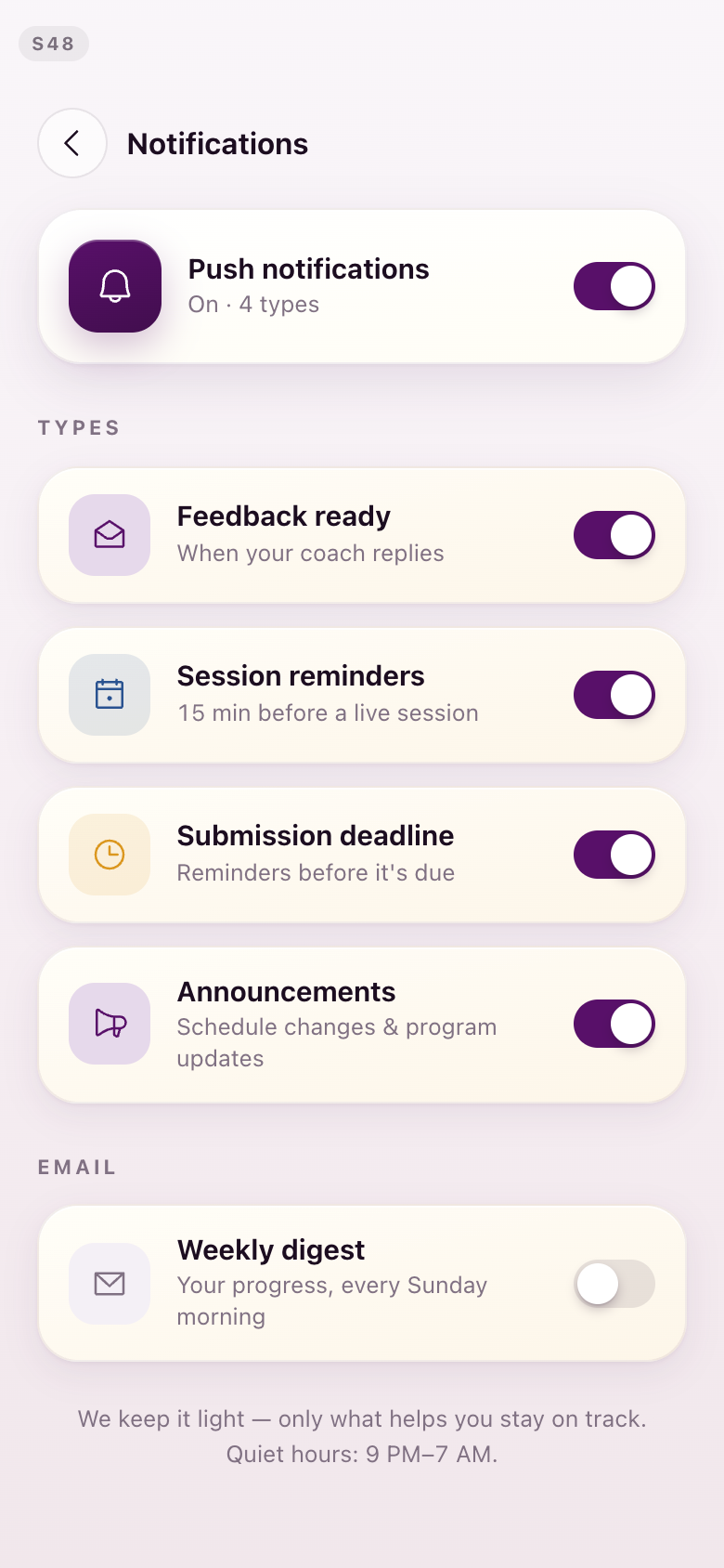
Phosphor is the single icon library. Its outlines are built into the app as drawing instructions rather than pasted in as pictures, so nothing in the set can drift away from the rest of it. Weight is used for one job only: the tab bar fills the tab you are on, and every icon inside a screen is drawn at the same line weight. The candidate pool was cut from 152 icons to 60, and then each recurring thing was given exactly one icon, everywhere it appears. A reading circle is the seated ring. A one-to-one is two people. Feedback is an open envelope. There is one microphone in the product.
Seven of your other notes fold into this one pass. The generic bell is the library's bell. The four live-session types read as one family, differentiated by their own mark rather than by line weight. The lesson card carries a video mark and a running-time mark, so you can tell it is a lesson without reading the heading. Kamran and Yasmine settled the six picks that were genuinely open on a shared board before any of it was drawn.
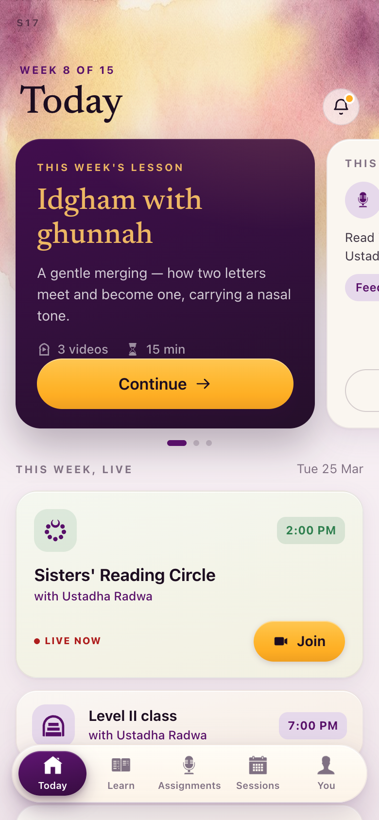
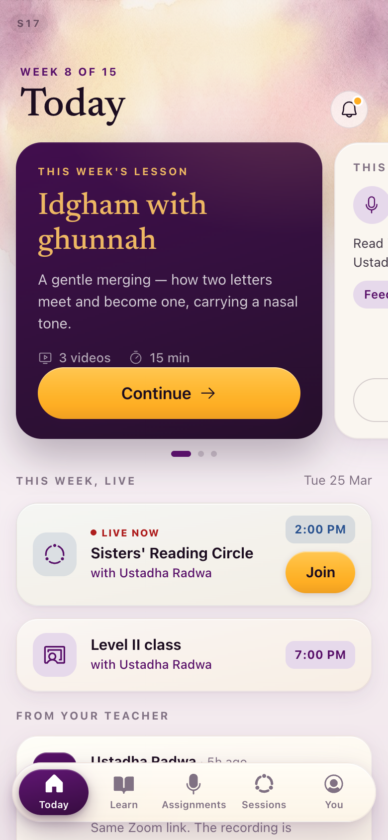
S17Today
The tab bar is the clearest read: filled on the tab you are on, line weight everywhere else. The lesson card gains its own anchor — a video mark and a running time — and the bell is the library's bell.
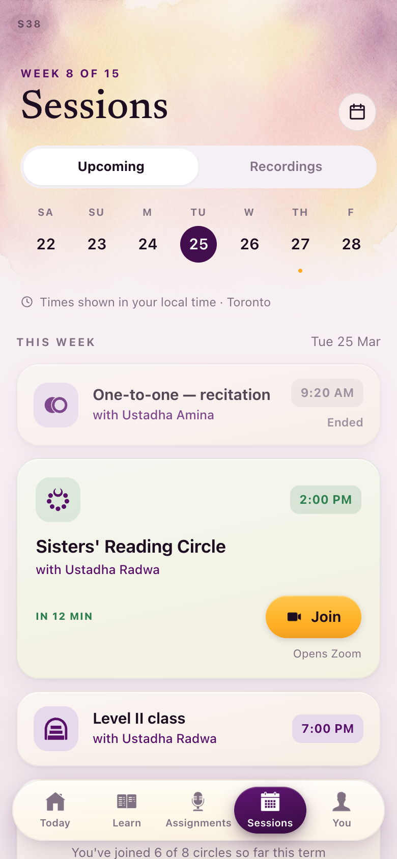
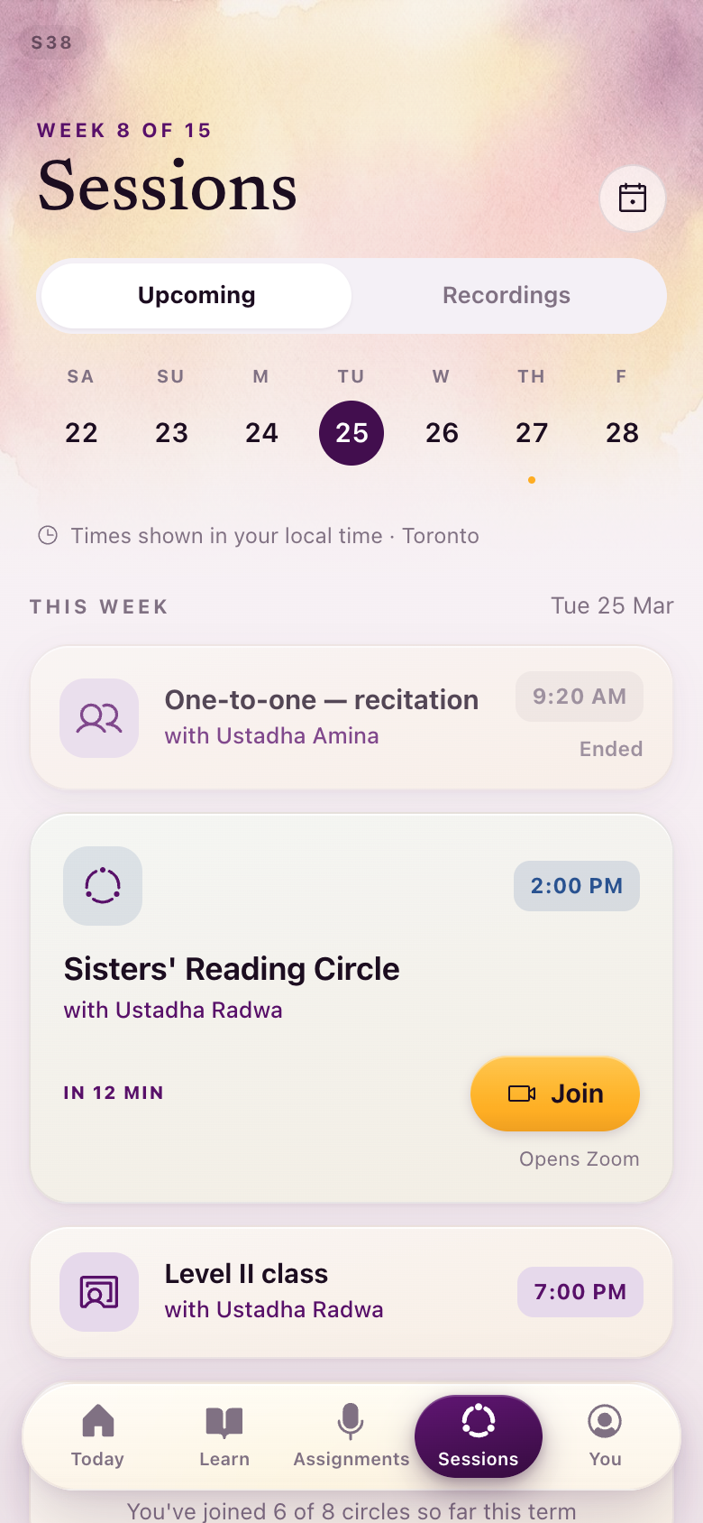
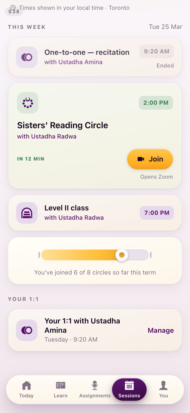
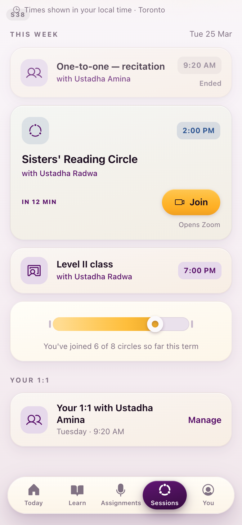
S38Sessions
The four live-session types as one family. The seated ring is a reading circle, two people is a one-to-one, and the level class and drop-in hours sit beside them at the same weight.
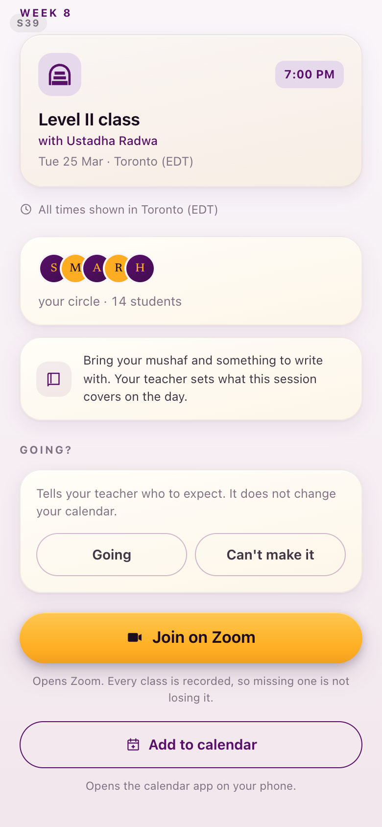
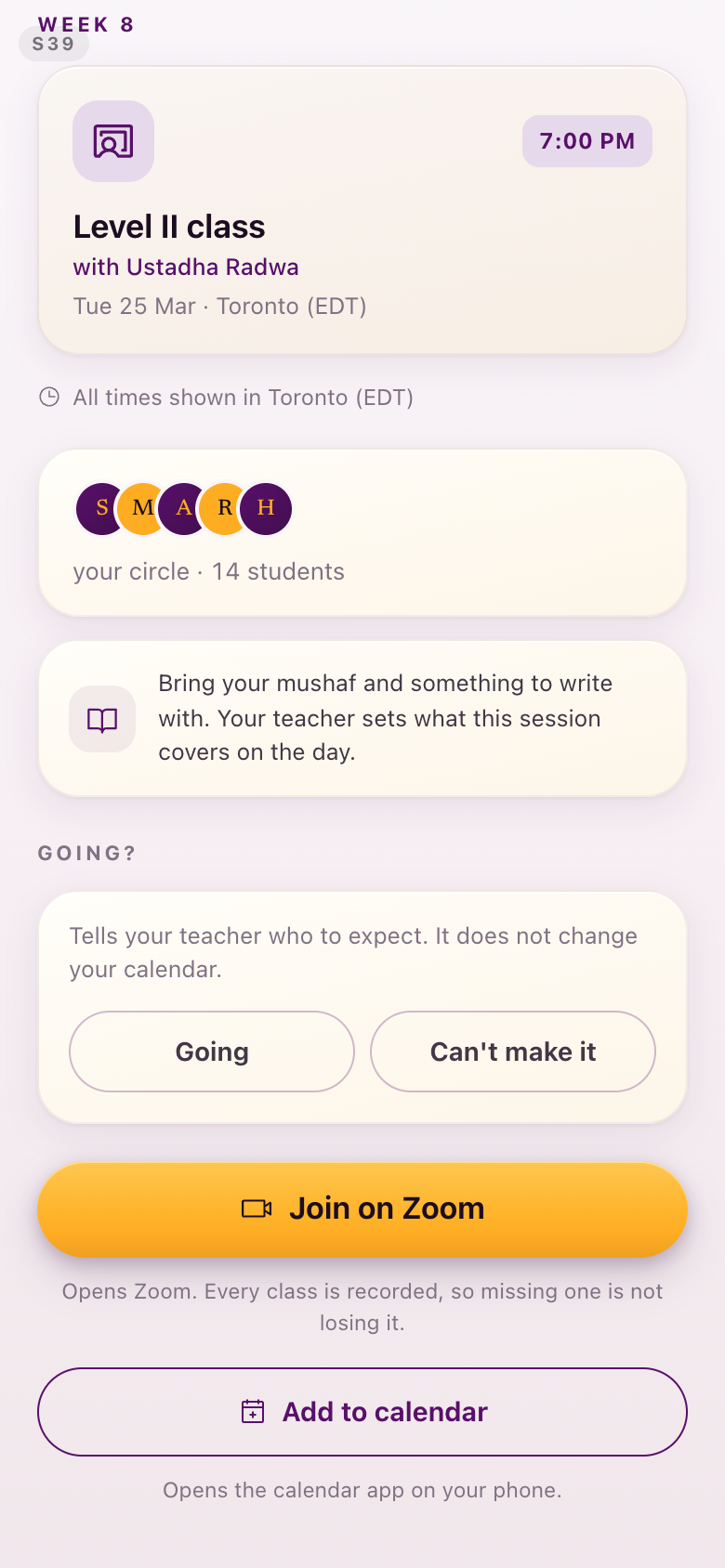
S39Session detail
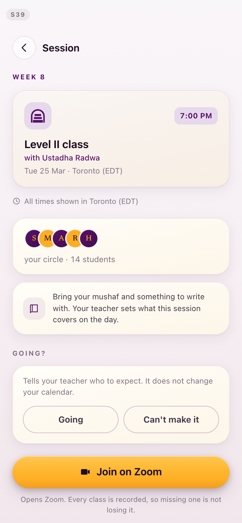
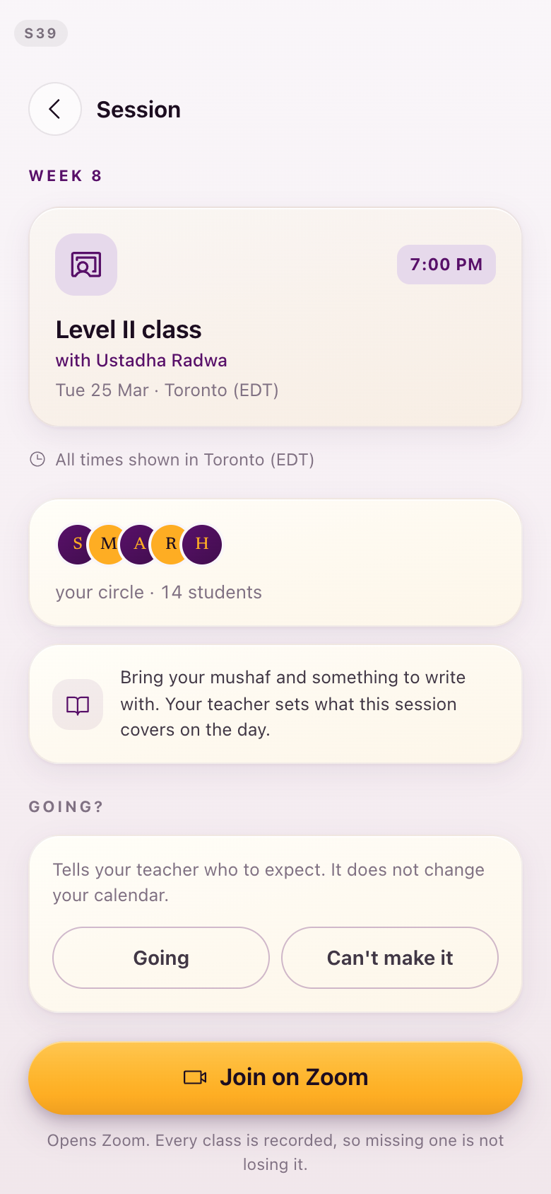
Facts carry their symbols: what to bring, who is teaching, how to join.
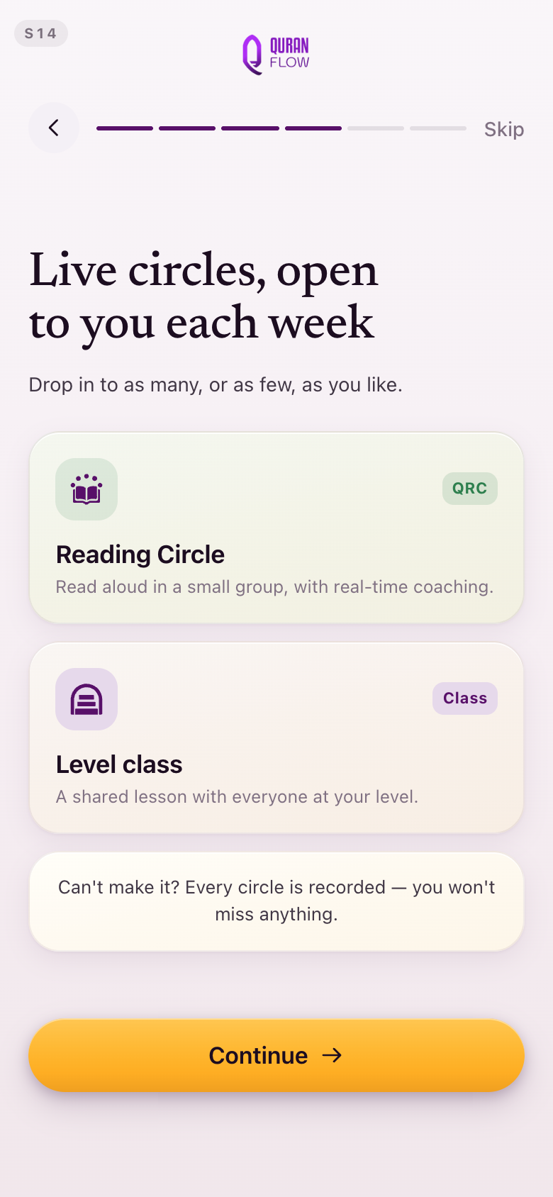
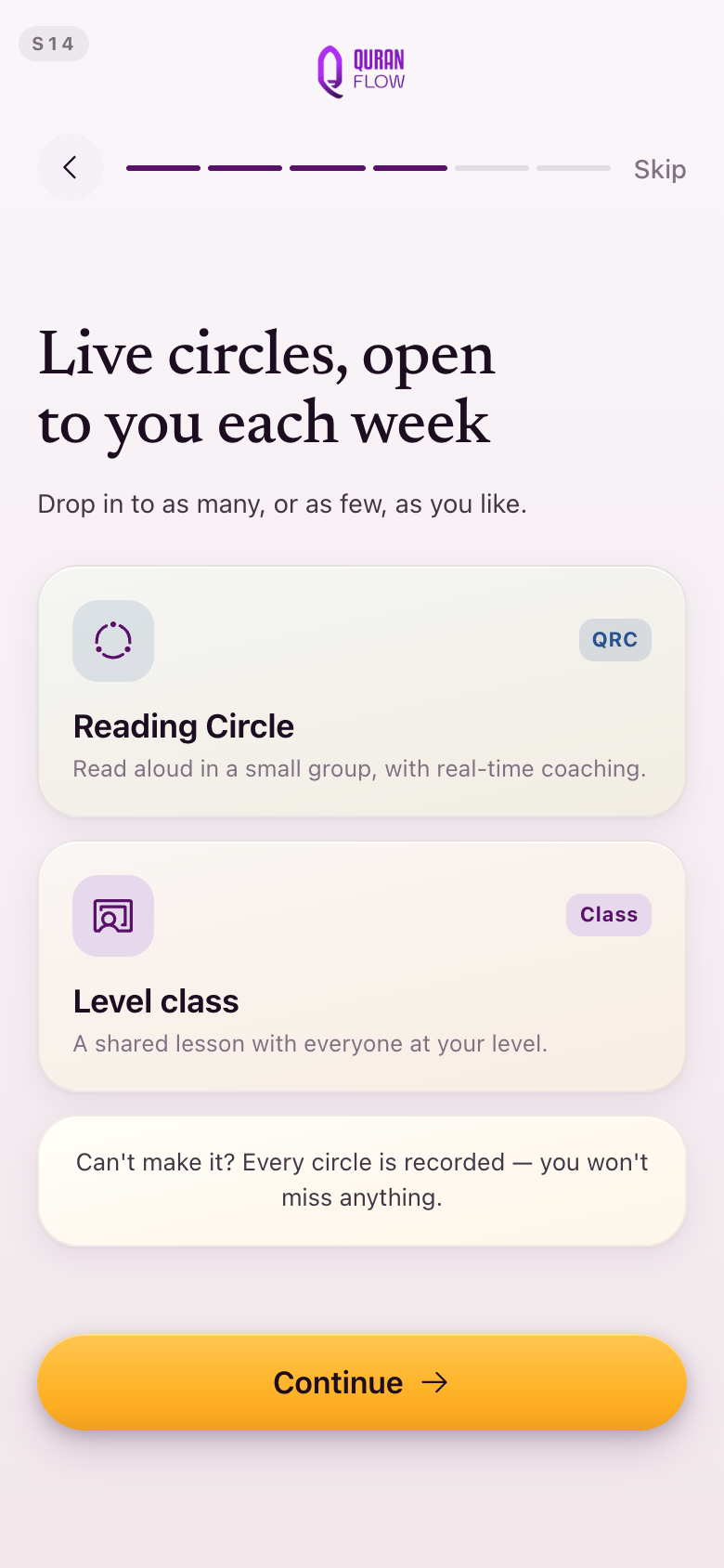
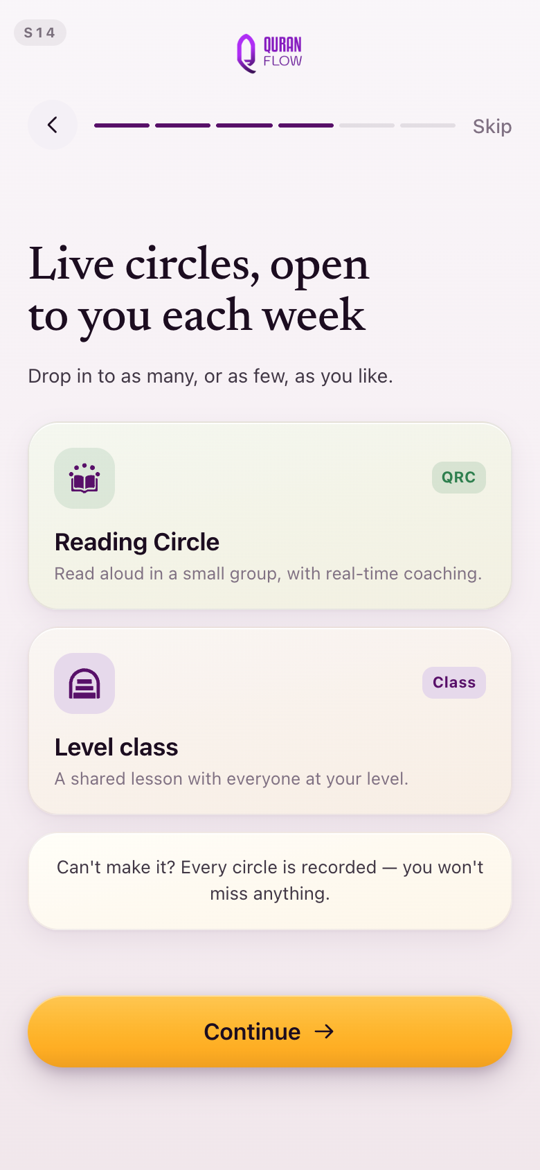
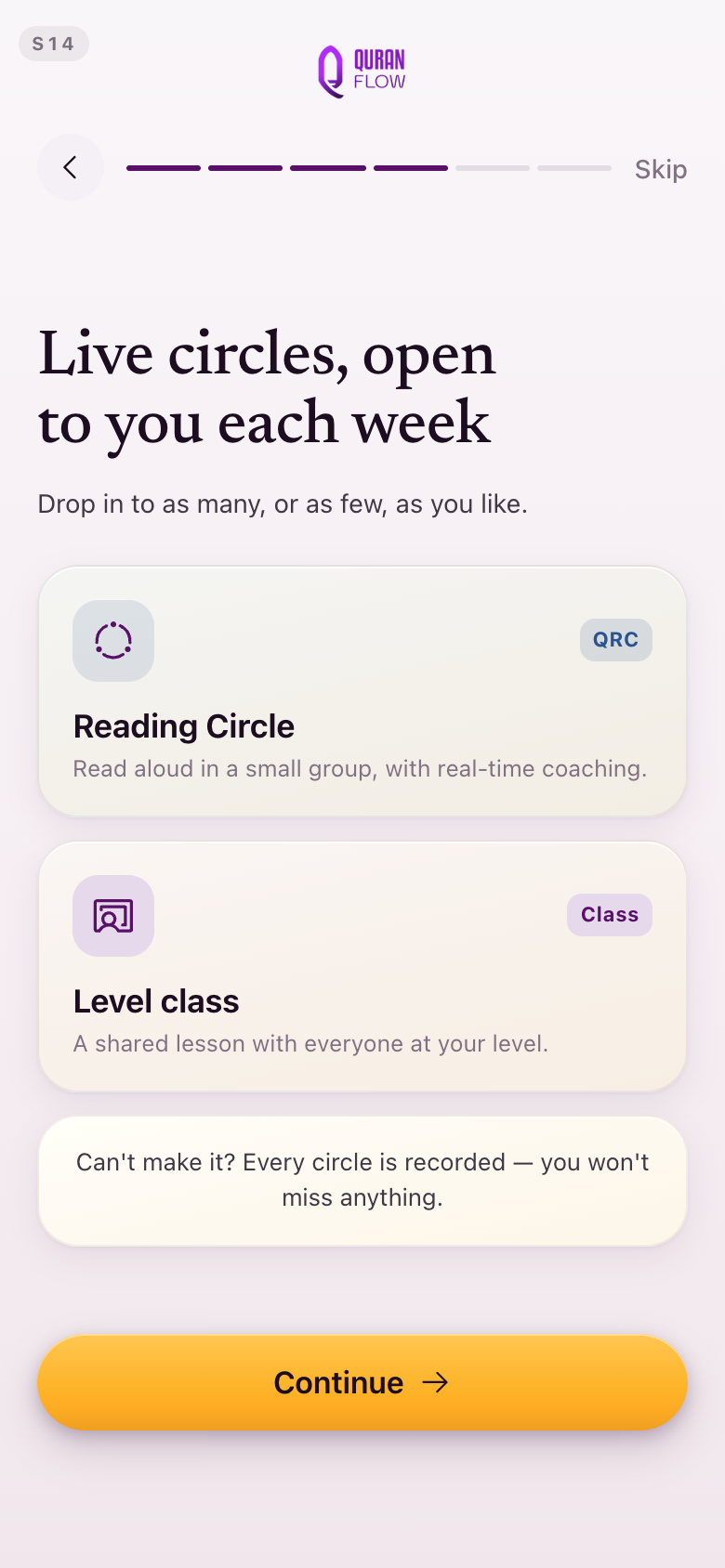
S14Live circles, in onboarding
The circle mark a student meets first is the same seated ring she will see on Sessions every week after, and it arrives already wearing the circle's new lapis.
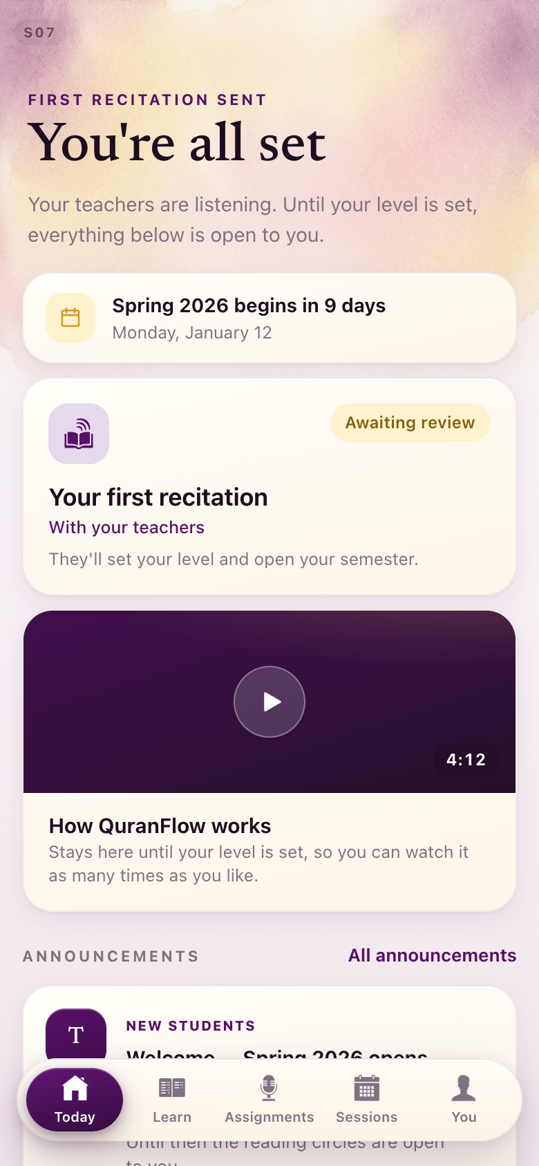
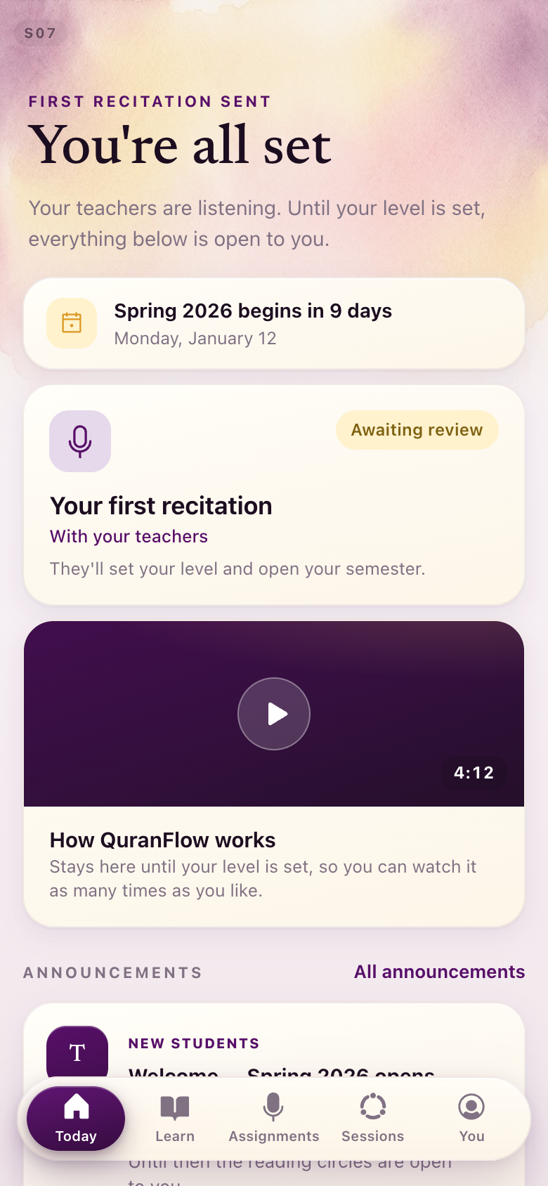
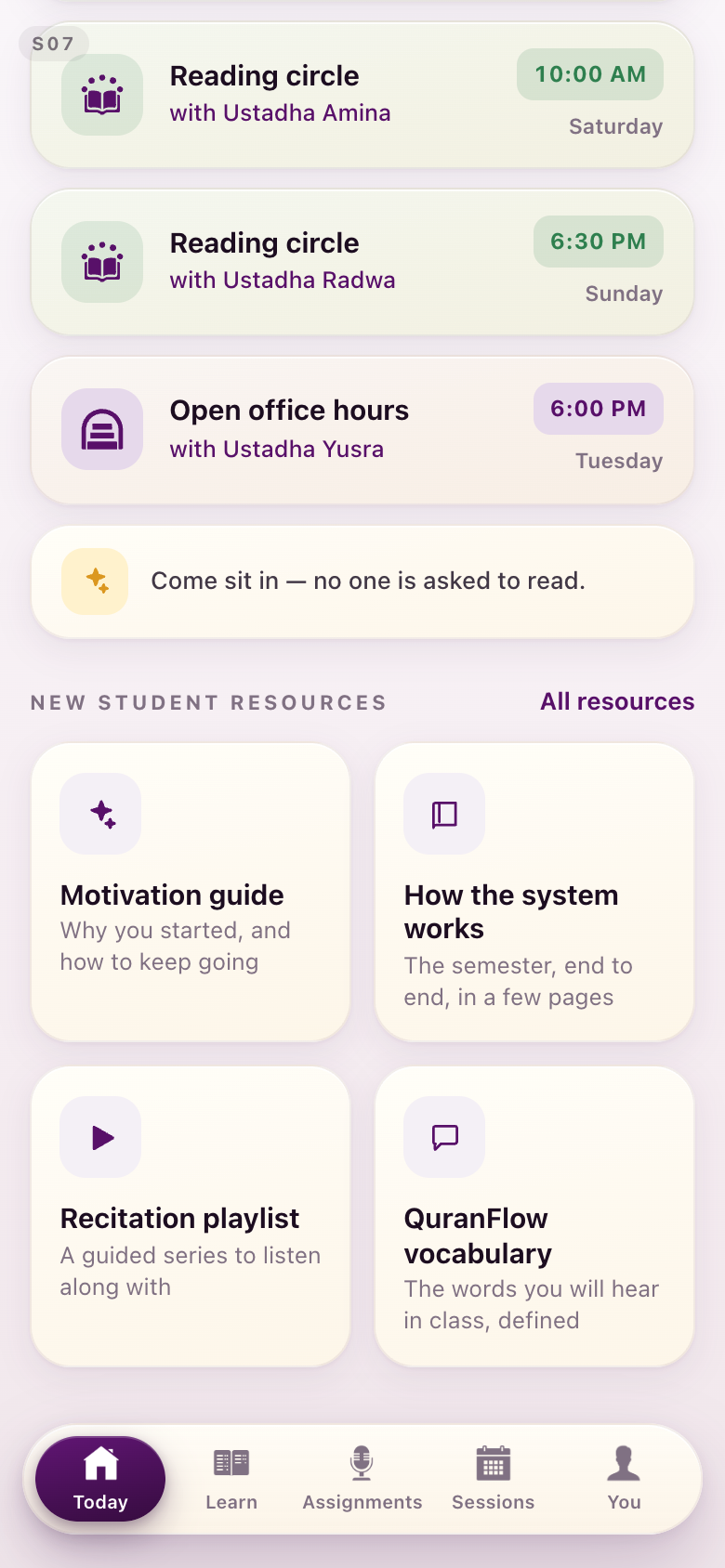
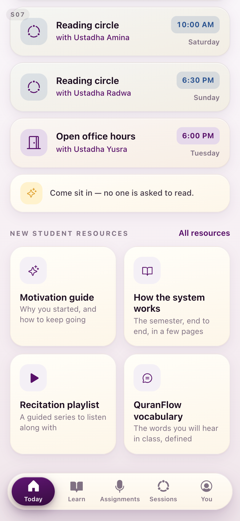
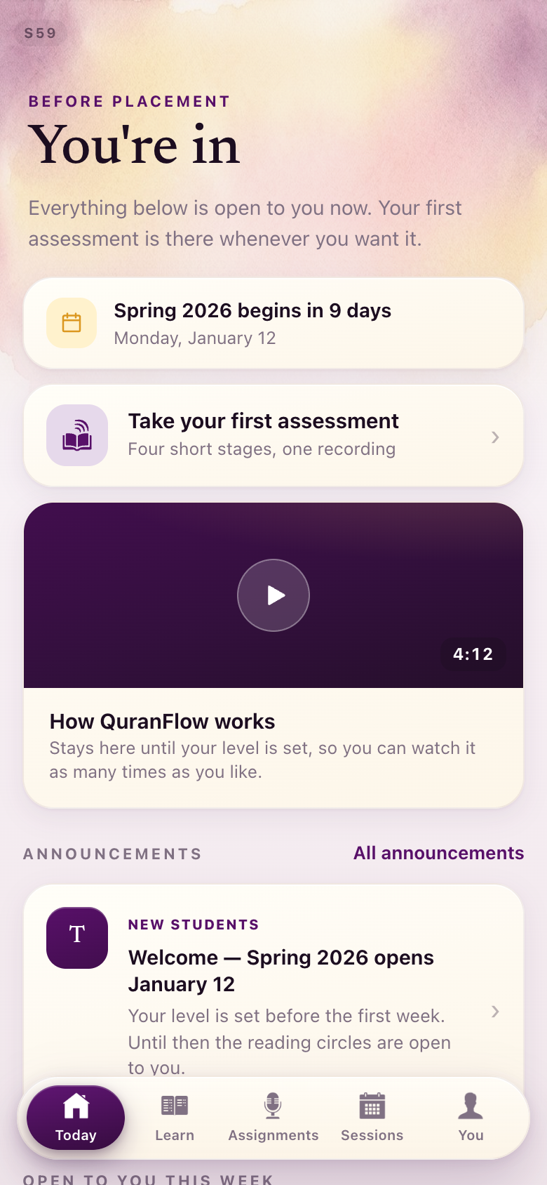
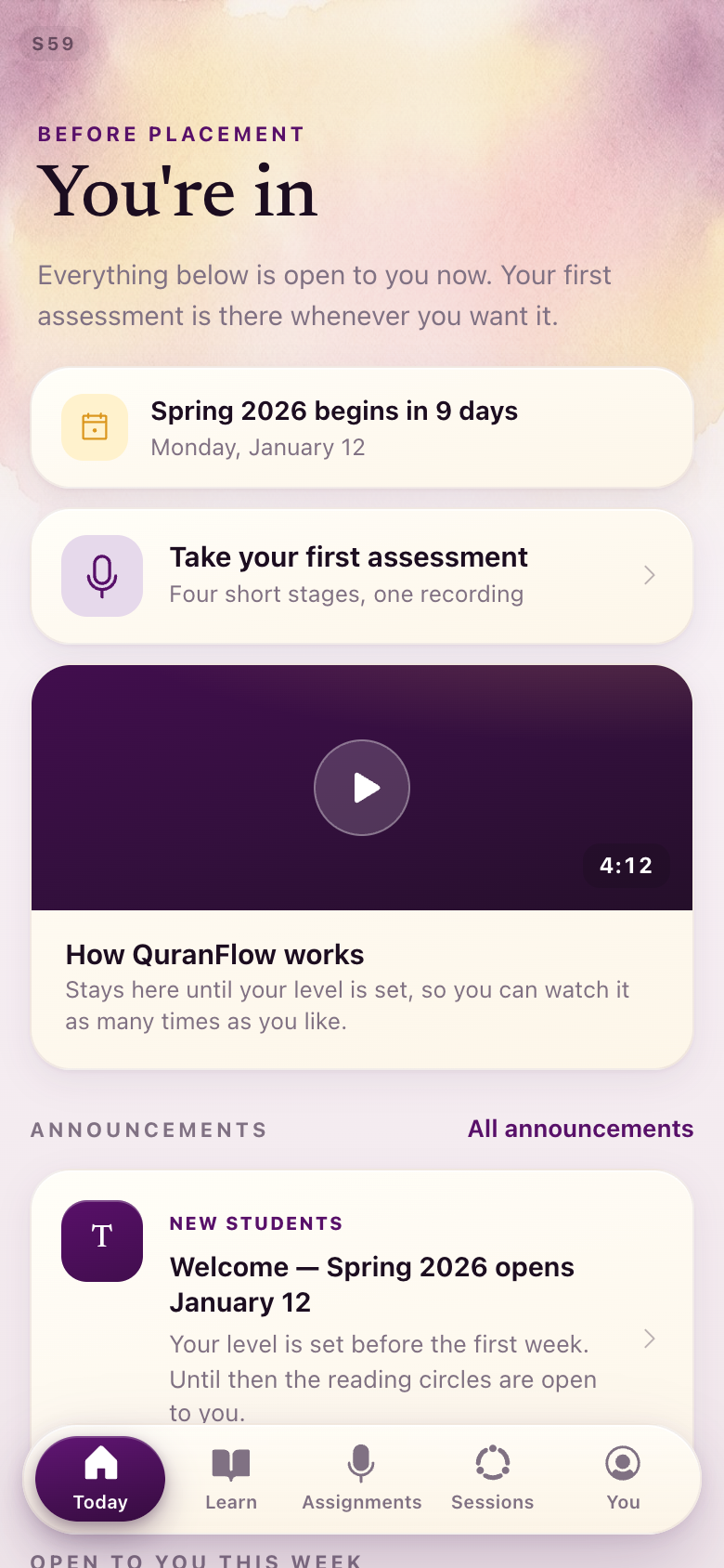
S07 · S59Level 0, waiting
The mark on the pending recitation is the one microphone; the date carries the calendar mark. Two waiting states: placed in the queue, and having skipped the assessment.
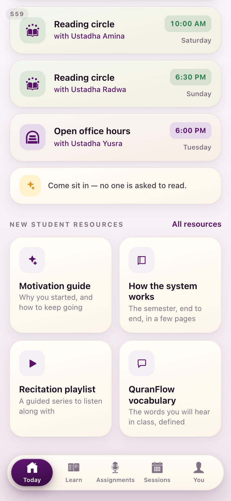
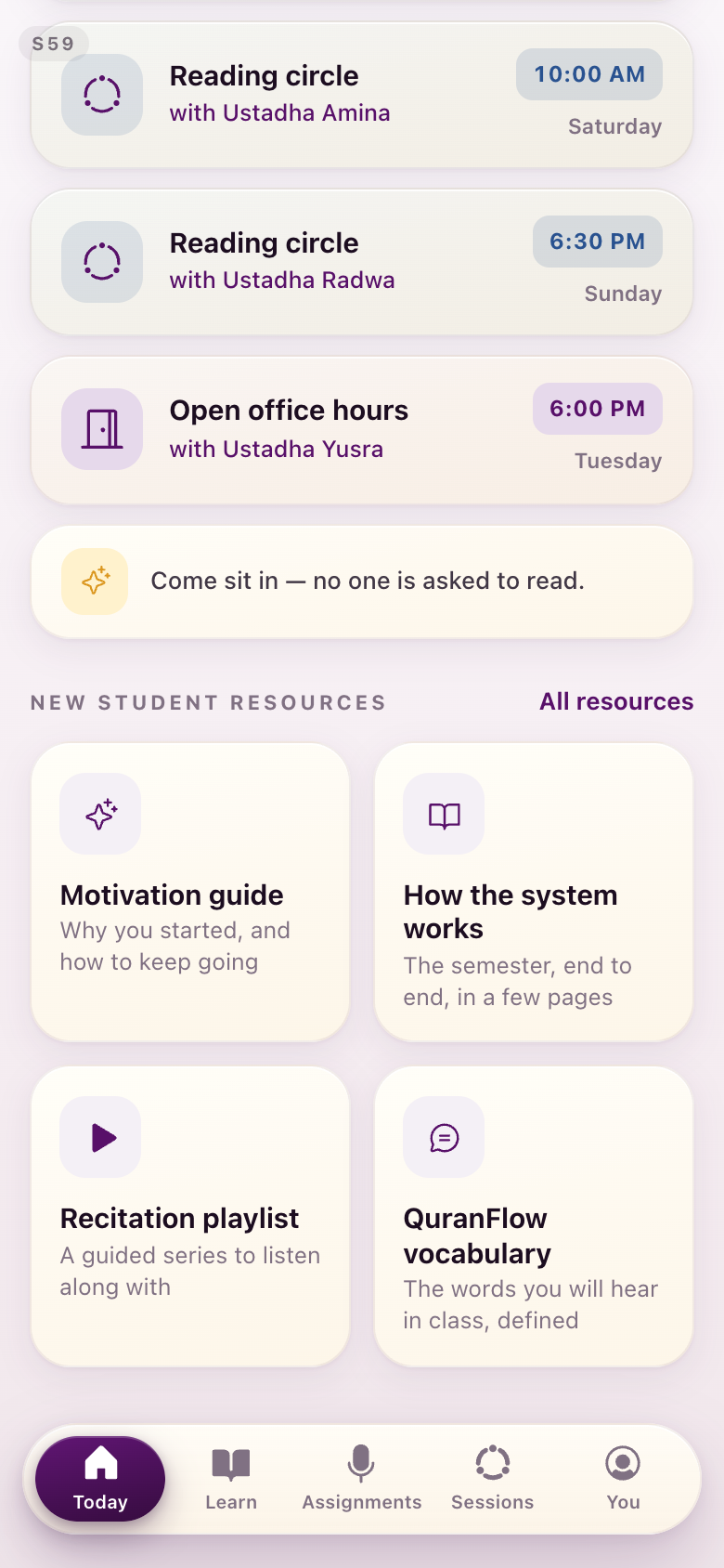
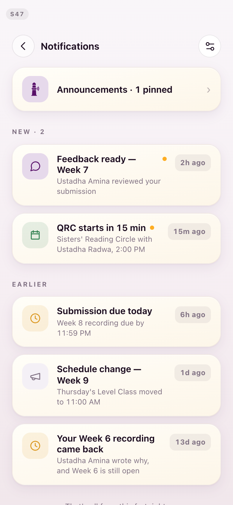
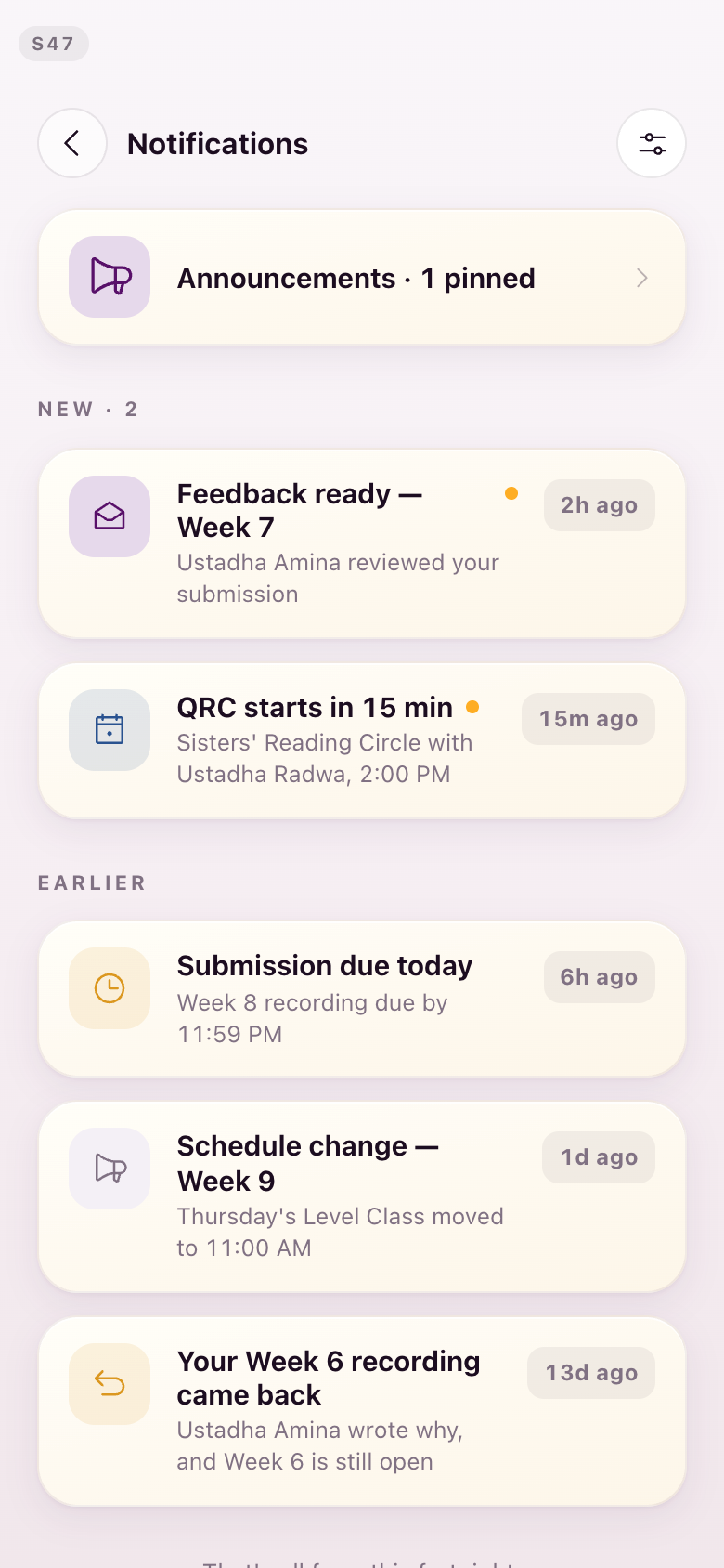
S47Notifications
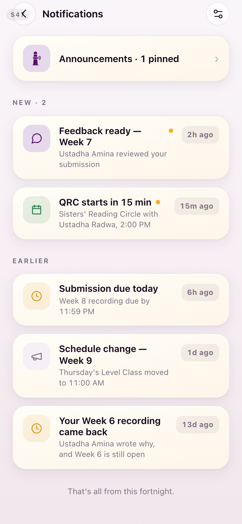
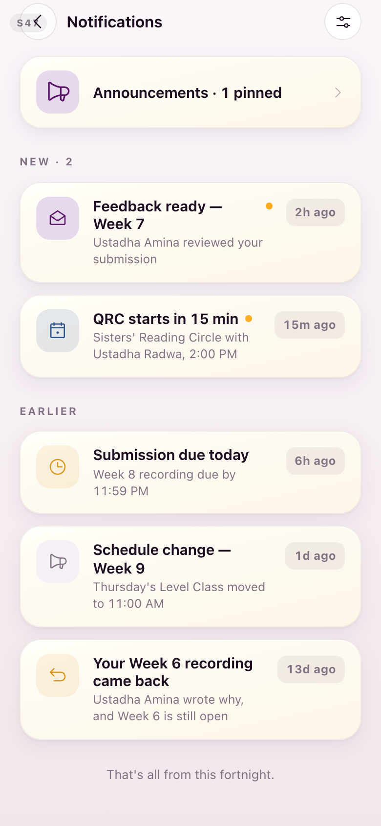
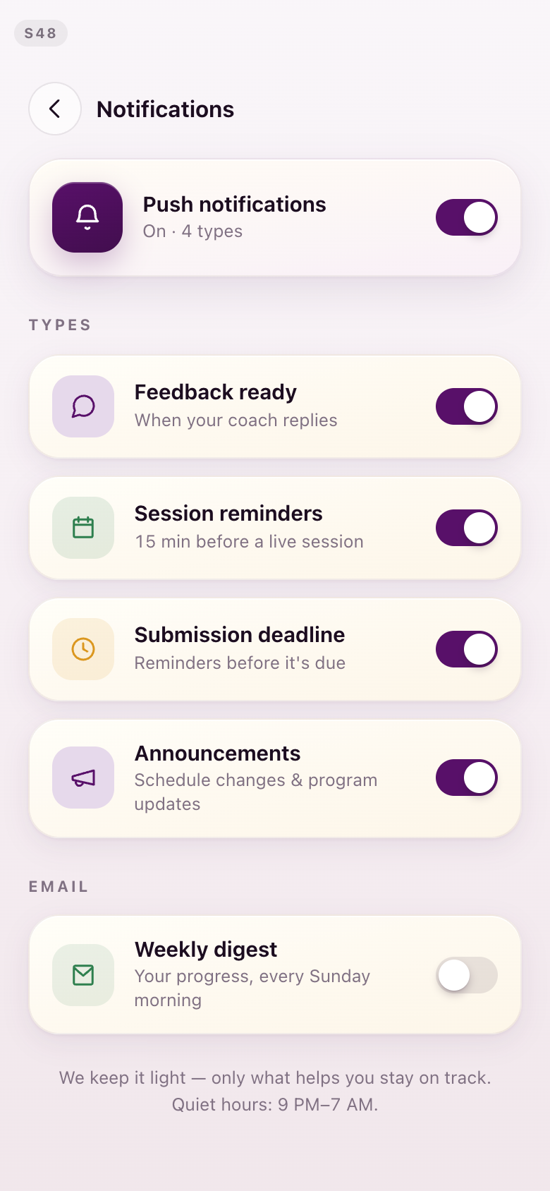
Each notice takes the icon its subject already owns: an open envelope for feedback, the seated ring for a circle, a megaphone for an announcement.
S48Notification settings
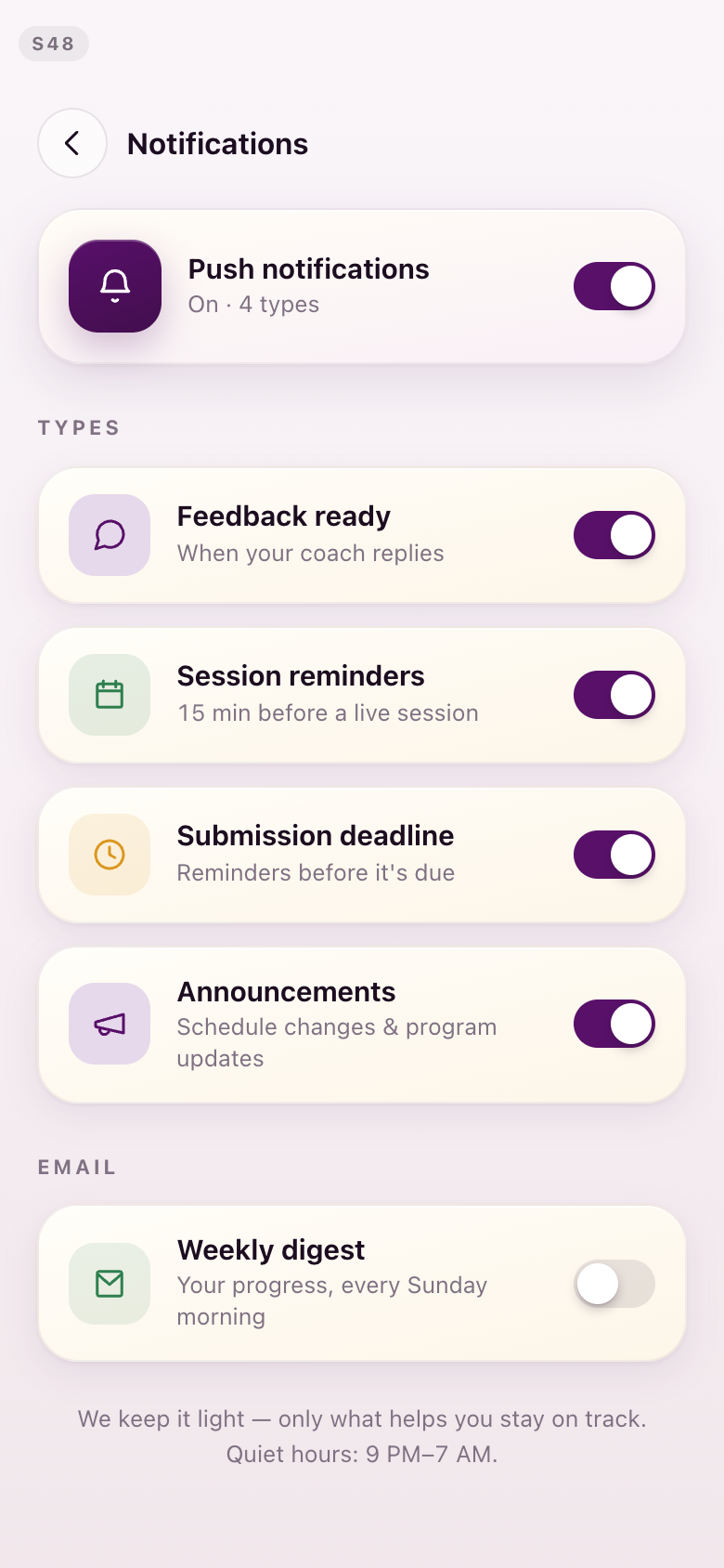
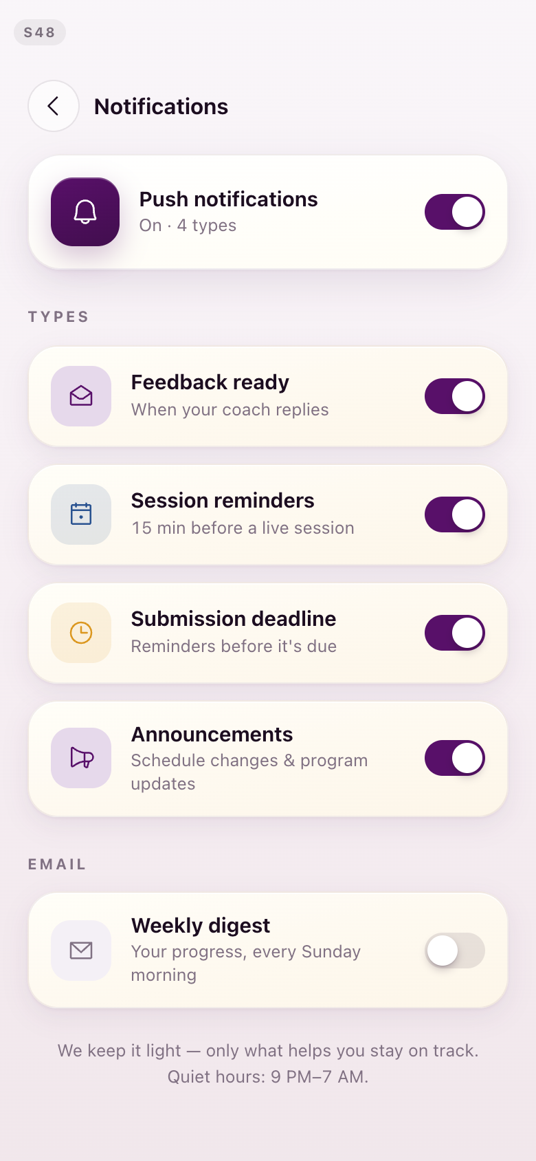
Every row takes the mark its notice uses, so the setting and the thing it governs look like each other. The session reminder also loses its green here.
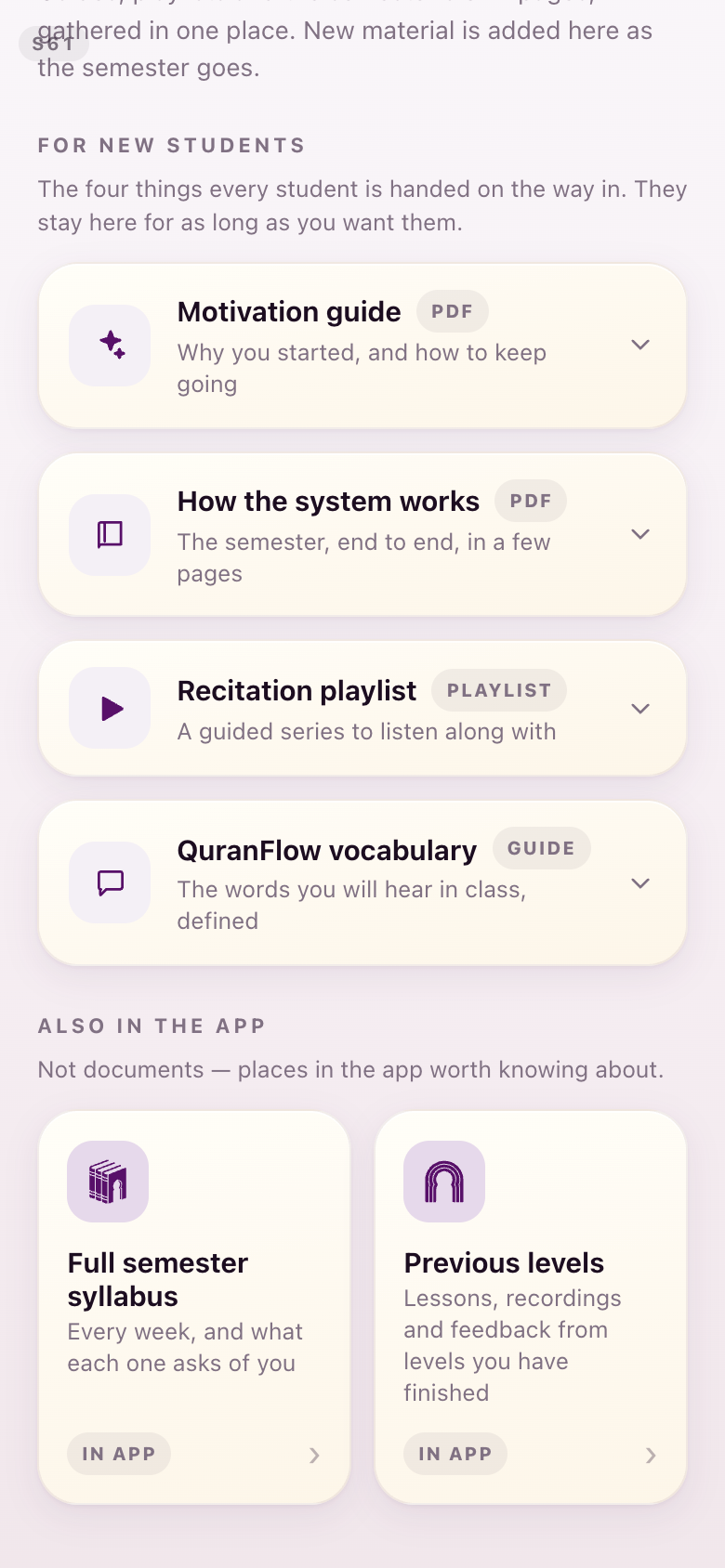
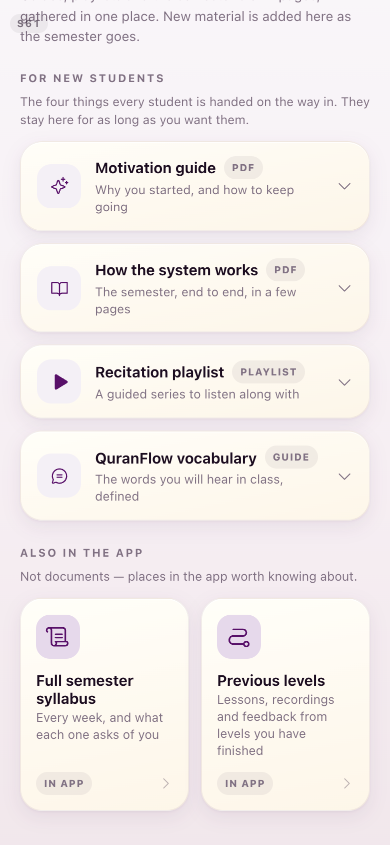
S61Resources
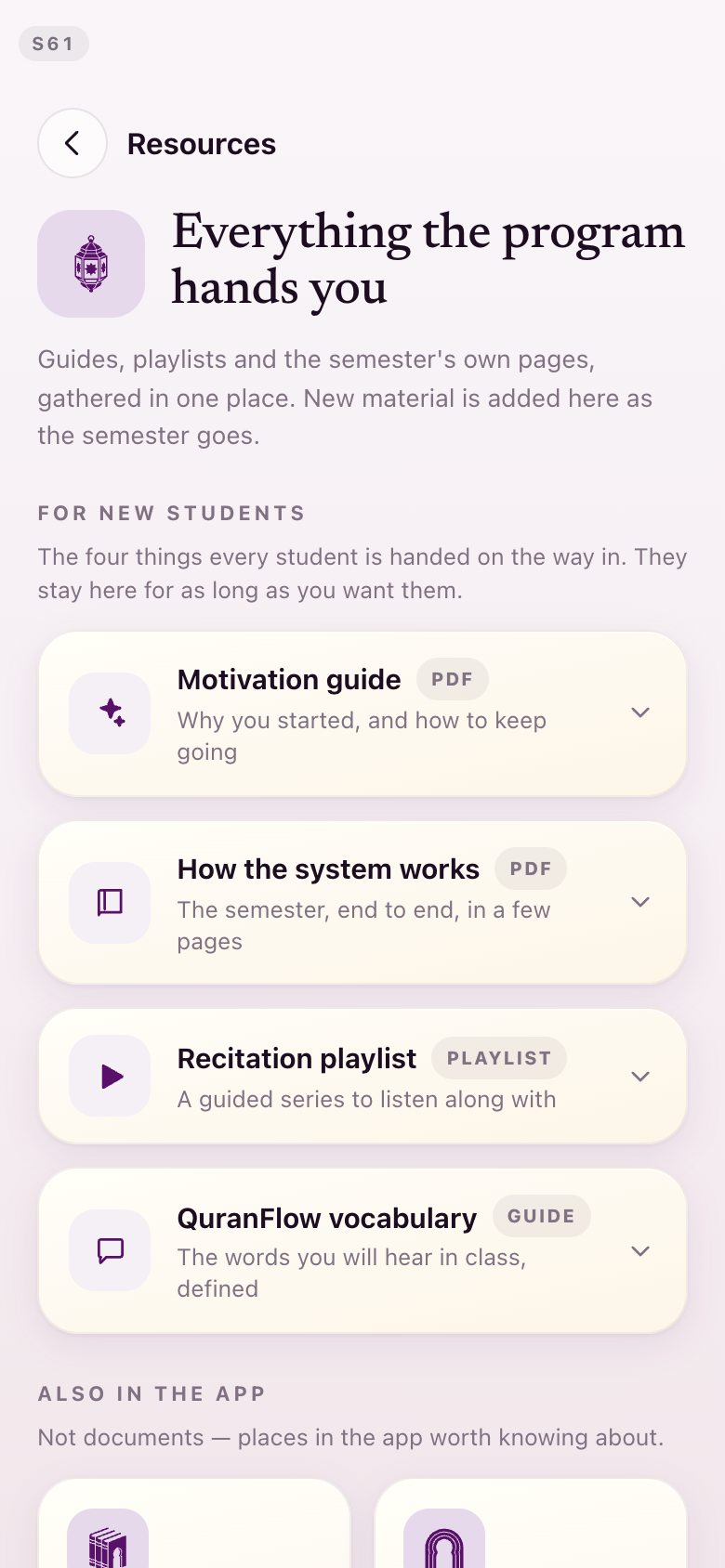
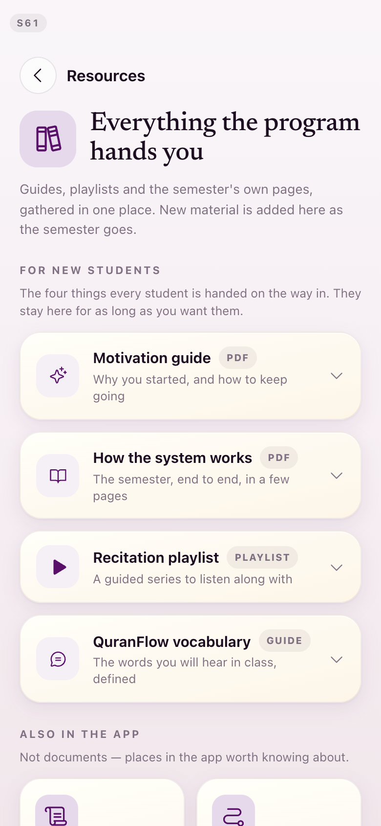
The four document rows and the two places-in-the-app tiles are redrawn at one weight, so a PDF, a playlist and a place you can go stop looking like three different products.
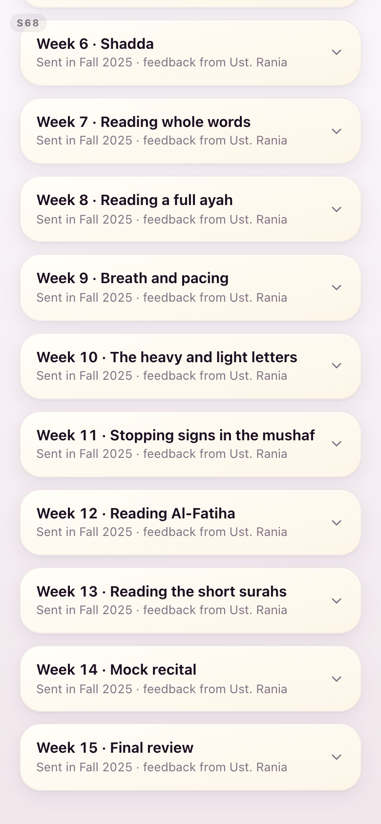
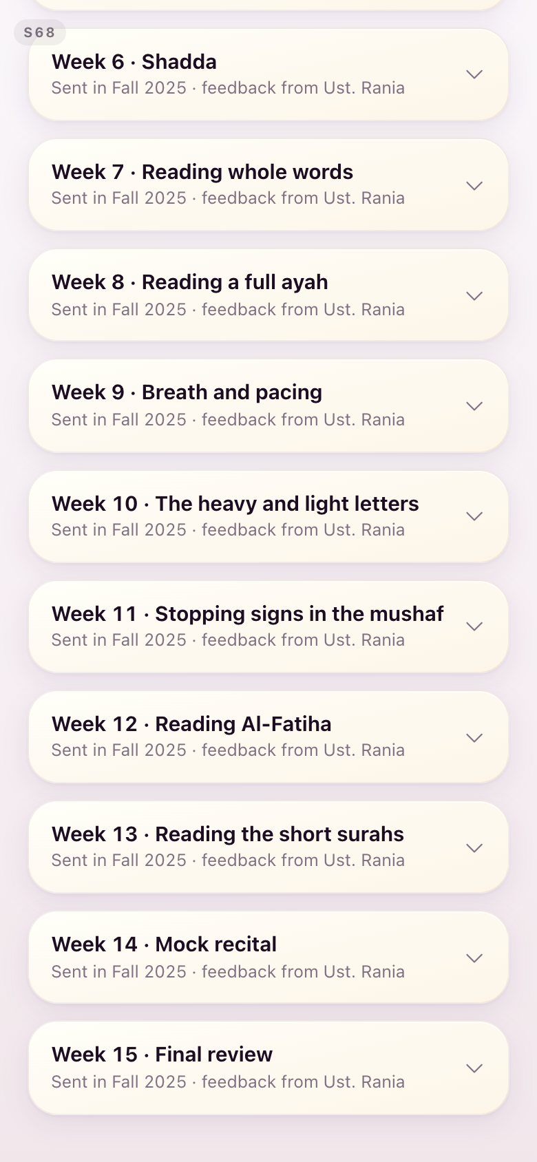
S68Past levels
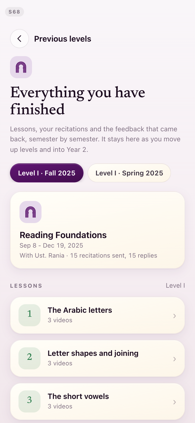
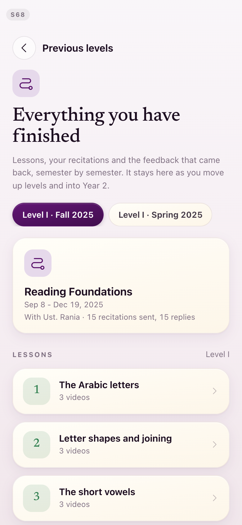
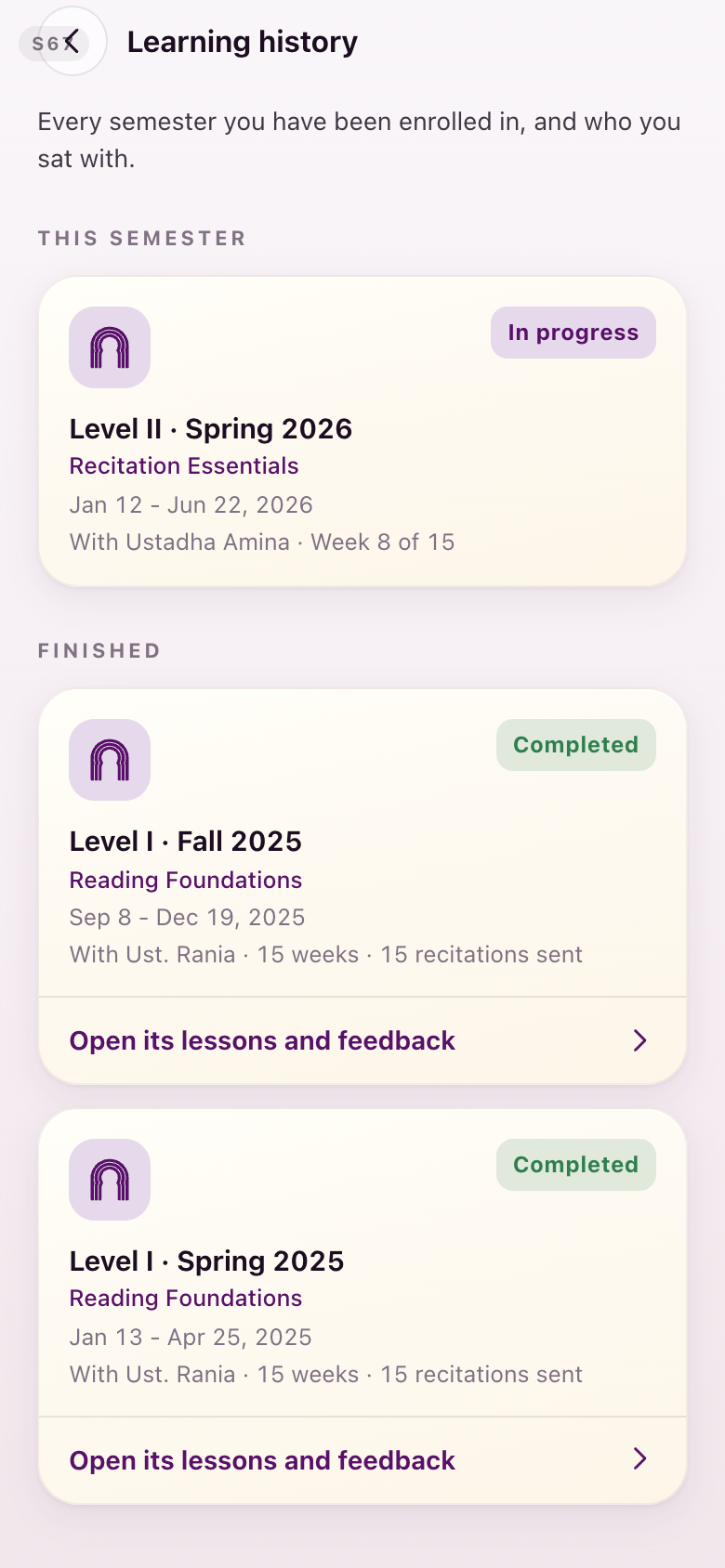
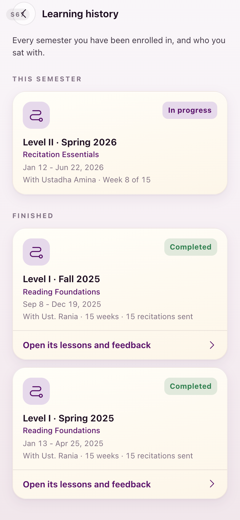
The mihrab at the head of the page becomes a mark from the set, and the finished-lesson numbers go muted.
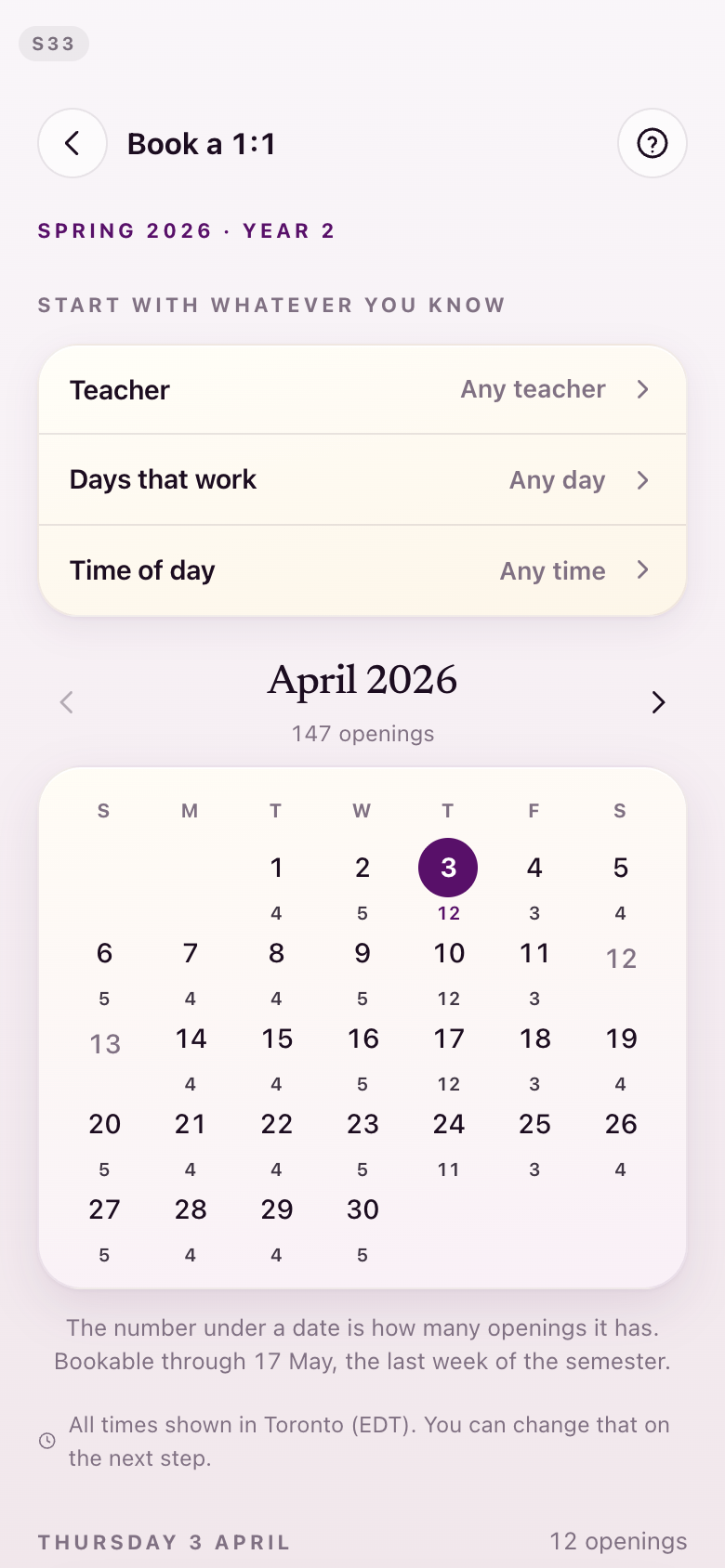
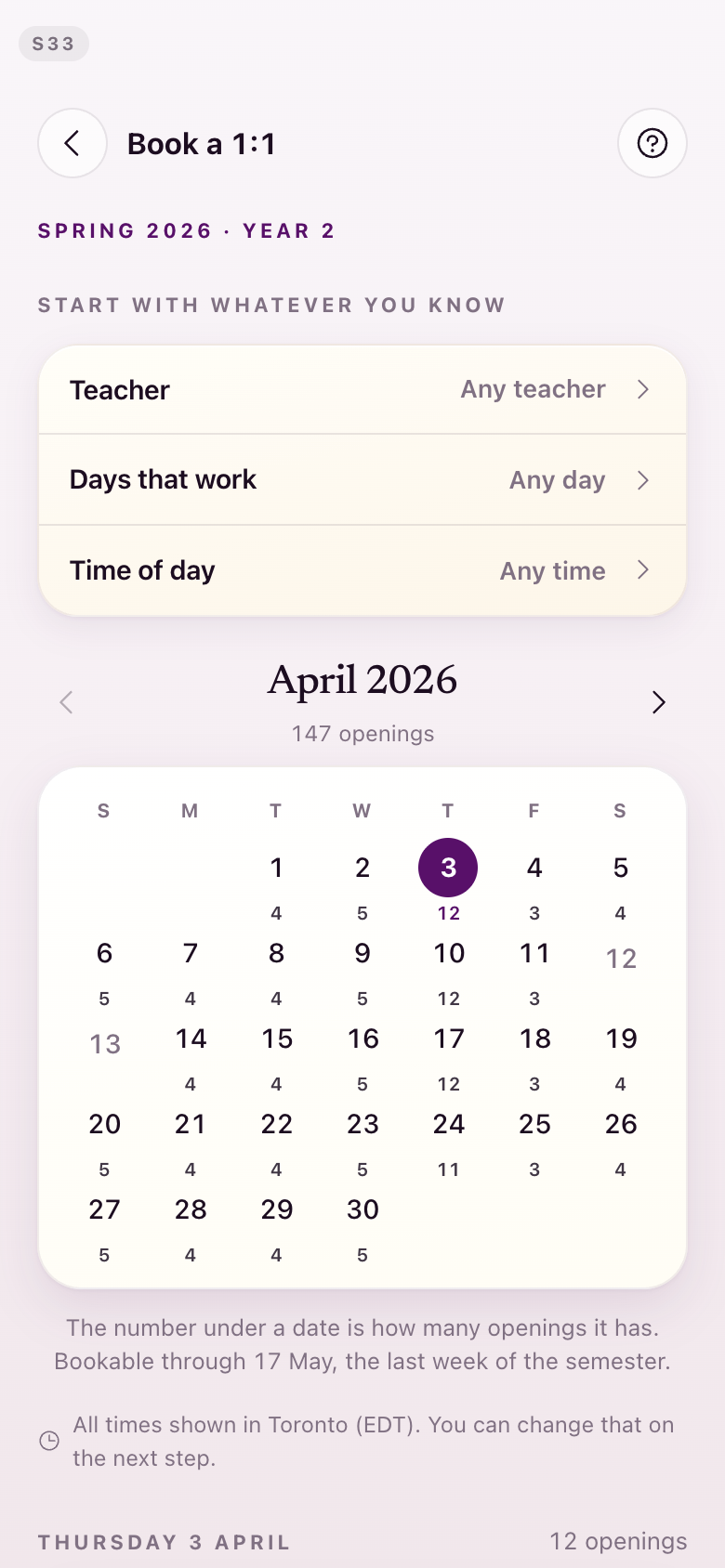
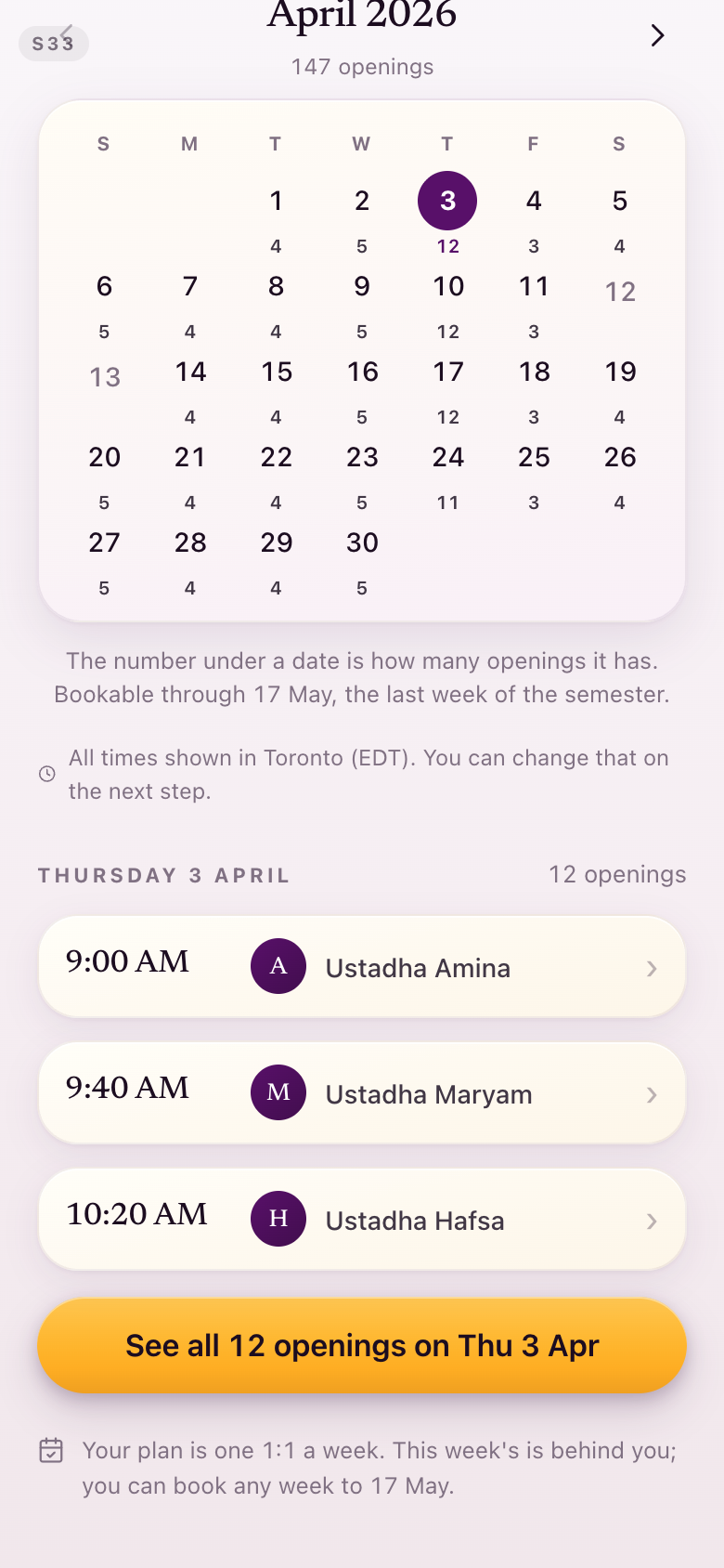
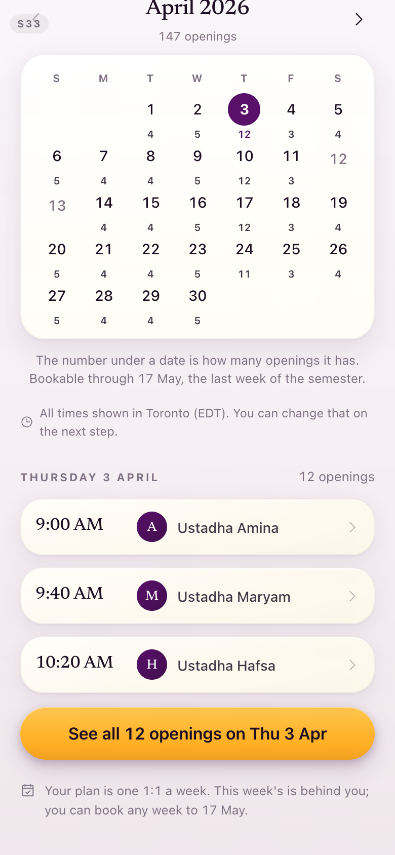
S33Book a one-to-one
Barely touched: the filters and the month keep their shape, and only the marks change.
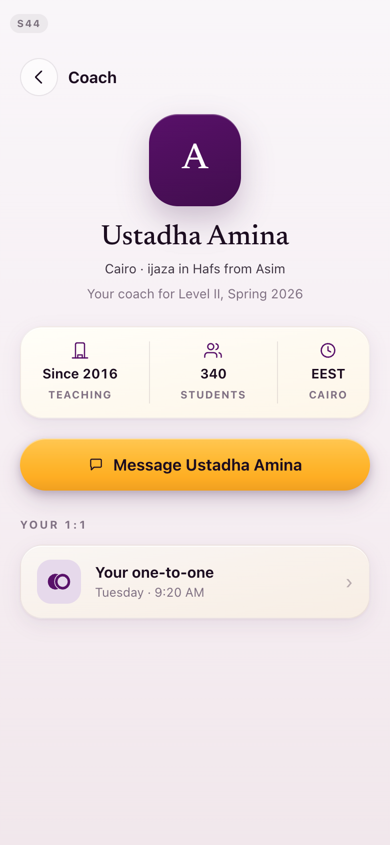
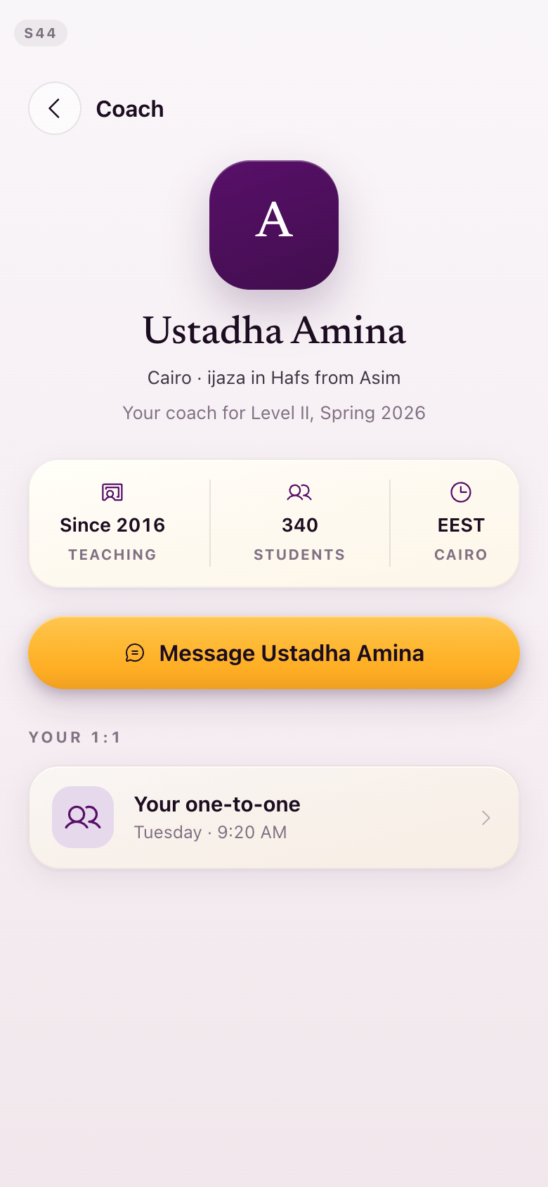
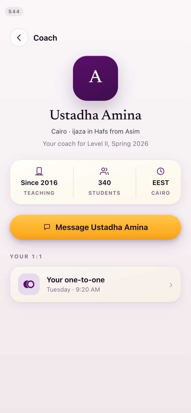
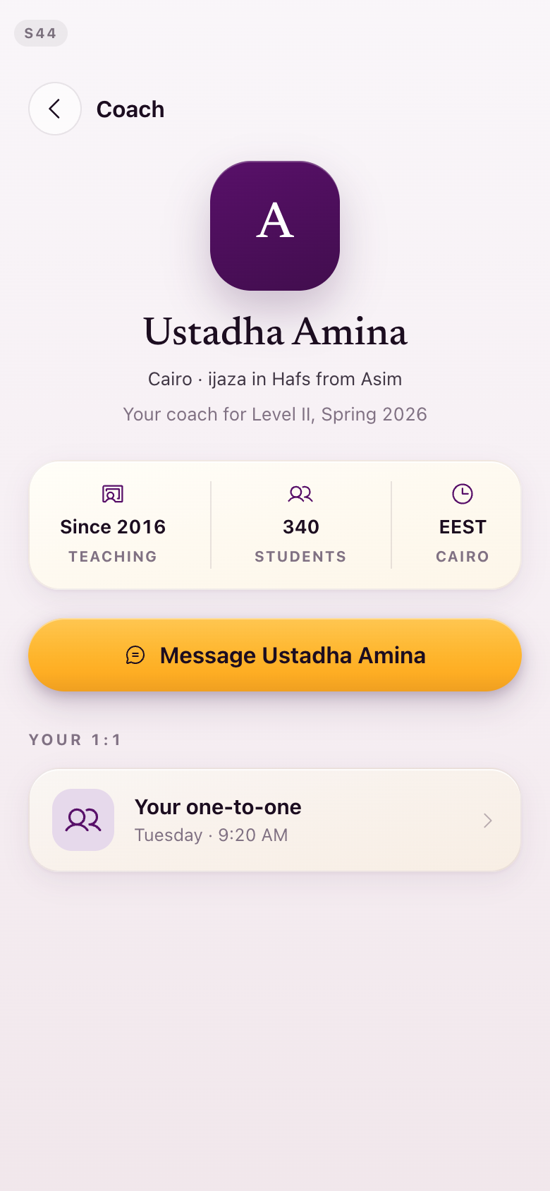
S44Your coach
Her facts row and her one-to-one row redrawn in the set; two people for the one-to-one, again.
S54Welcome to Mastery
This screen carries the one symbol from your list that has not been redrawn — see the note below.
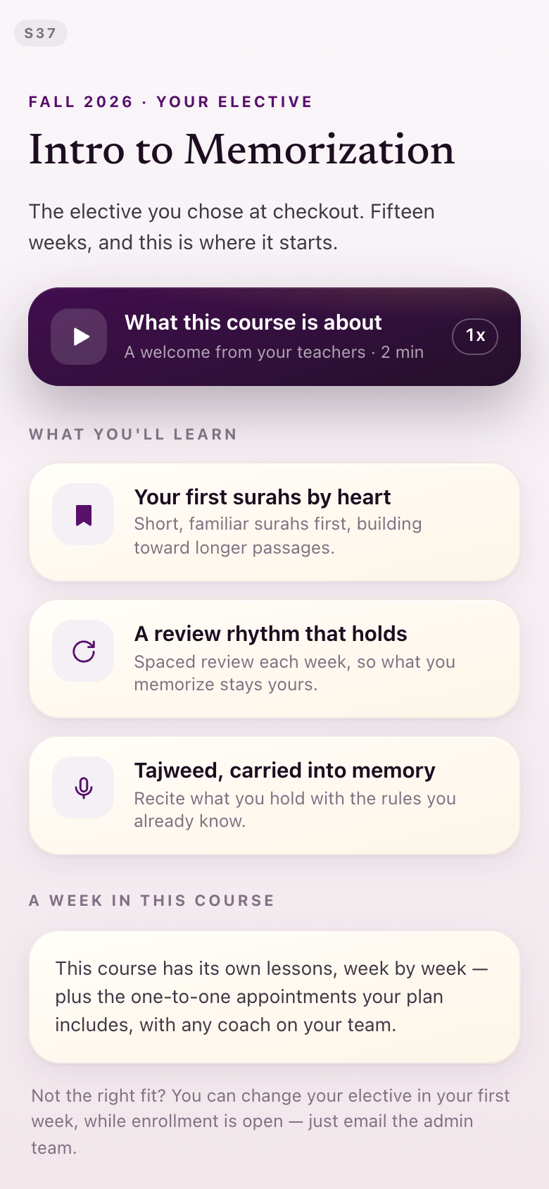
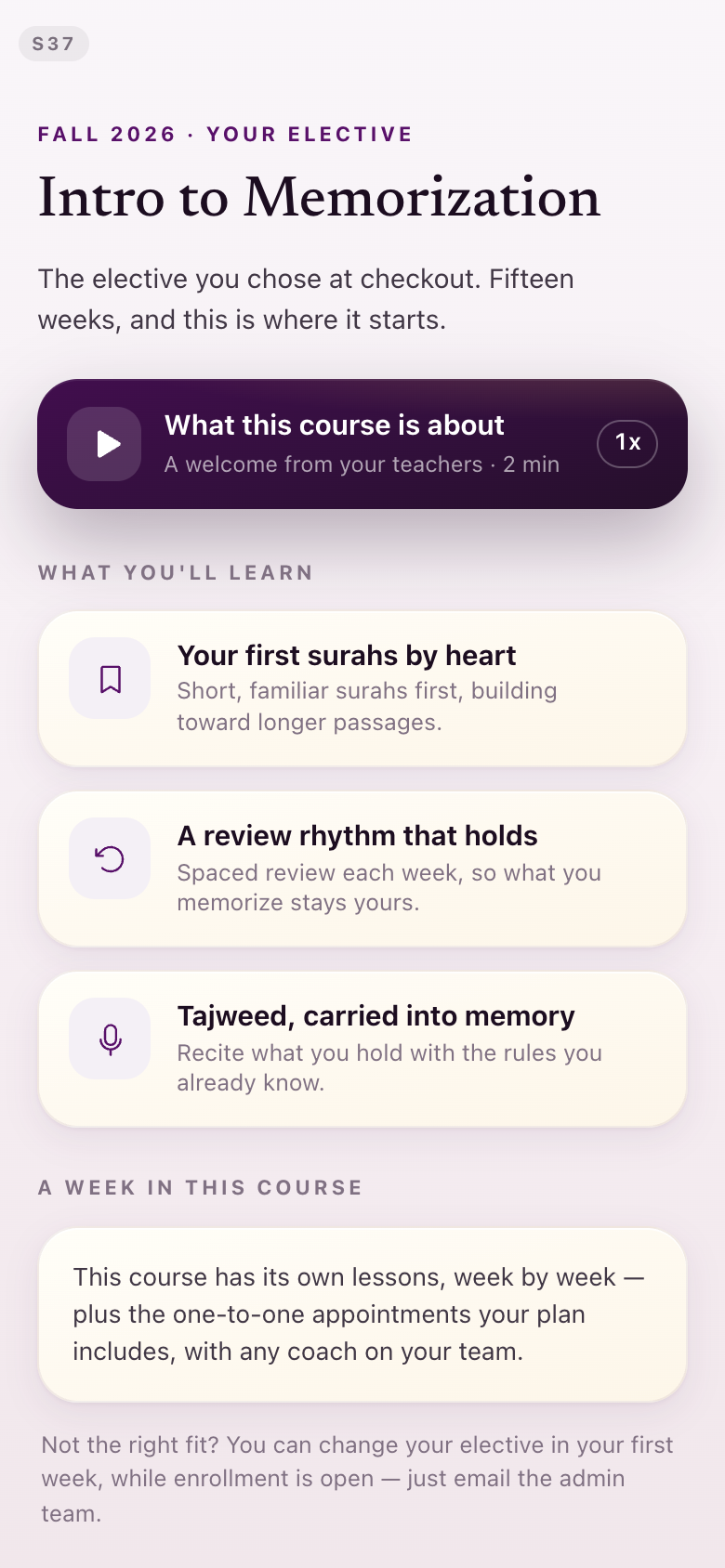
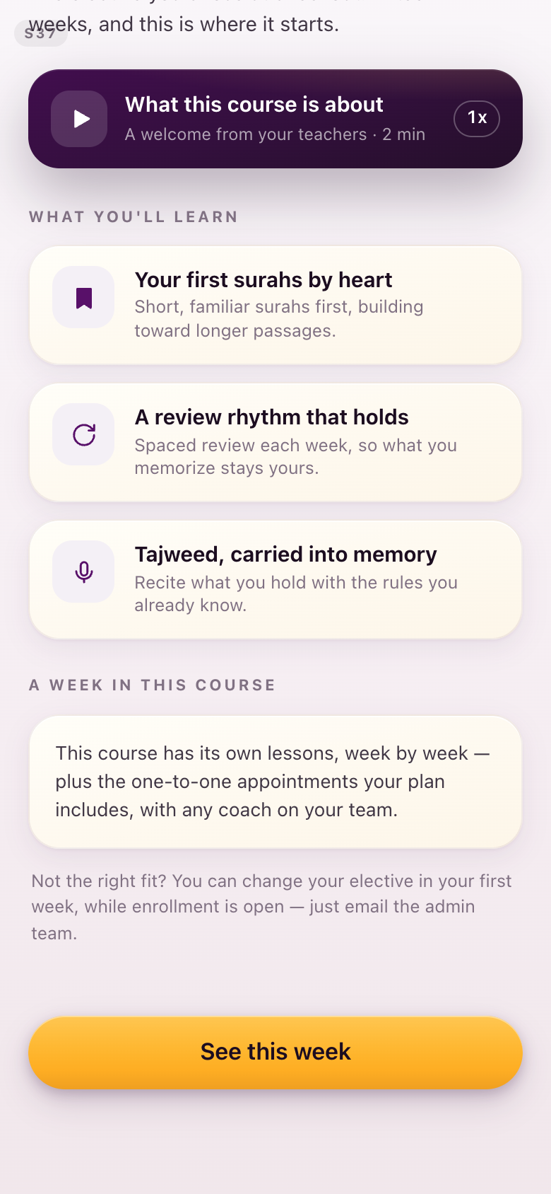
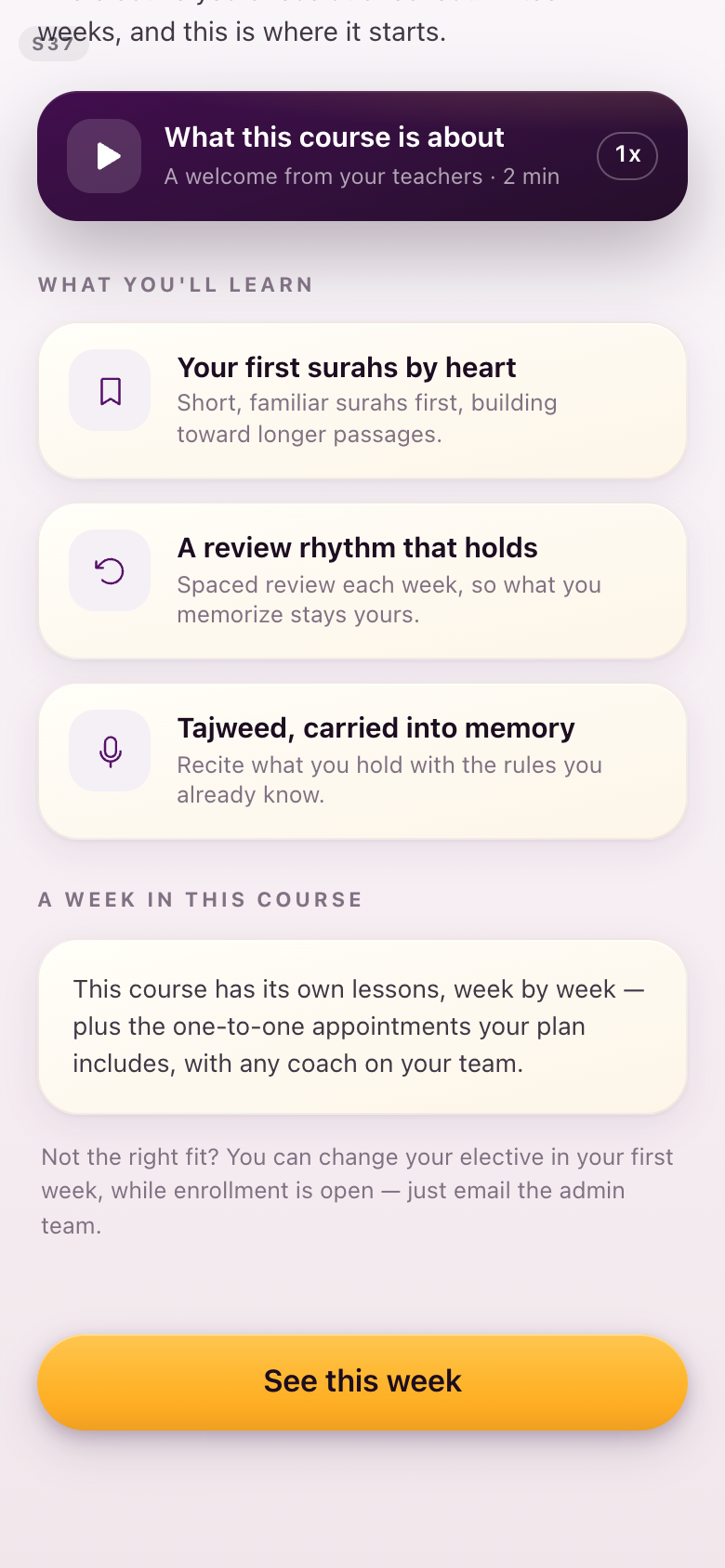
S37Your elective
The three things the course teaches take marks from the set, and the note at the foot drops to the quieter outlined card that asides now use.
Section 2The five submission states
Is this the icon for returned? Would there be an icon that better communicates that something is returned?Lejla, August 28
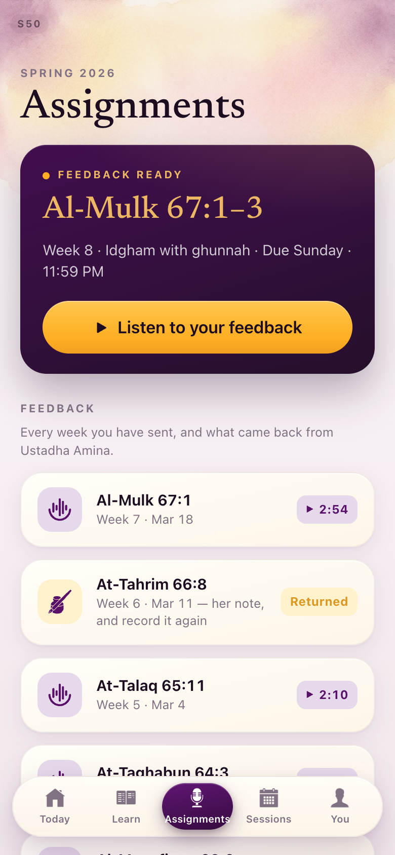
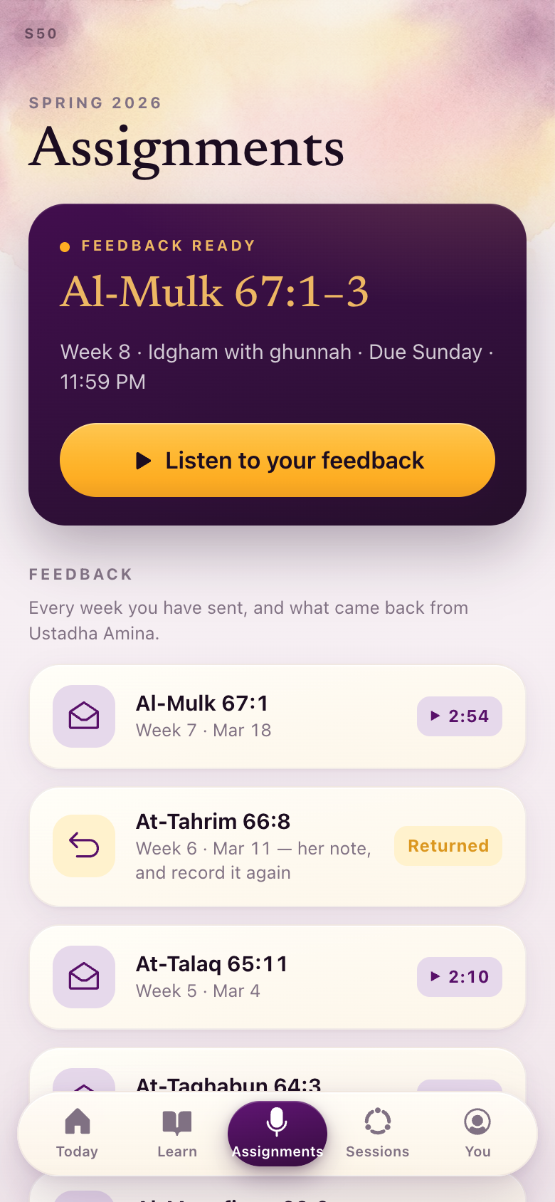
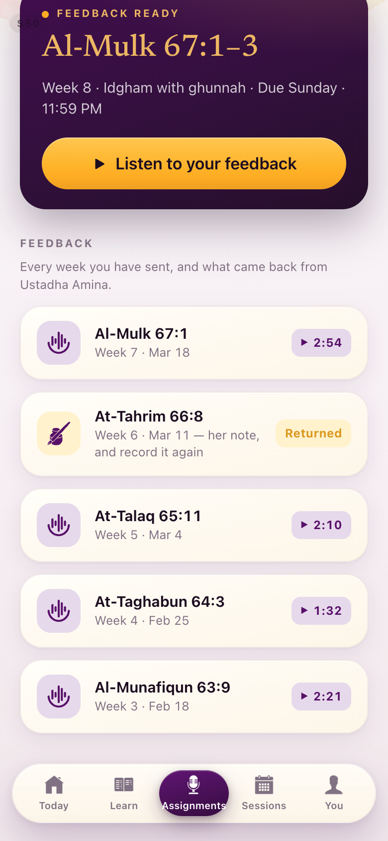
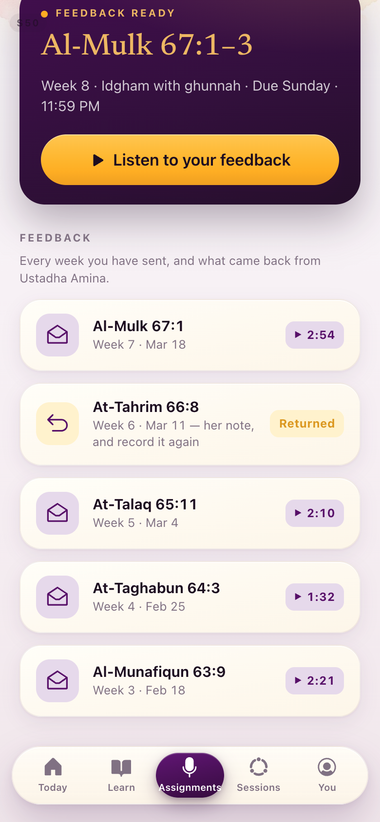
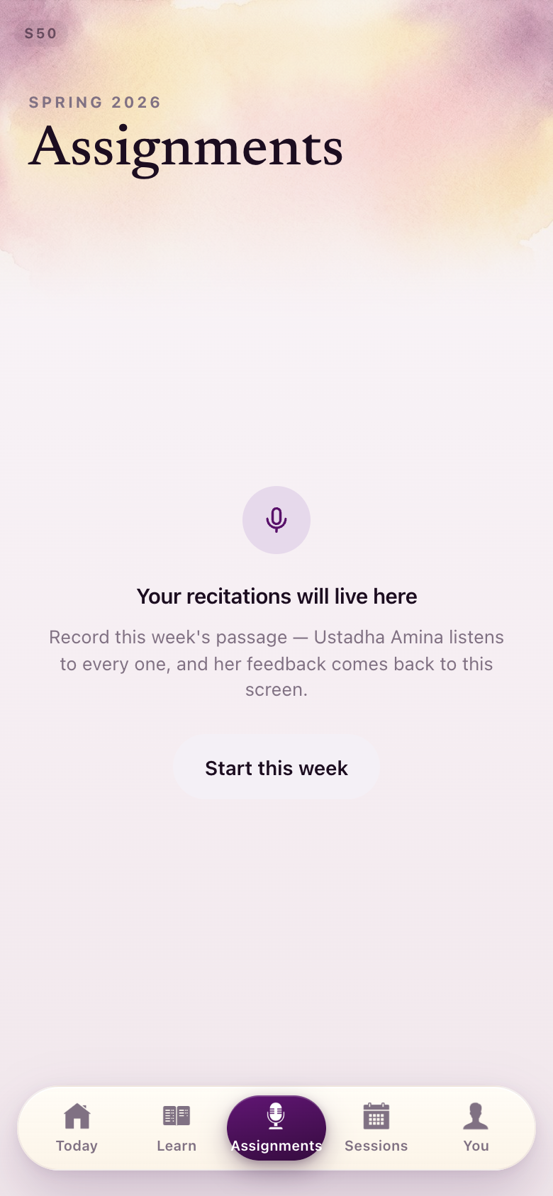
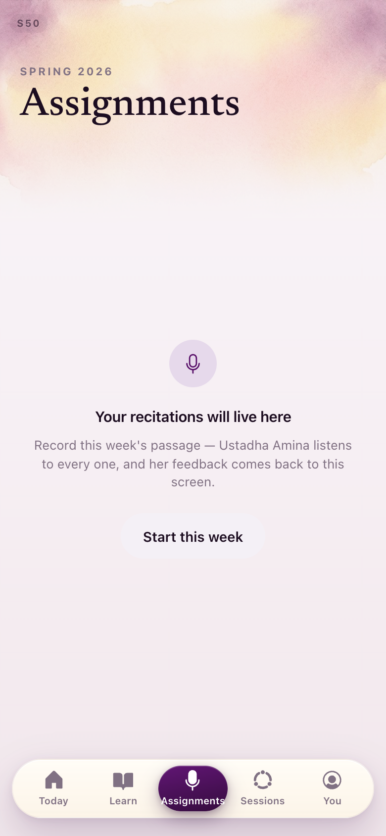
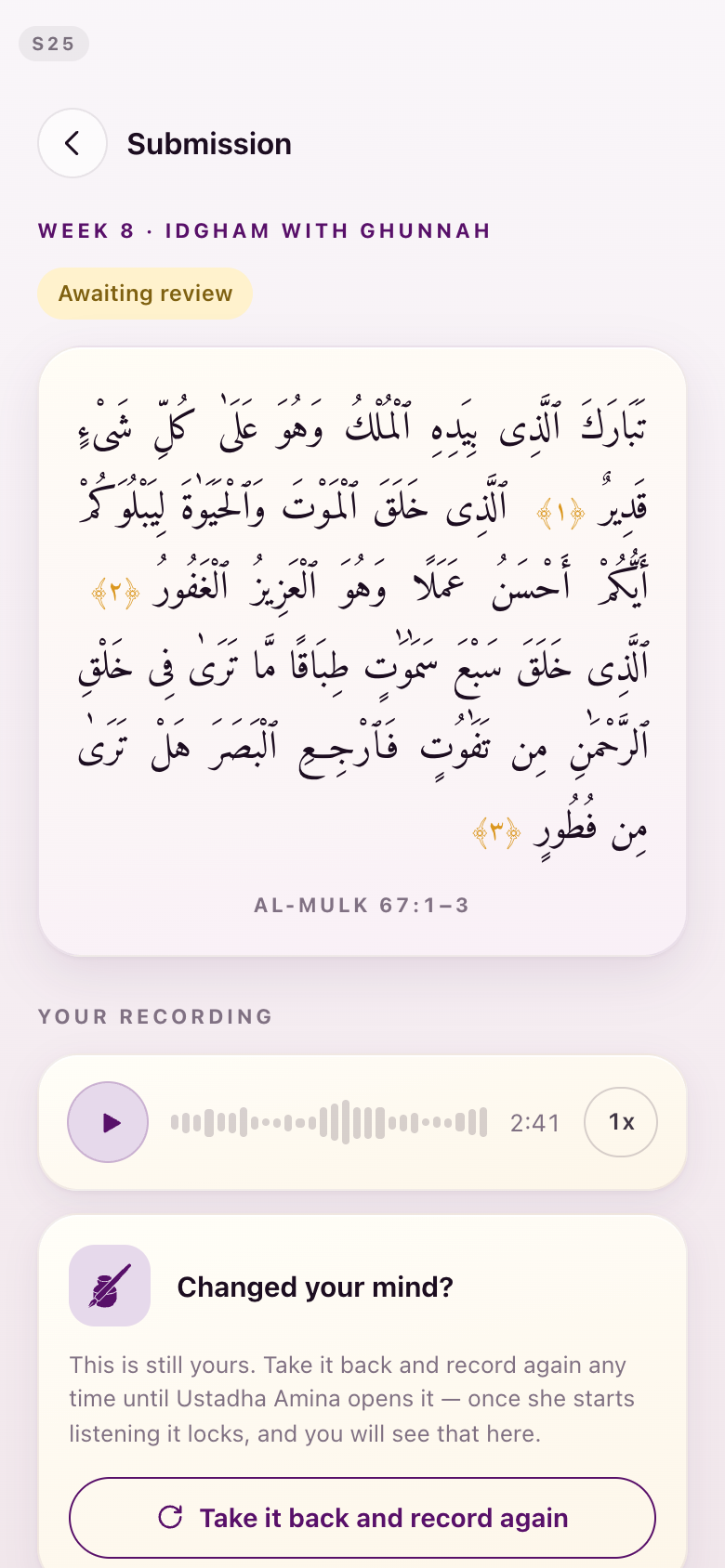
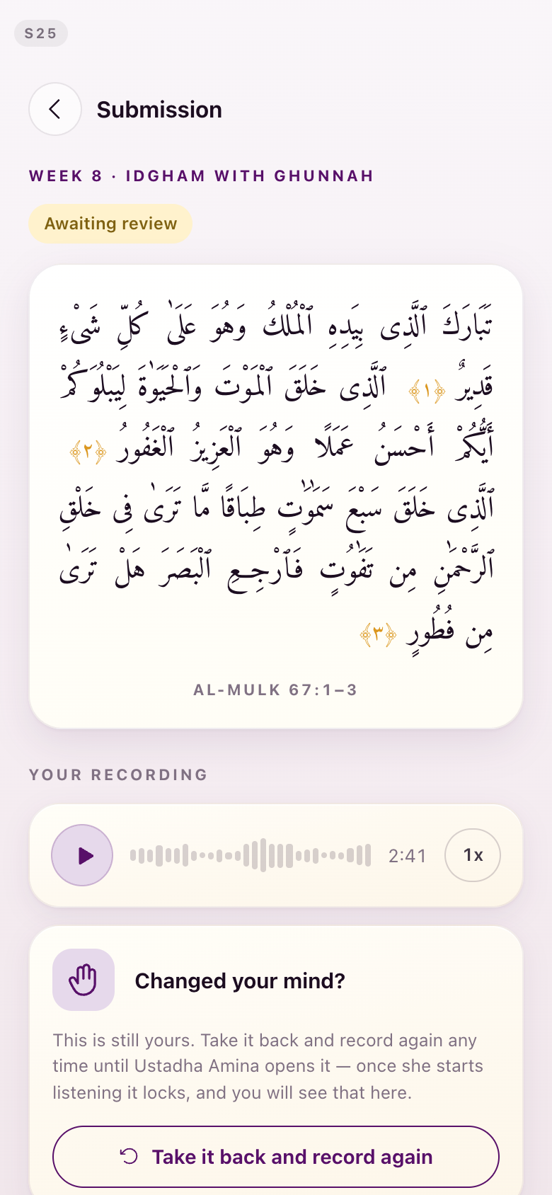
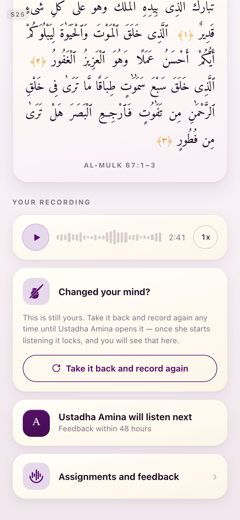
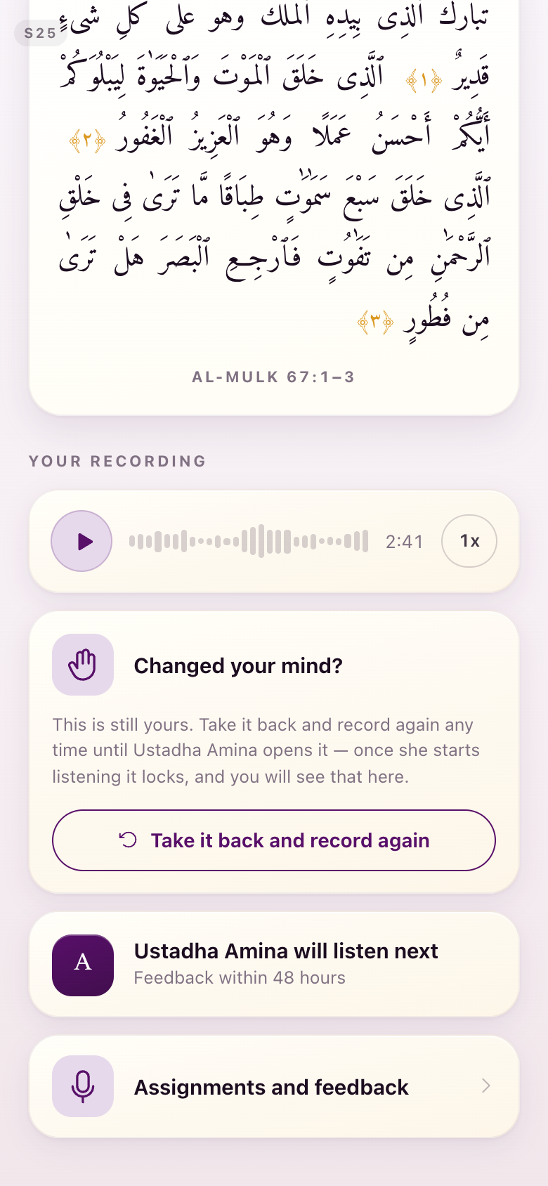
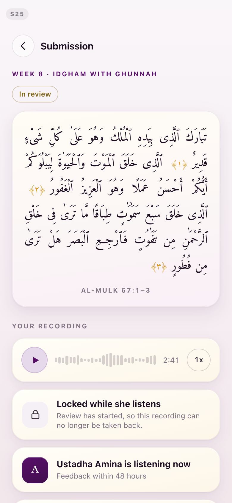
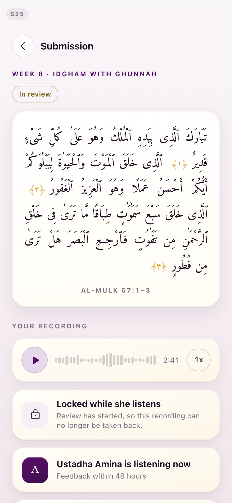
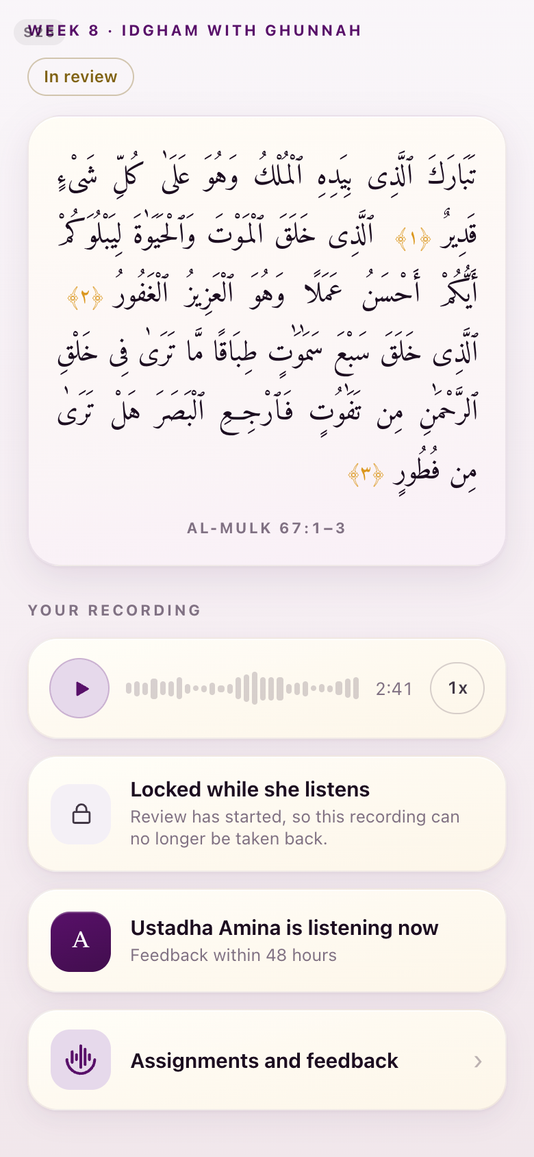
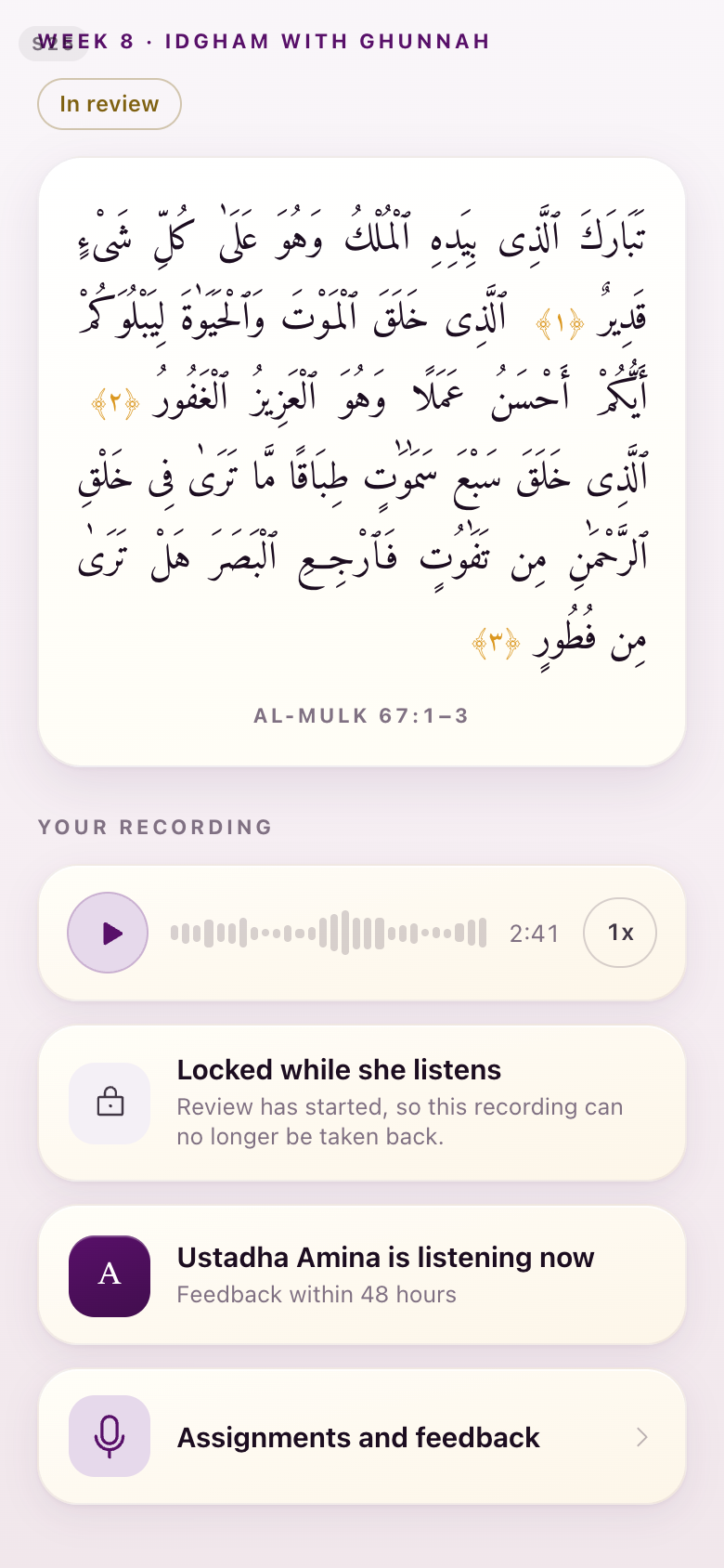
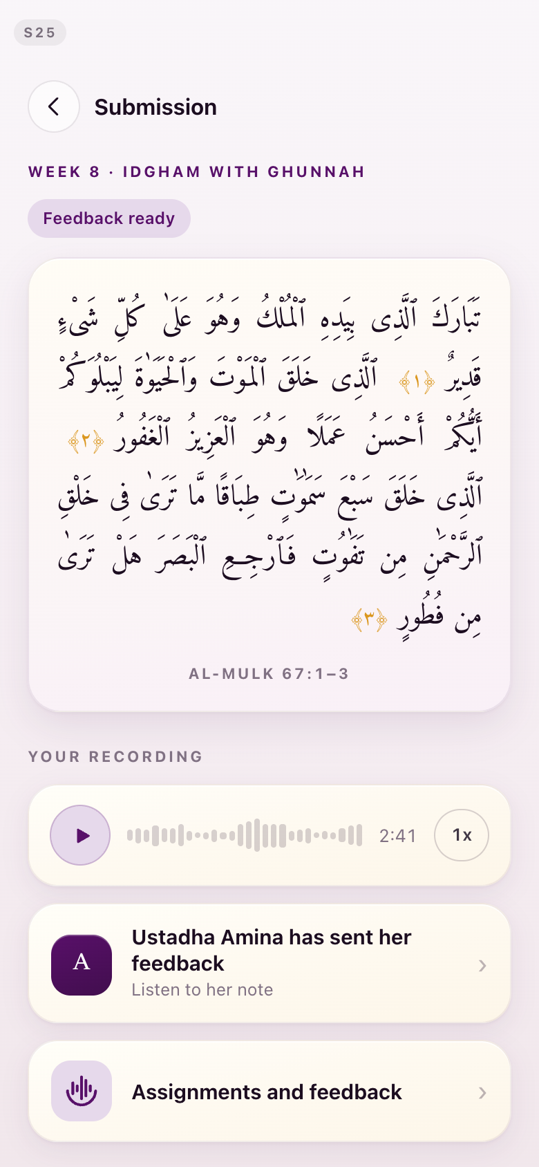
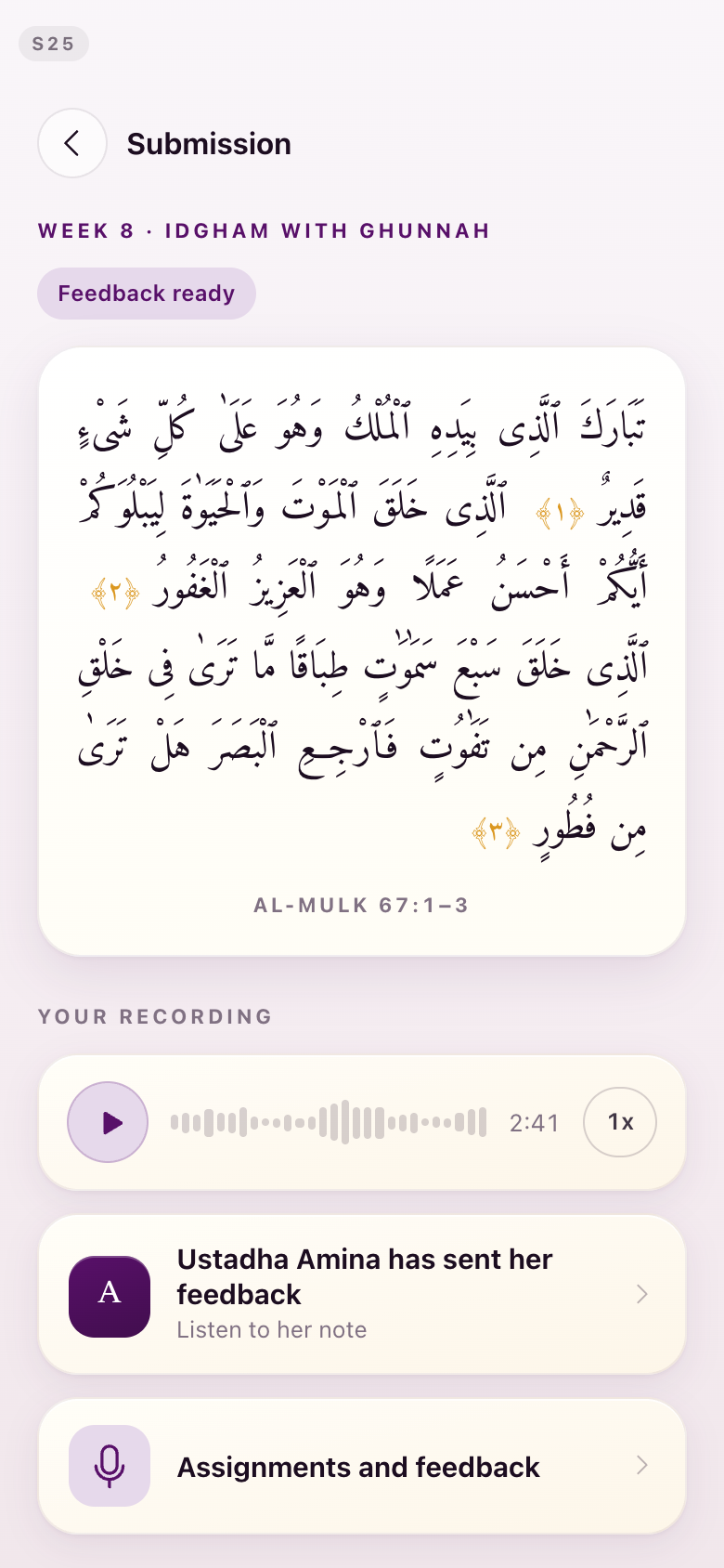
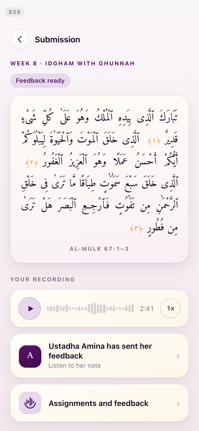
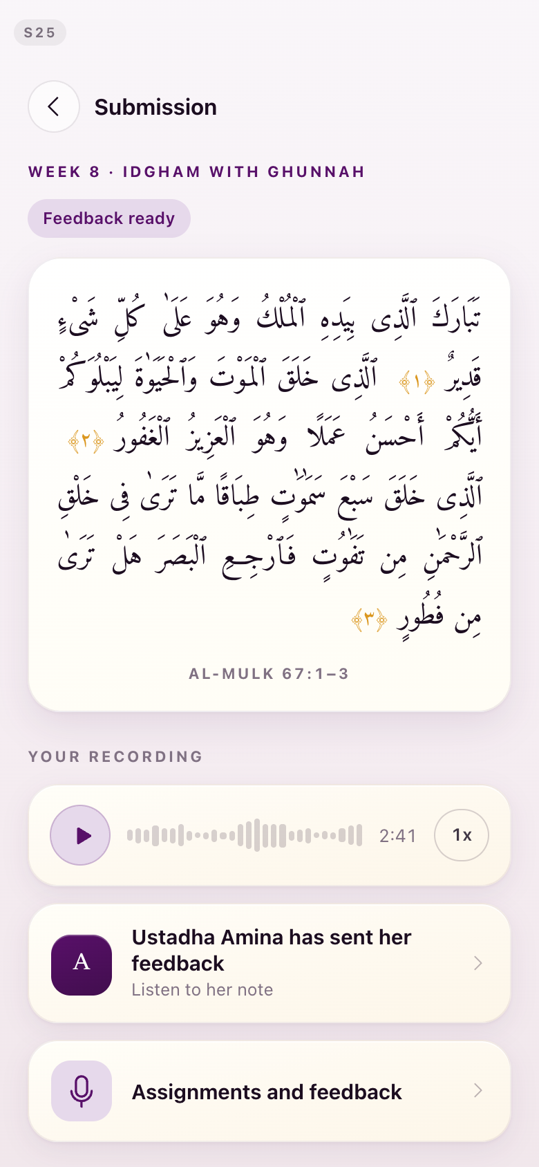
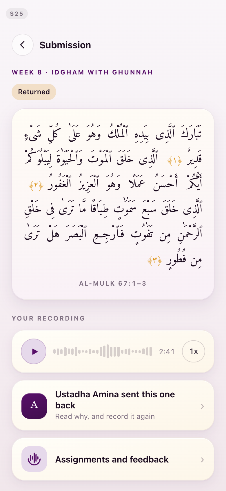
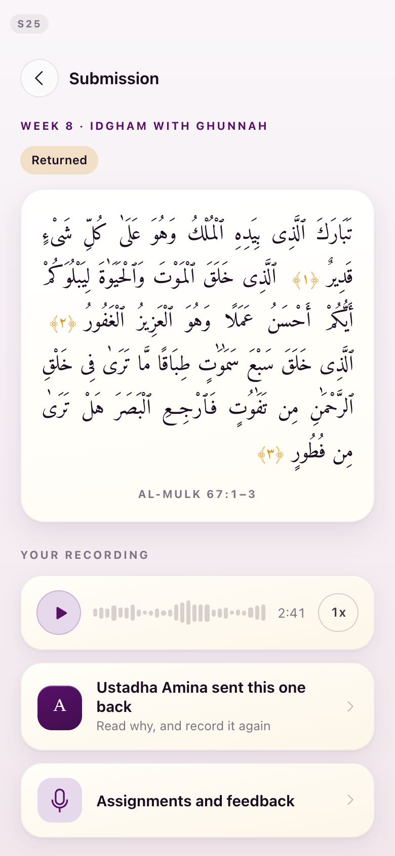
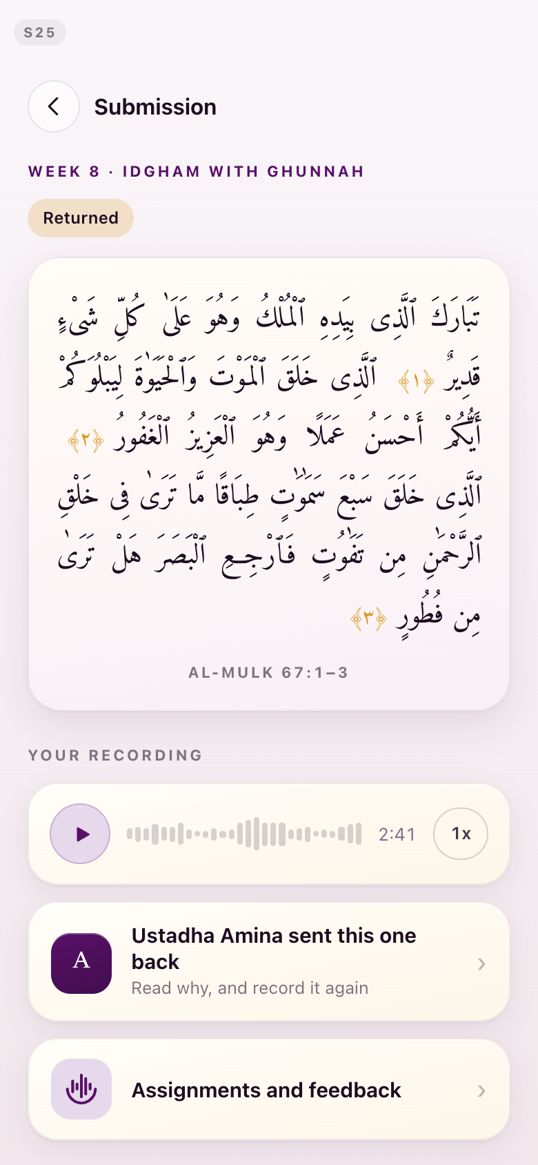
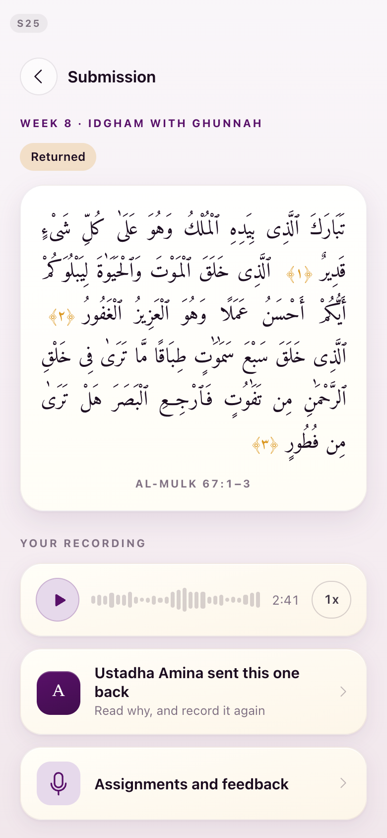
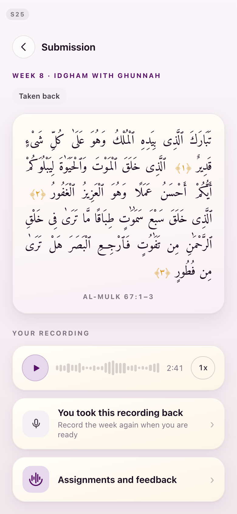
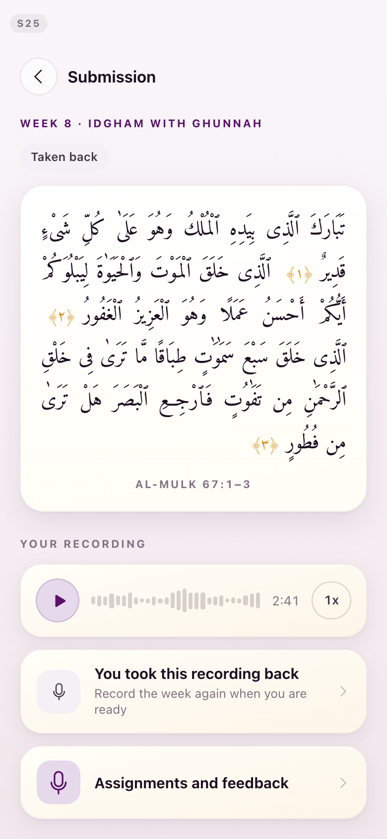
The five states already had names — awaiting review, in review, feedback ready, returned, taken back. Each now has its own icon on the row, drawn from the same library as everything else: an hourglass, headphones, an open envelope, a u-turn arrow, an open hand.
The status wording stays as text in the pill beside it. The icon does not replace the words, it gives you something to scan for before you read them. The detailed pen-and-ink mark that made "returned" unreadable — the one drawing with far more detail than anything around it — is gone.
S50Assignments
Everything you have ever sent, each row wearing its state. The returned row is the u-turn arrow; the two with feedback waiting are open envelopes.
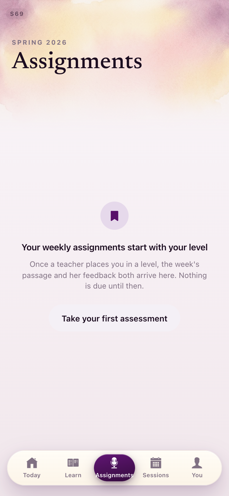
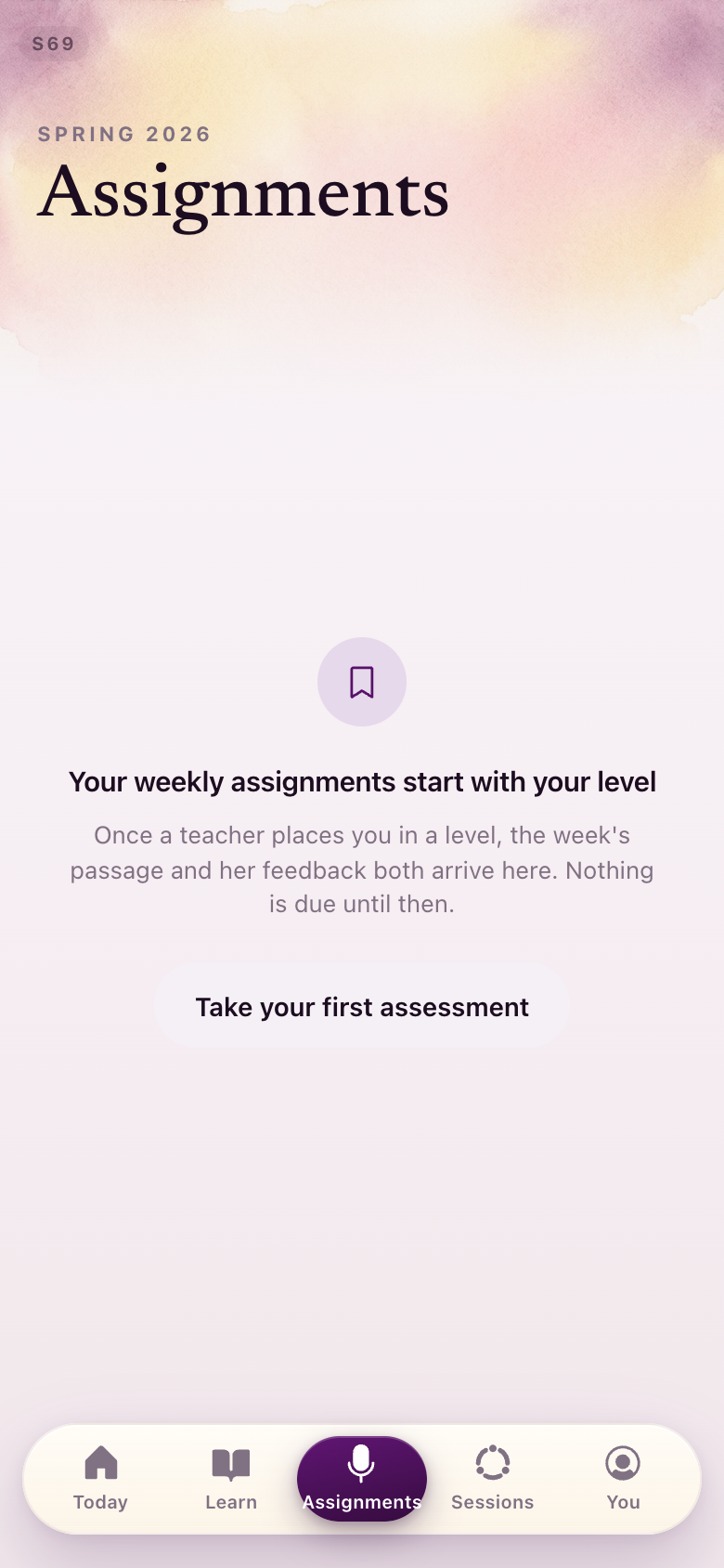
S50 · S69Assignments, before anything is sent
The empty tab, and the tab as a Level 0 student sees it.
S25A submission, in each of its states
The same screen five times: awaiting review, in review, feedback ready, returned, and taken back.
Section 3Straight-line geometry
The flowers are just not giving... If we're leaning into the geometry, just go for full-on geometry. I really like the geometric patterns, I wouldn't mind that being incorporated.Lejla, August 28
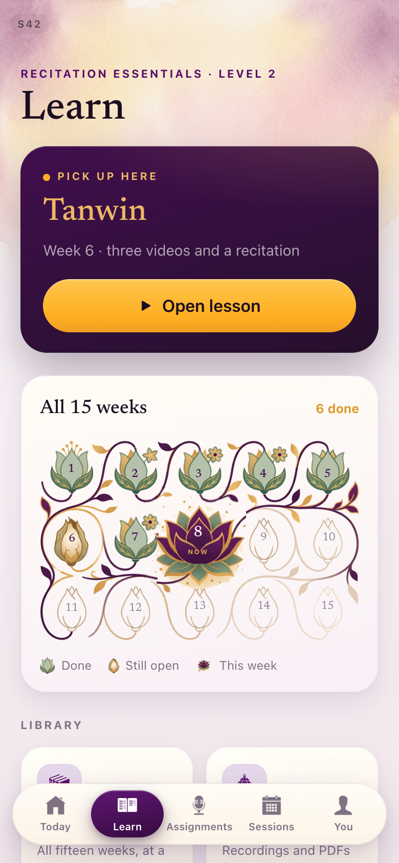
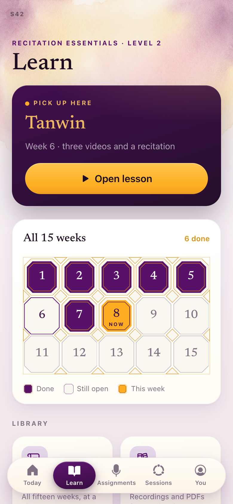
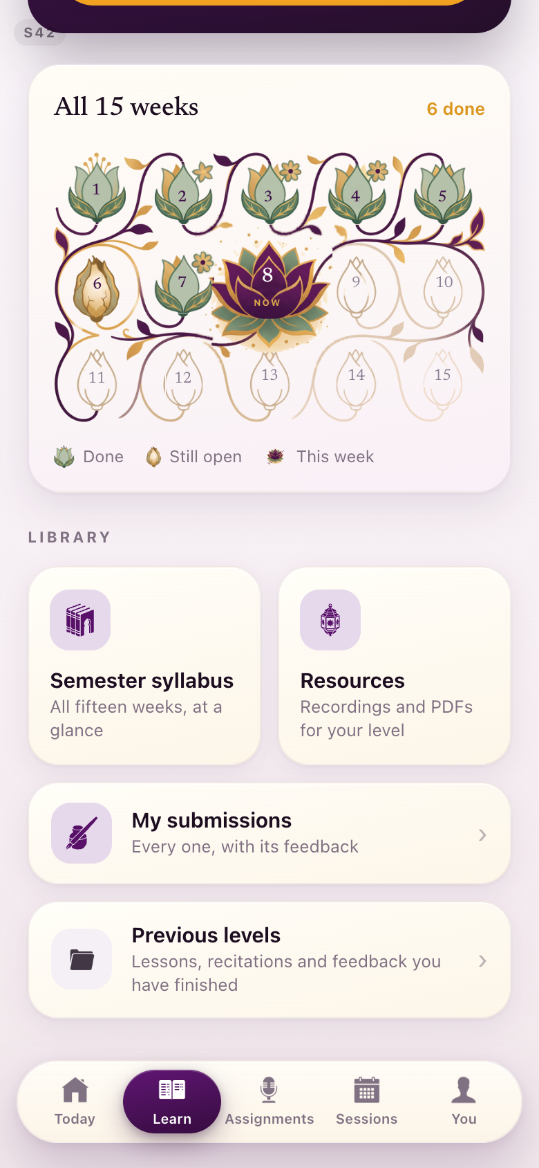
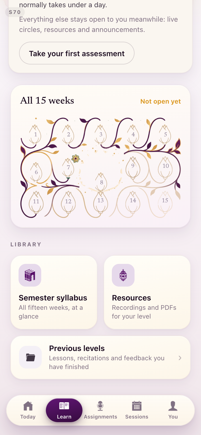
The floral register is retired and its eighteen painted image files are deleted from the build. What replaces it is not a pattern printed behind the numbers — it is a panel the student fills.
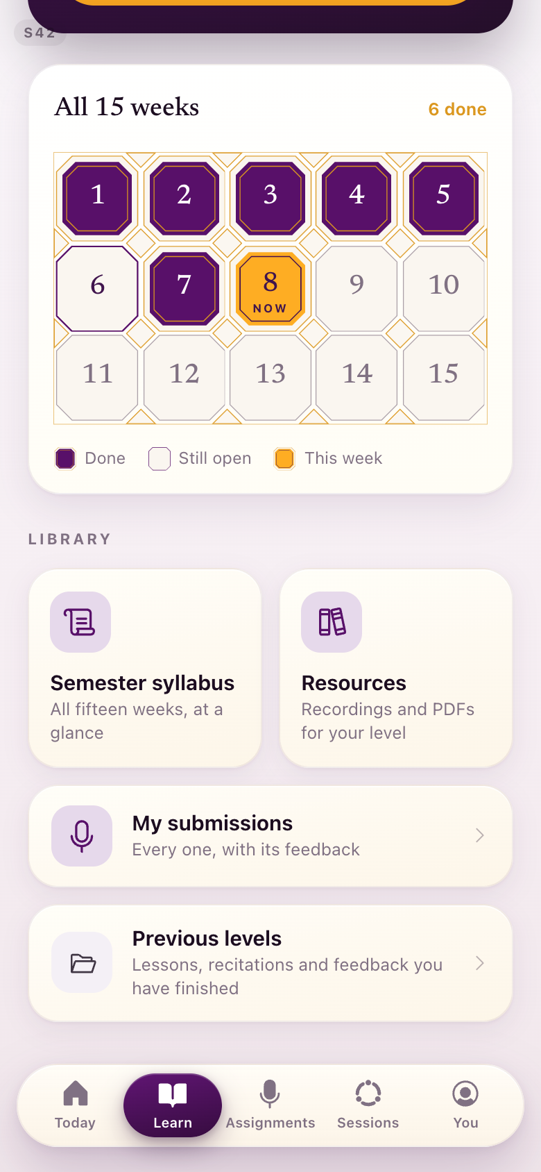
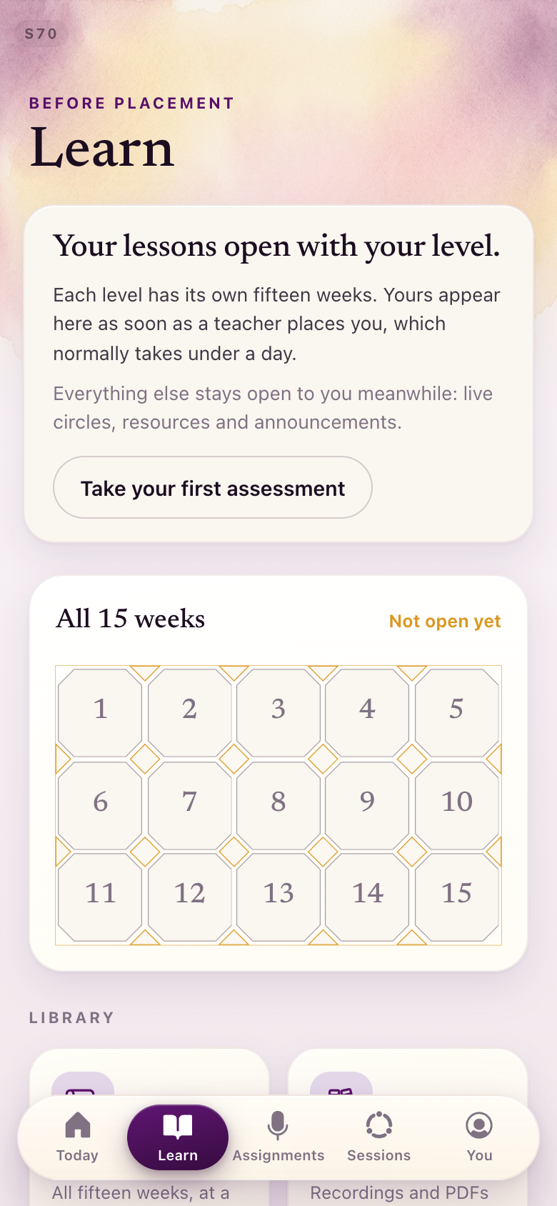
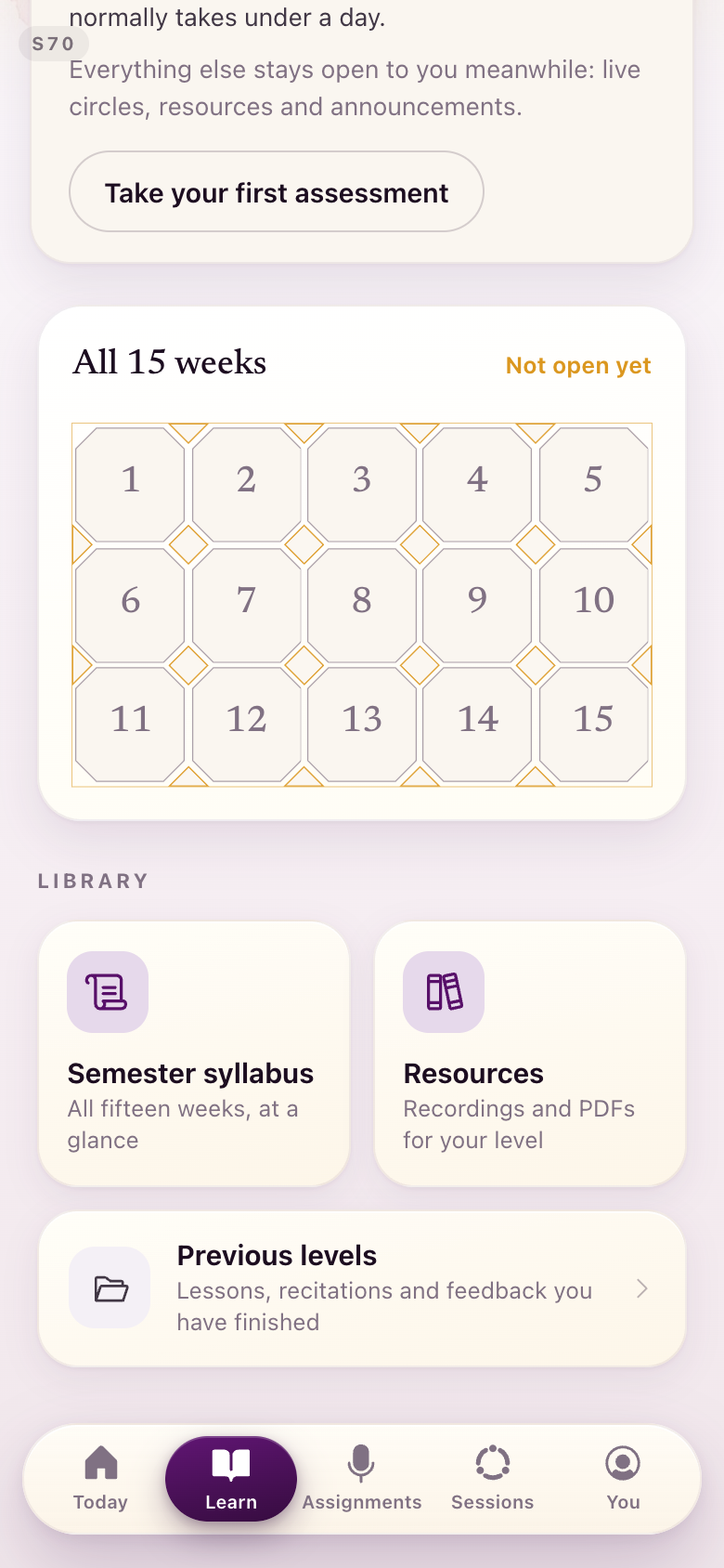
The fifteen weeks are now one octagon-and-square tessellation with a seat for each week. A finished week is a plum stone set into its seat, the week you are in is the one gold stone, and the small square tiles between the seats gild in as their neighbours complete. The numerals stay live text over the geometry, so the grid is still readable as weeks.
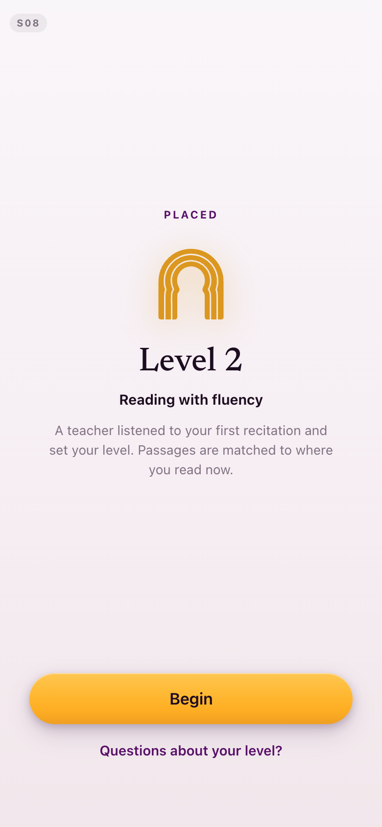
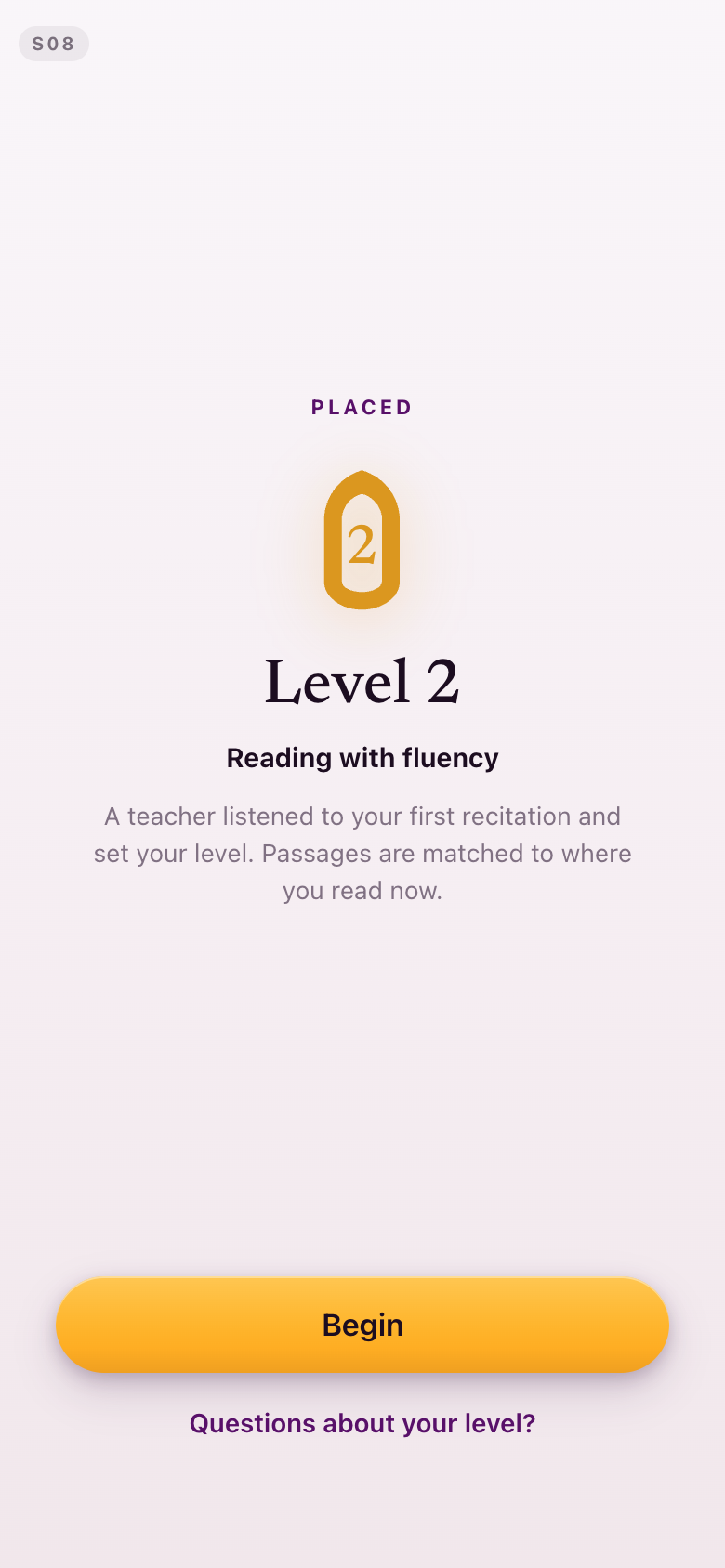
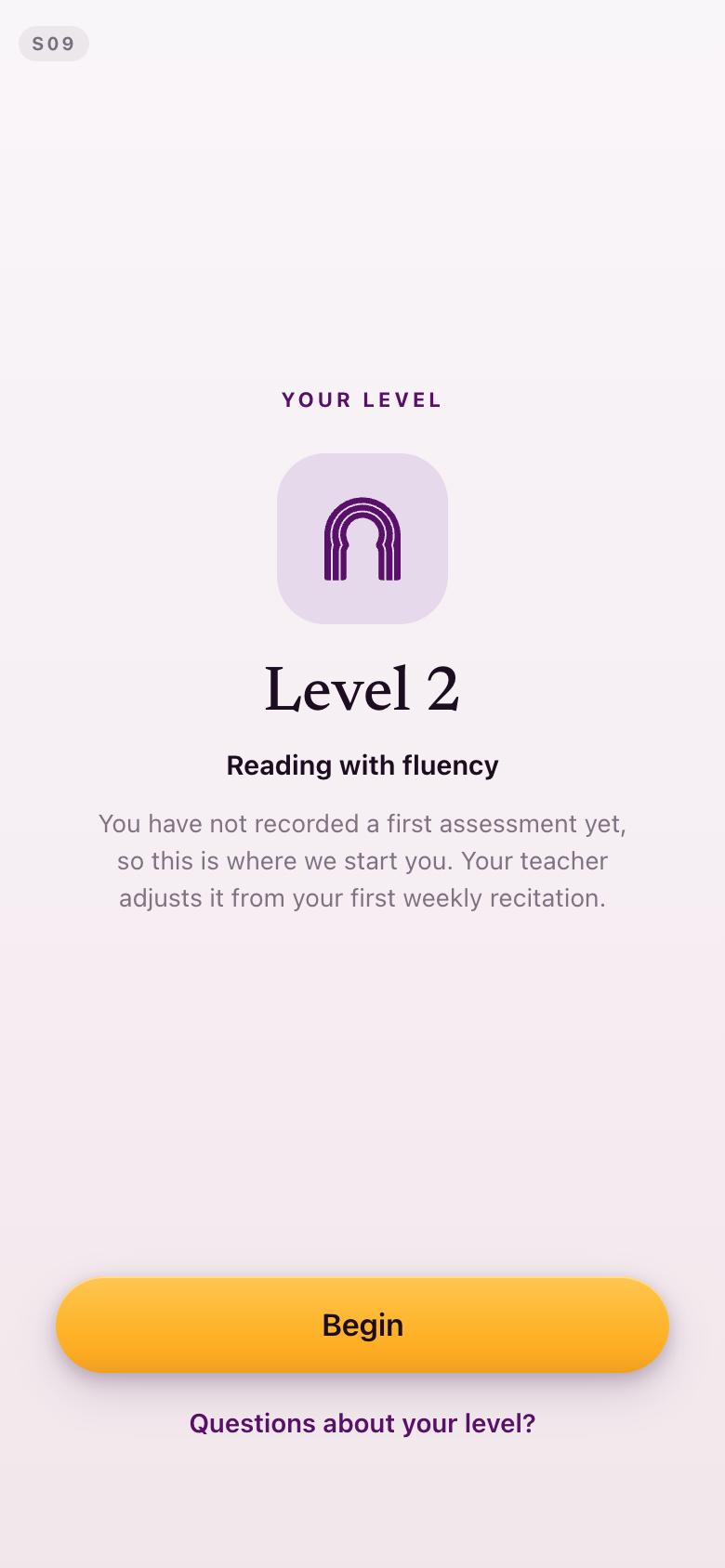
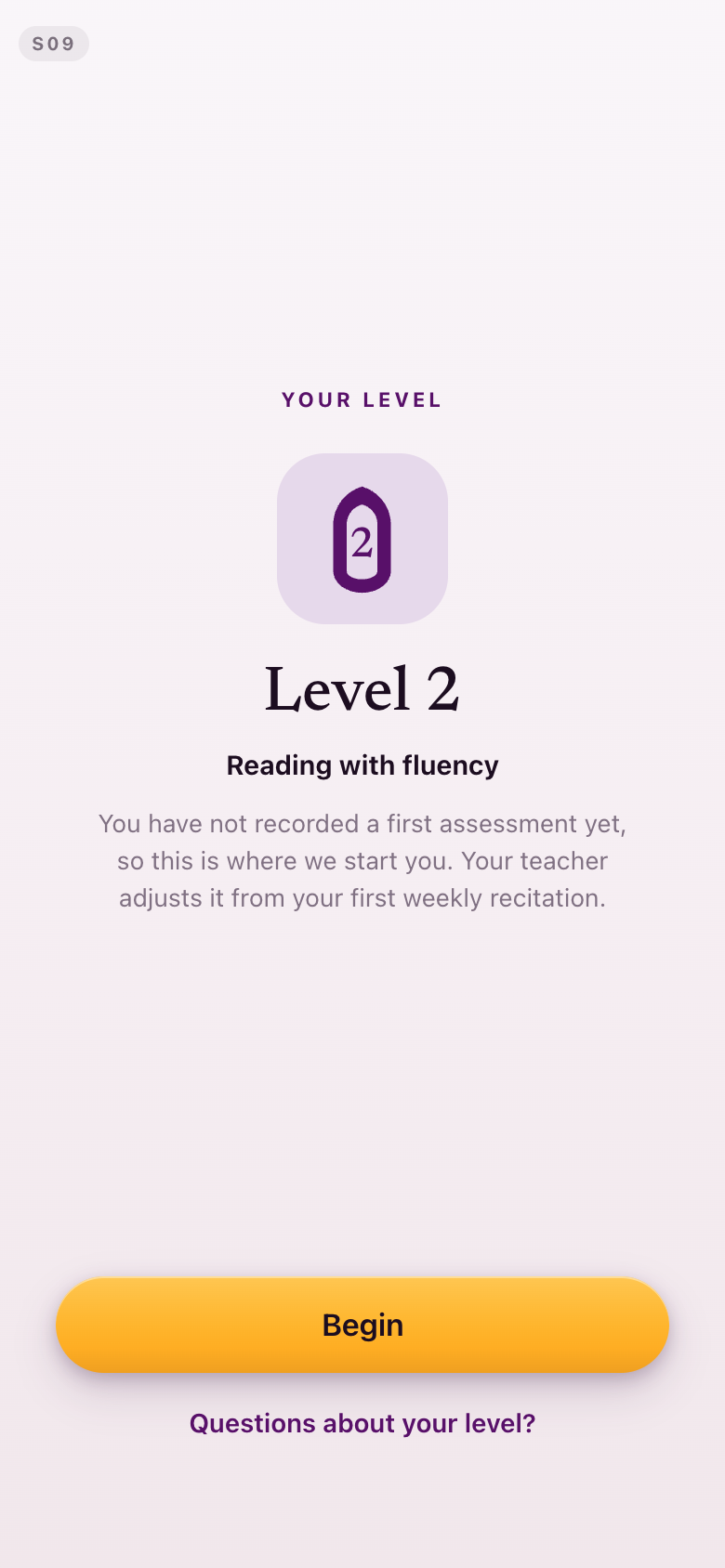
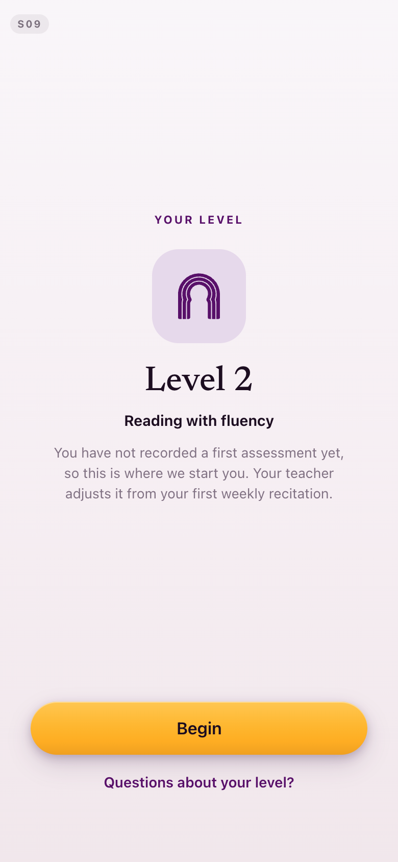
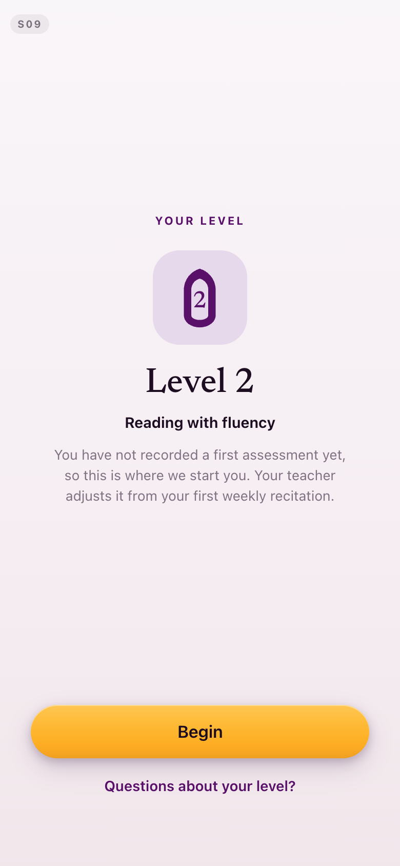
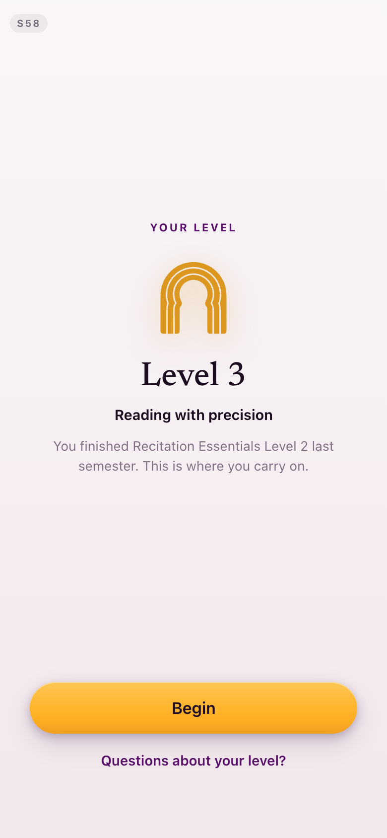
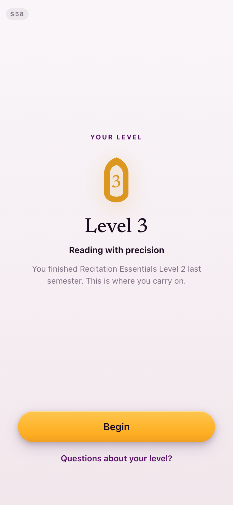
The level mark is the QuranFlow logo's arch carrying the level numeral inside it. It is used only where one specific numbered level is the subject — placement, and the screens that announce a level — and it is never shown empty, because empty at that size it reads as a zero. The traced arch is a placeholder for the brand team's own vector.
Today's corner ornament was cut rather than redrawn: it only ever appeared on the feedback card in the week feedback had just landed, which is not one of the states captured below, and no ornament replaces it.
S42Learn
The garden is gone. Fifteen seats, six of them set, one gold for the week you are in, and the tiles between them gilding as their neighbours close.
S70Learn, before placement
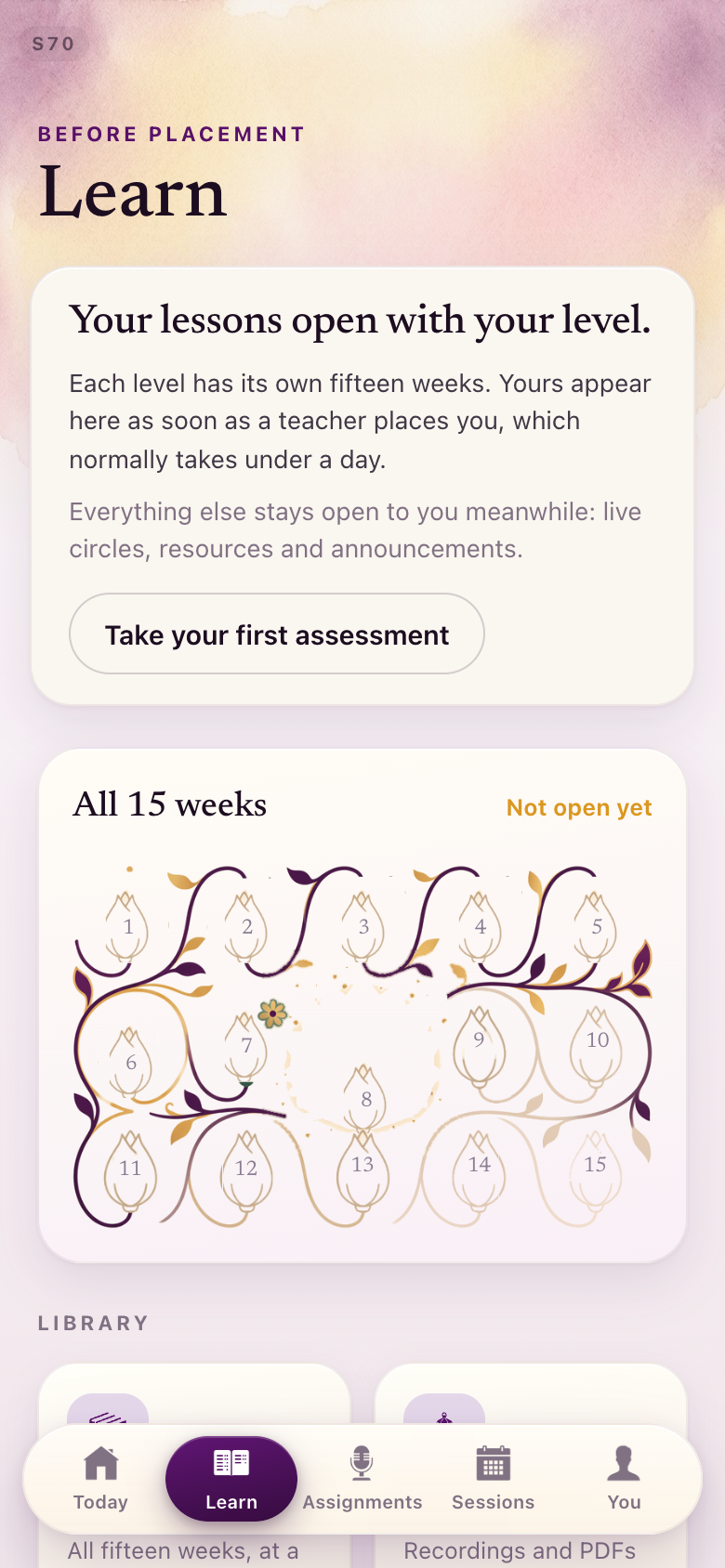
The same panel with nothing earned yet, so the shape of the semester is visible before it starts.
S08 · S09 · S58Placement
The level mark: the QuranFlow arch carrying the numeral. Three arrivals — placed by a teacher, auto-placed at Level 2 after never recording, and a returning student told her level.
Section 4Colour that means one thing
The color scheme is usually gold and white... but sometimes it throws in green and I'm not sure what the rule is... I'm trying to figure out when does it revert to green.Lejla, August 28
Green means completed. That is the whole rule now, and nothing else uses it.
The collision was that reading circles were wearing green as their identity, so green meant "a circle" in one place and "done" in another. The reading circle takes lapis blue instead — its tile wash, its disc, its time tag and its dot in the calendar legend. Live and starting-now went plum, as did an active enrollment. A closed week went muted. After the sweep, exactly one green survives anywhere in the app: the word "Completed" in your learning history, which is the job green keeps. The move also lifted two colour contrast pairings that were failing.
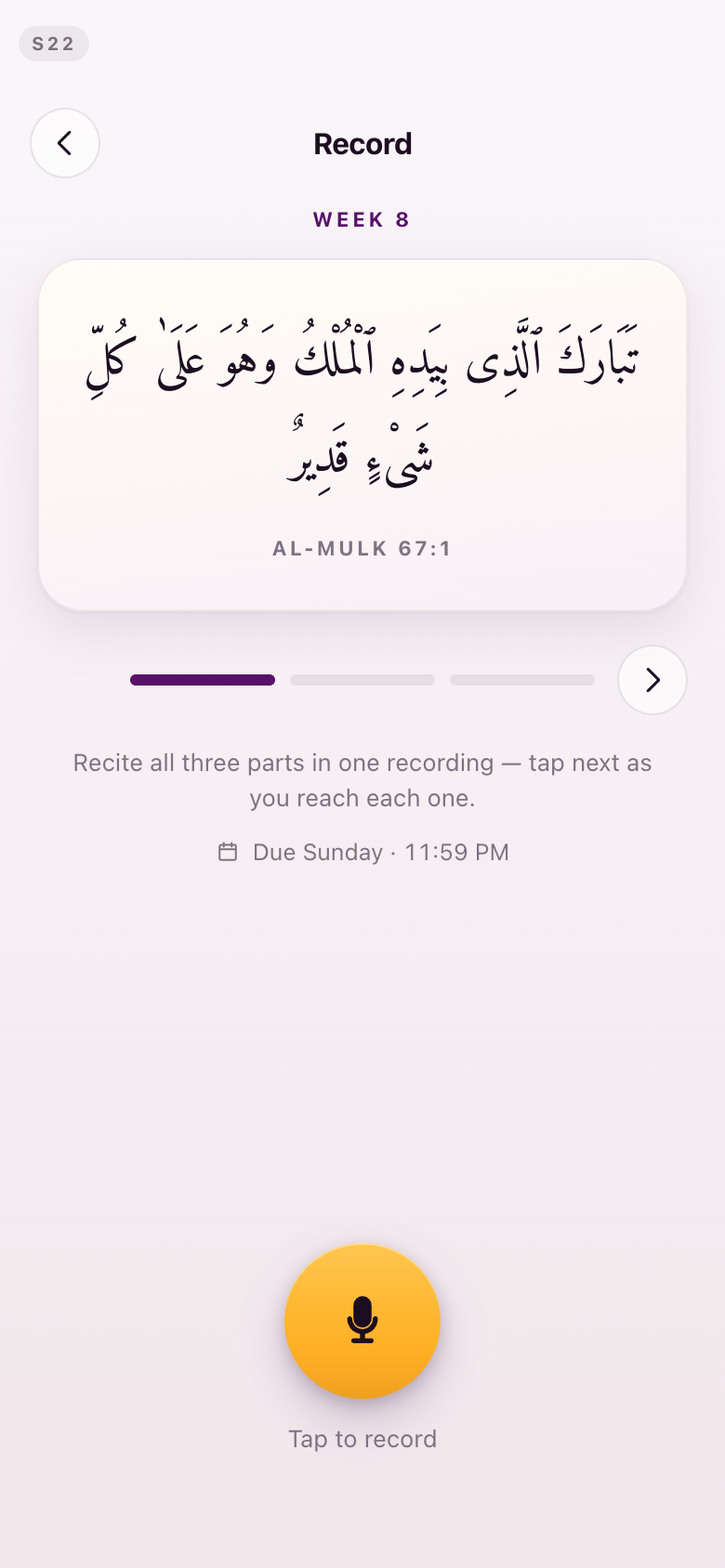
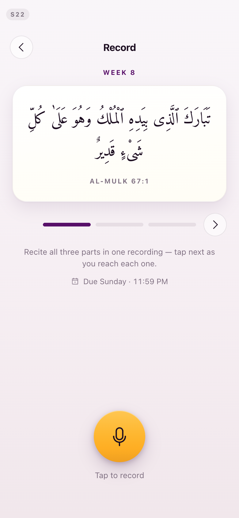
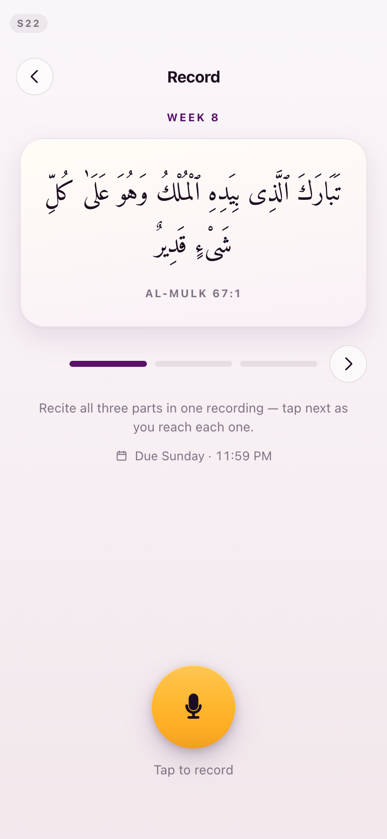
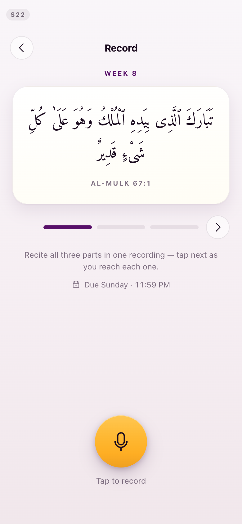
Arabic always ends on white. A passage card now starts on pure white and settles into warm paper at its foot, instead of finishing on a lilac tint. Every passage surface on the record-and-feedback loop was checked in the browser. One exception is on the record: the Lesson screen draws its own passage card and is shared with the older build, so it was left alone and needs its own ruling.
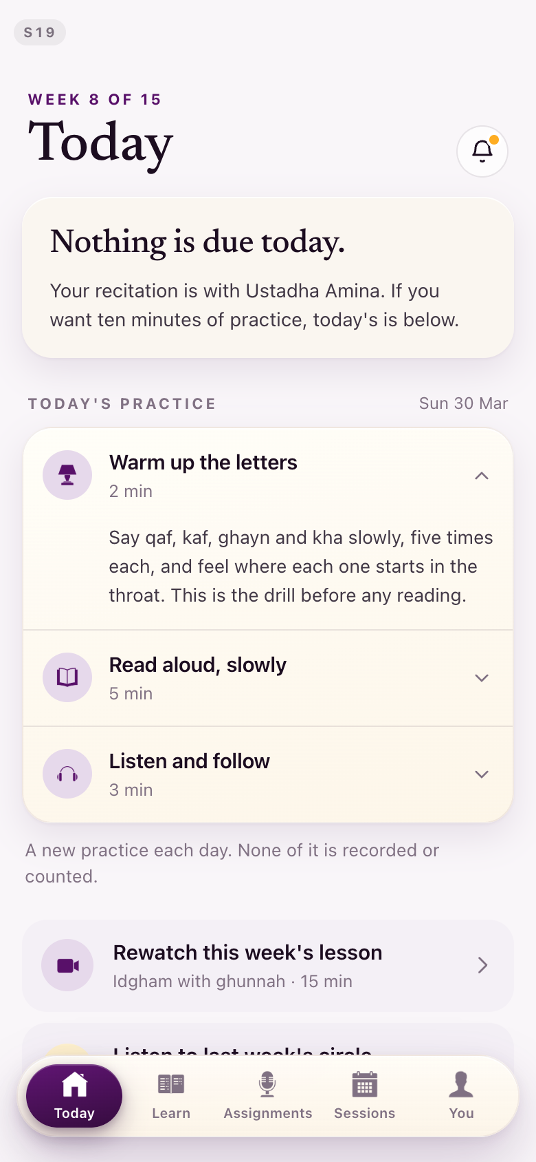
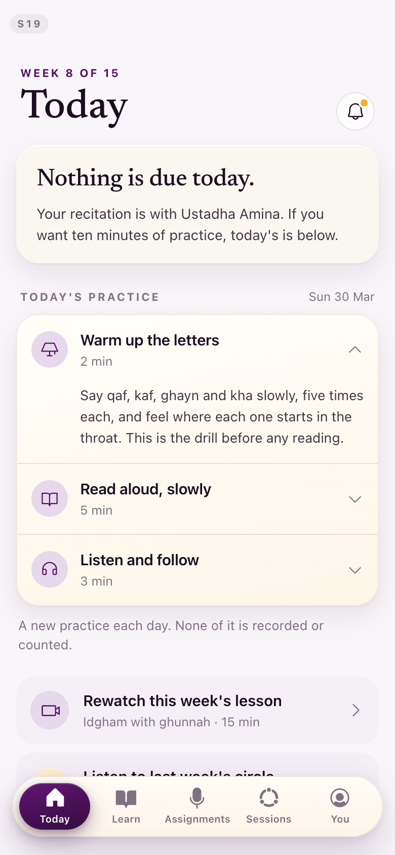
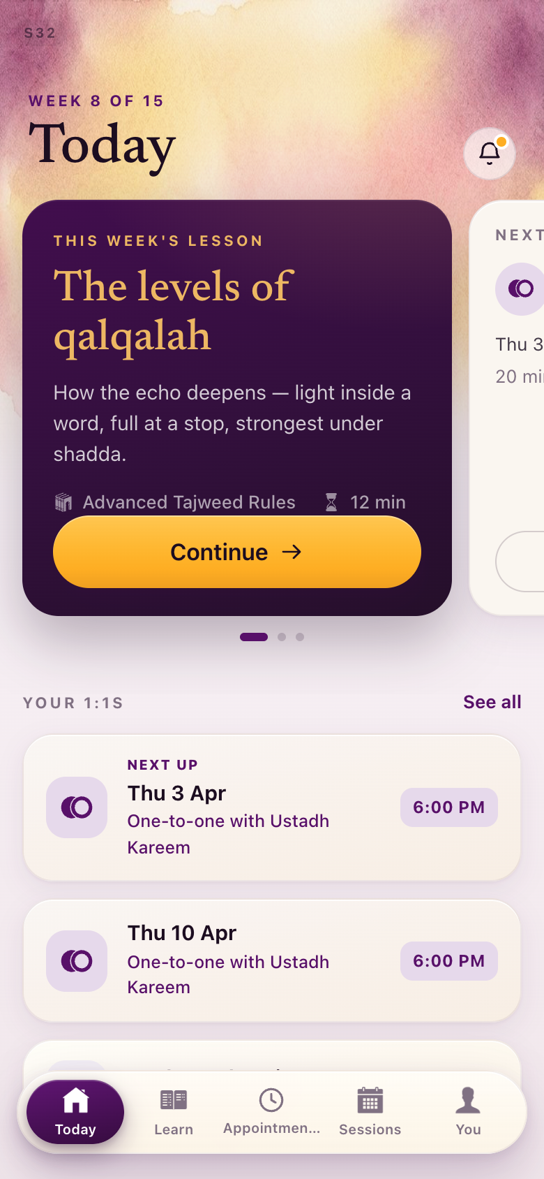
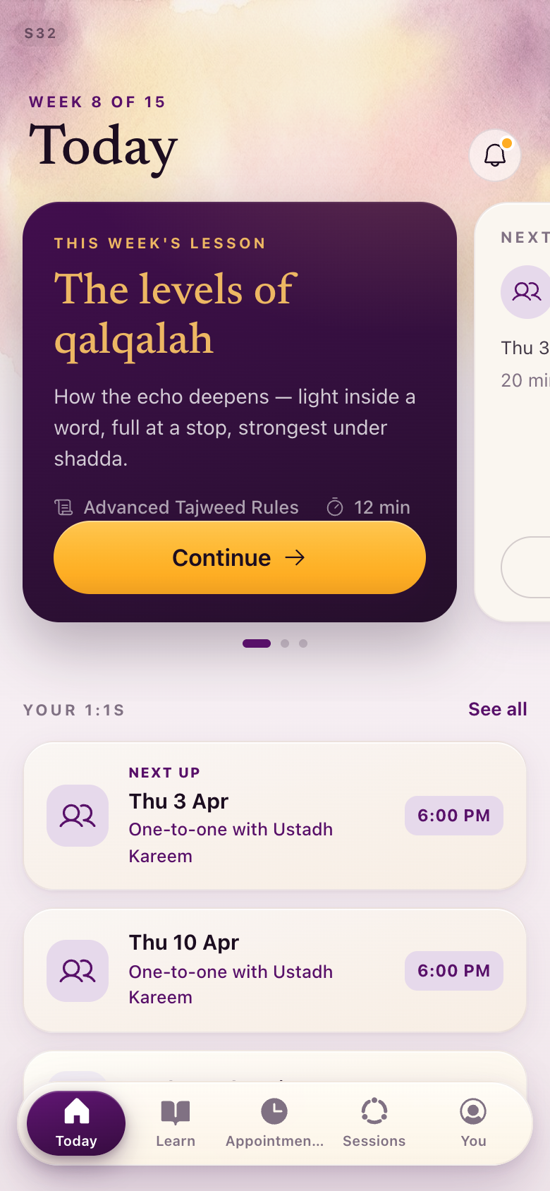
The dawn wash now runs at one muted strength on every root screen, the same quiet one the You, Sessions and Learn screens were already using, rather than shifting with the state of the week.
S22The recorder
The clearest read on the white rule. The passage card used to finish on a lilac tint under the last line; it now starts on pure white and settles into warm paper. The microphone is unchanged: it was already the one the rest of the product borrows.
S19Today, a rest day
The wash at the one muted strength, on the day with nothing to chase.
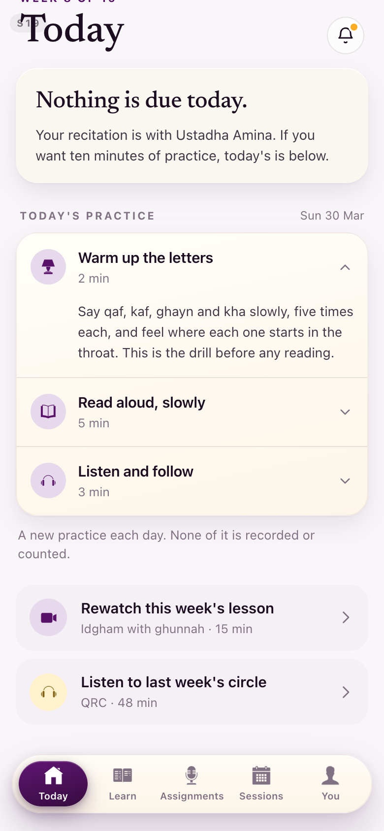
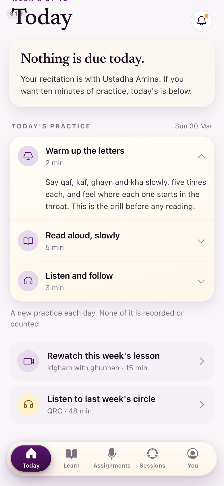
S32Year 2 Today
The same ground on the Year 2 home, where appointments sit where submissions were.
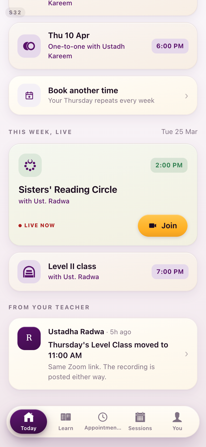
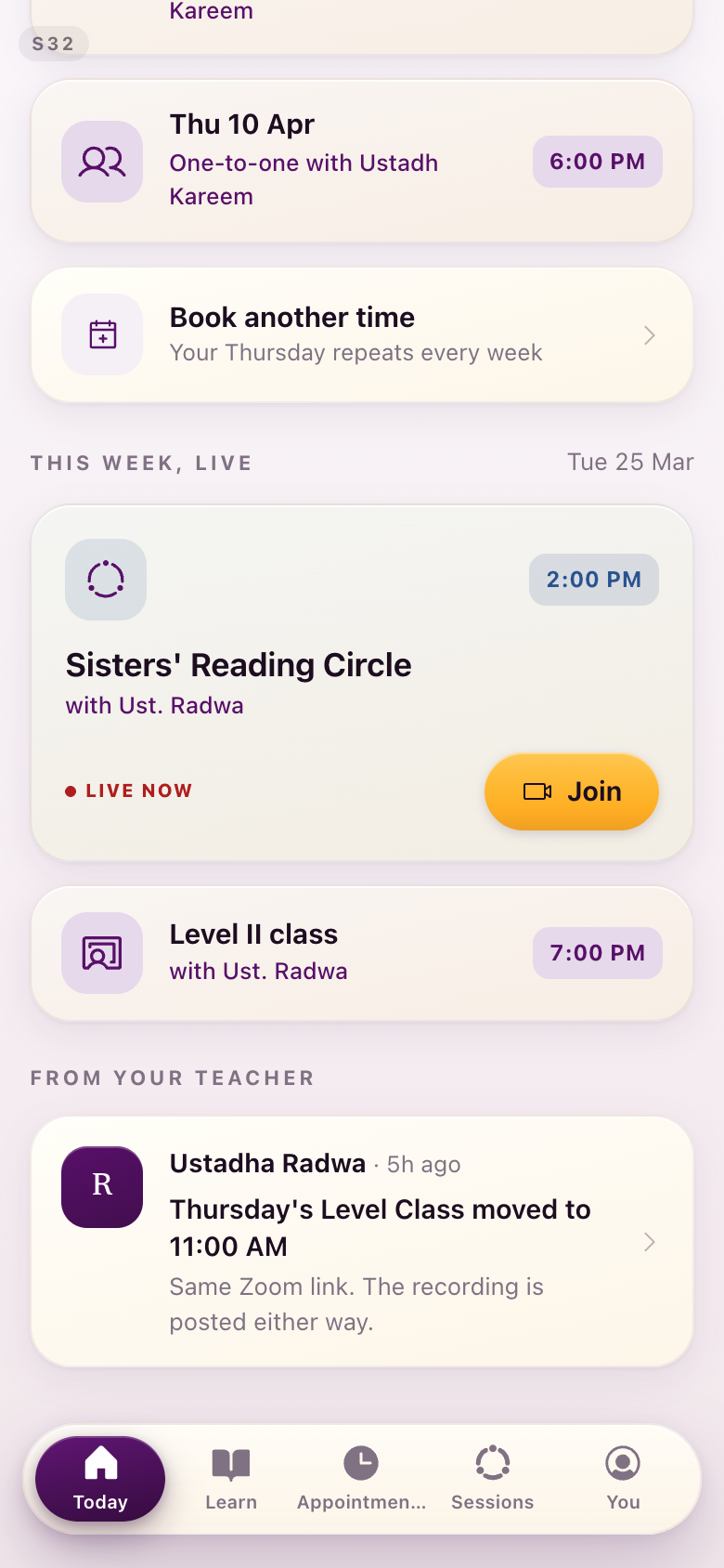
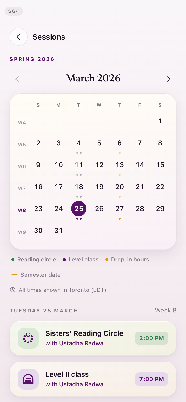
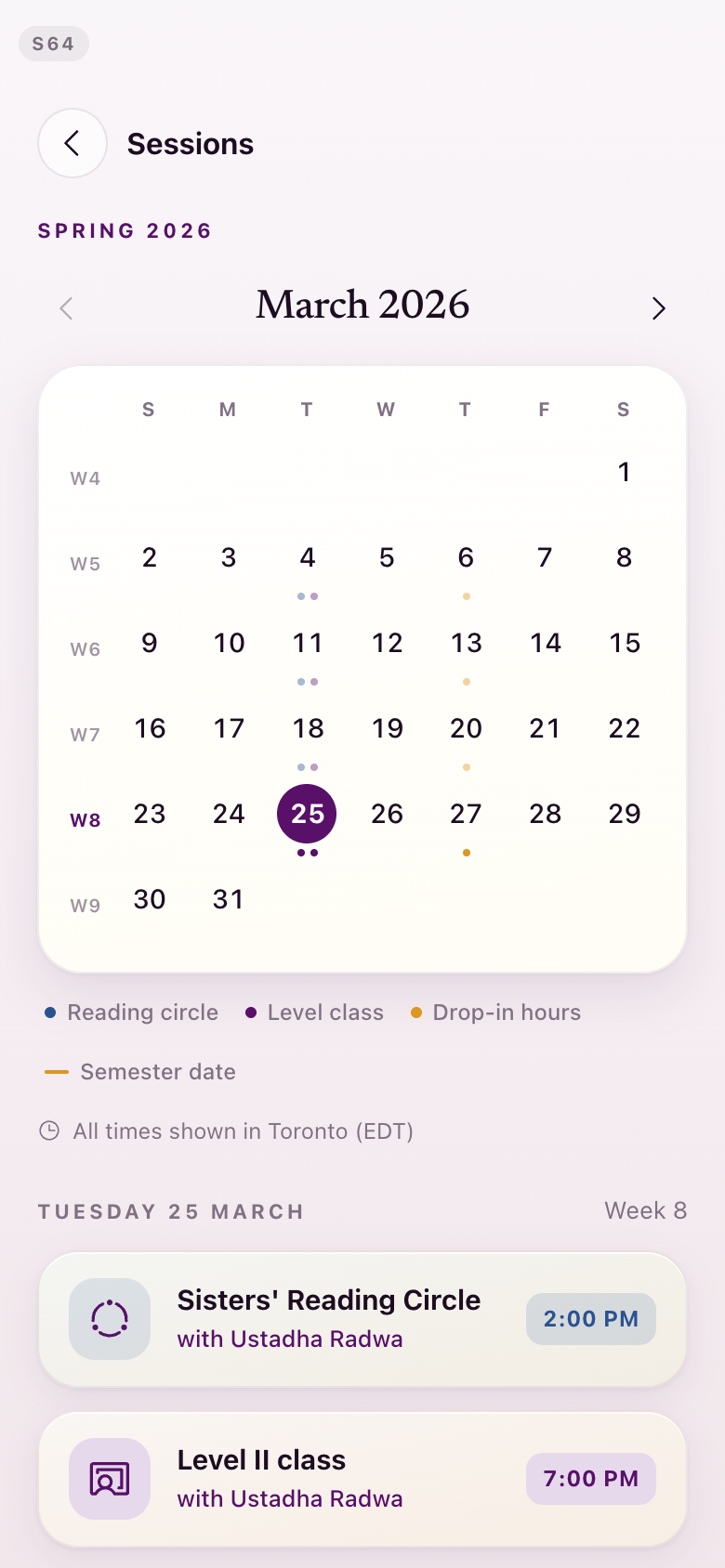
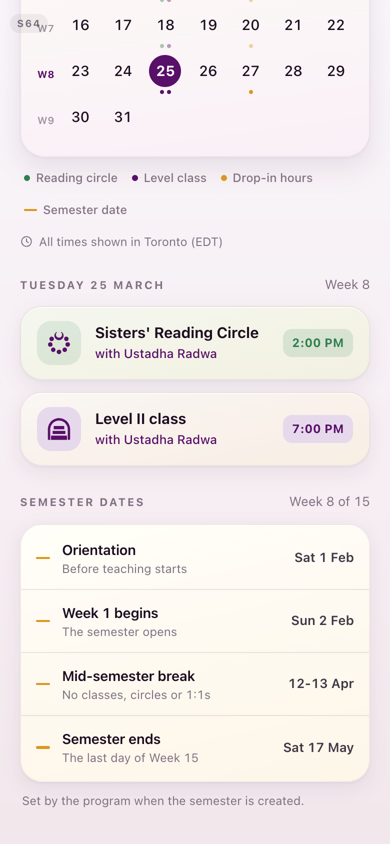
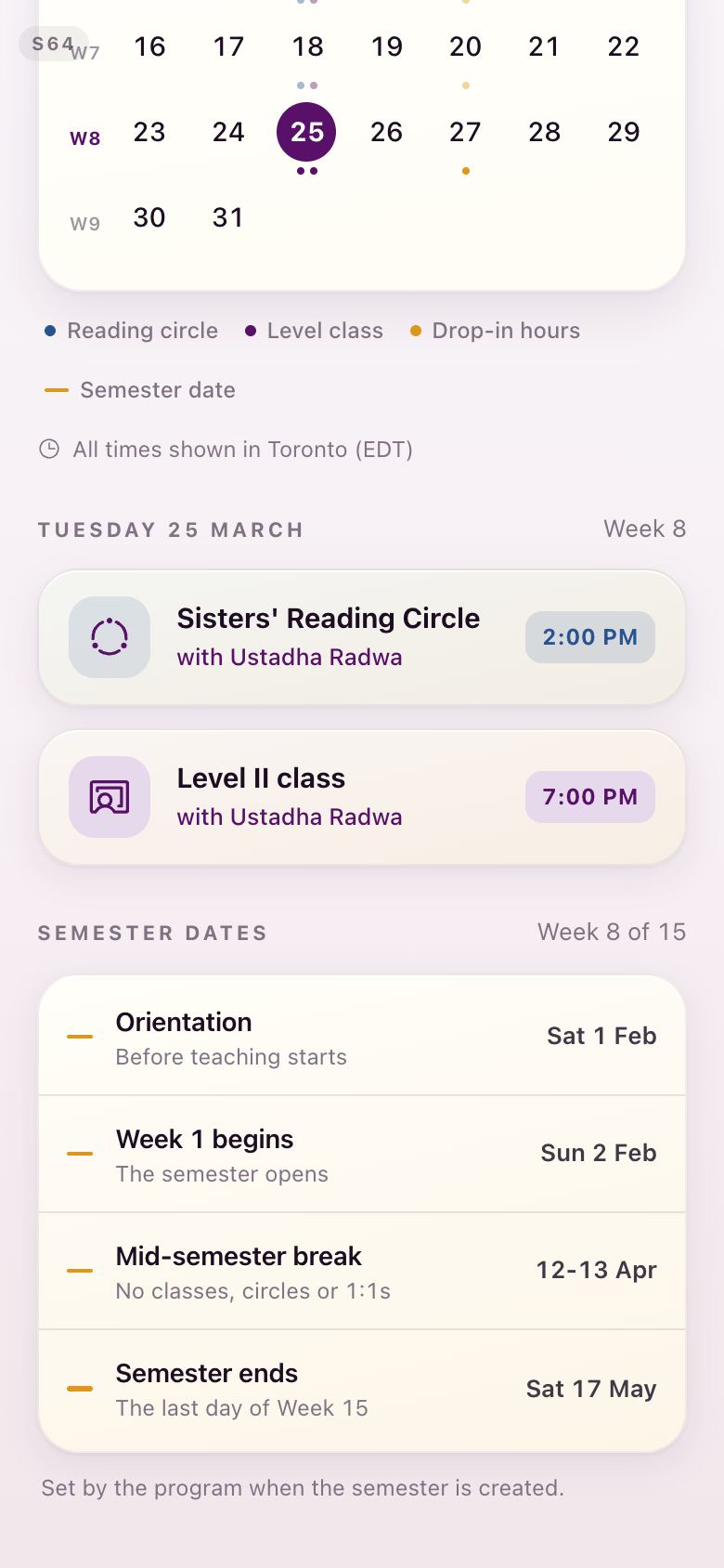
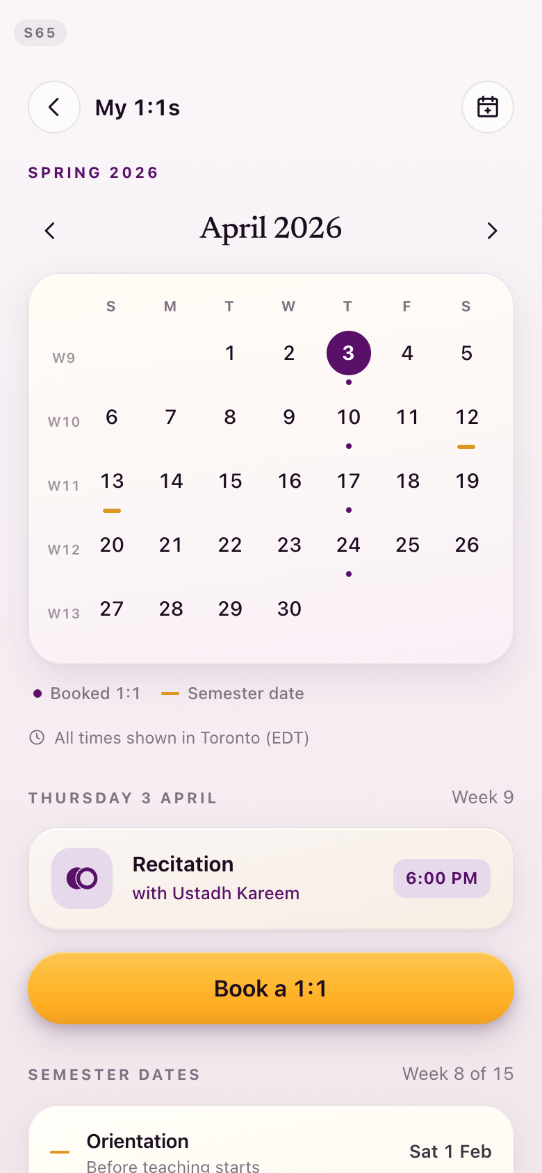
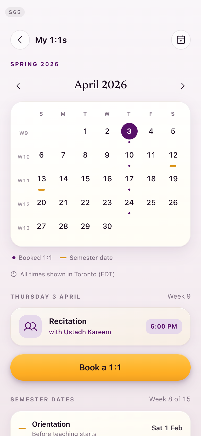
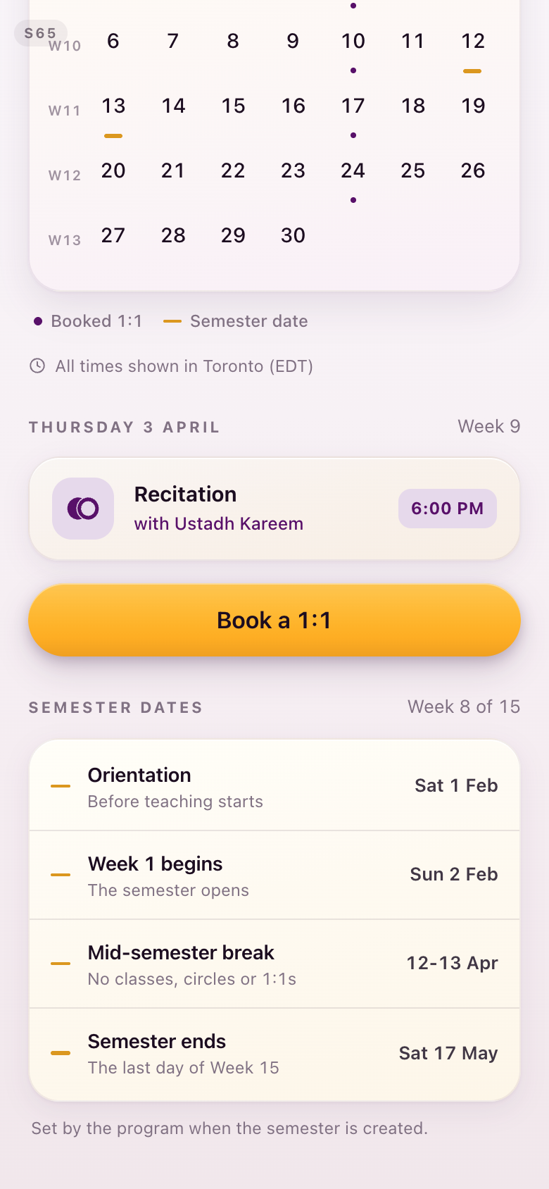
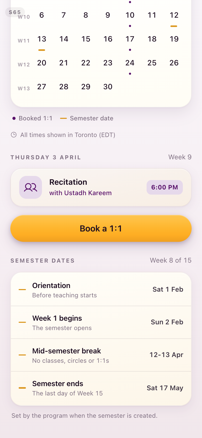
S64 · S65The month
The legend is the clearest read on the colour rule: the reading-circle dot moves from green to lapis, on both the live month and the appointments month.
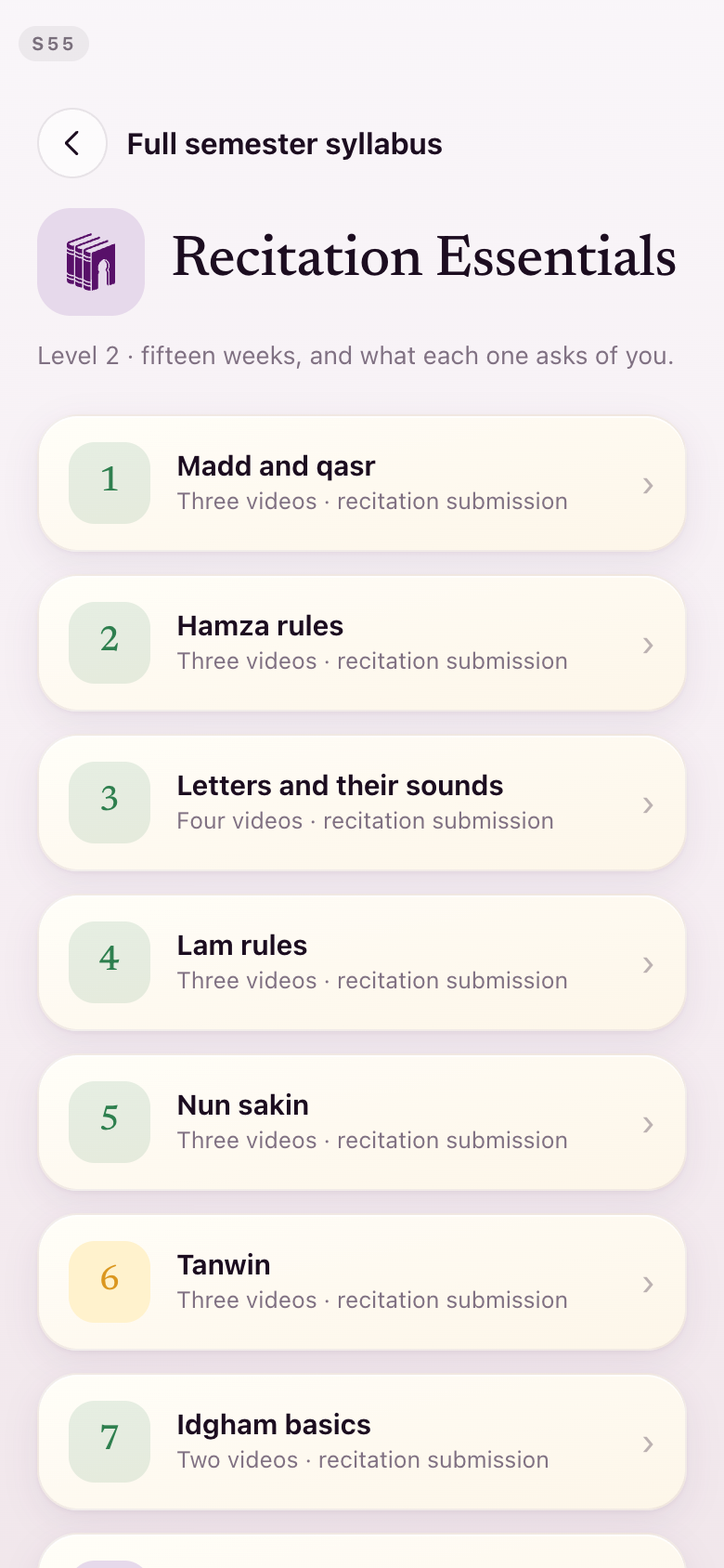
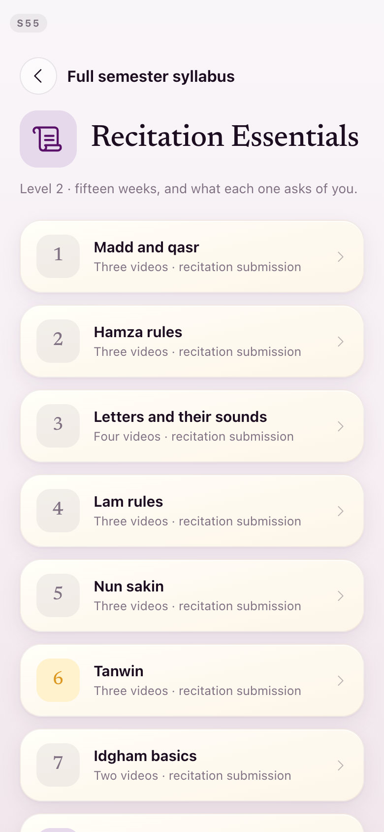
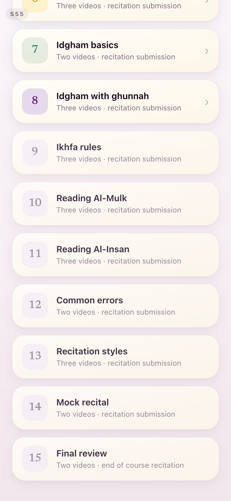
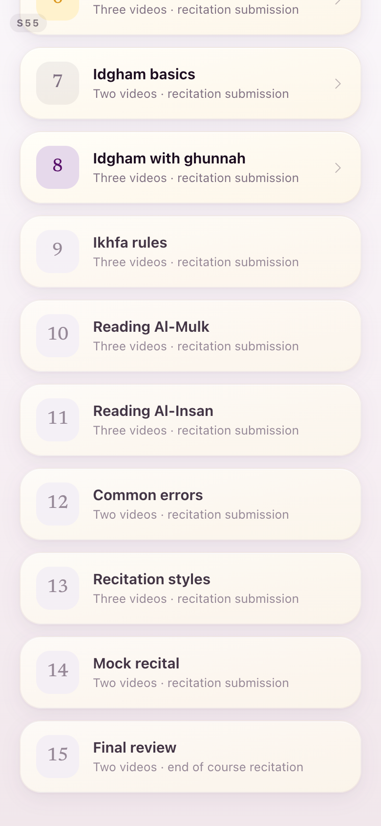
S55Full semester syllabus
Closed weeks went muted, so the green they were wearing does not compete with completion elsewhere.
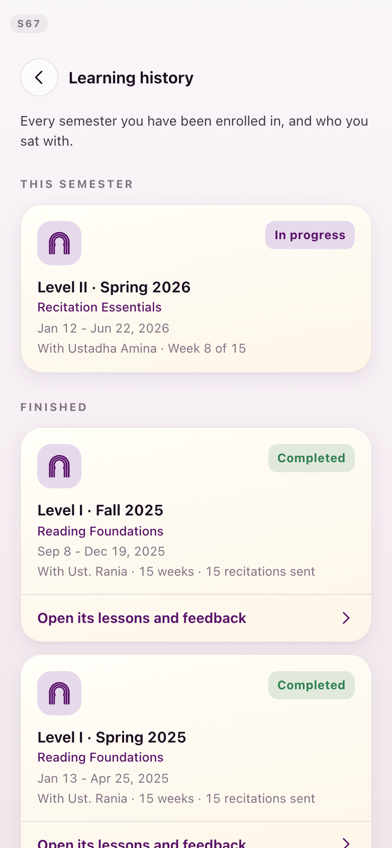
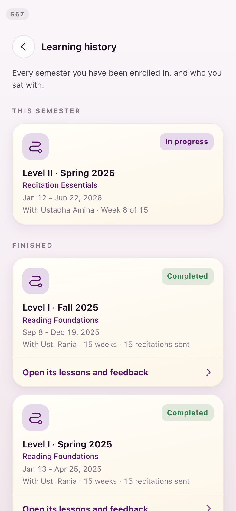
S67Learning history
The one green left anywhere in the app: the word Completed. The level marks beside each semester are redrawn at the same time.
Section 5Gold: unchanged
I like the switch to the golden buttons. We could have it everywhere.Lejla, August 28
They stay, everywhere. Gold is the action colour on every button in the app, and hierarchy is expressed by fill against outline — a filled gold button is the act, an outlined one is the alternative — never by a second colour.
Worth recording, because it was built and then withdrawn on the same day: a pass that demoted secondary buttons to a plum fill created two competing filled button colours on one screen, which is the pattern both Apple's tint colour and Material's emphasis levels exist to avoid. It was reverted. The v15 gold buttons you liked are the ones shipping.
Nothing changed here, so there is nothing to show.
Section 6The restores
Those communicate much more clearly than what's happening in the new screen... the old screen was better for S24.Lejla, August 28
Twelve items from your list, each one its own small fix. Your words on each are quoted with it.
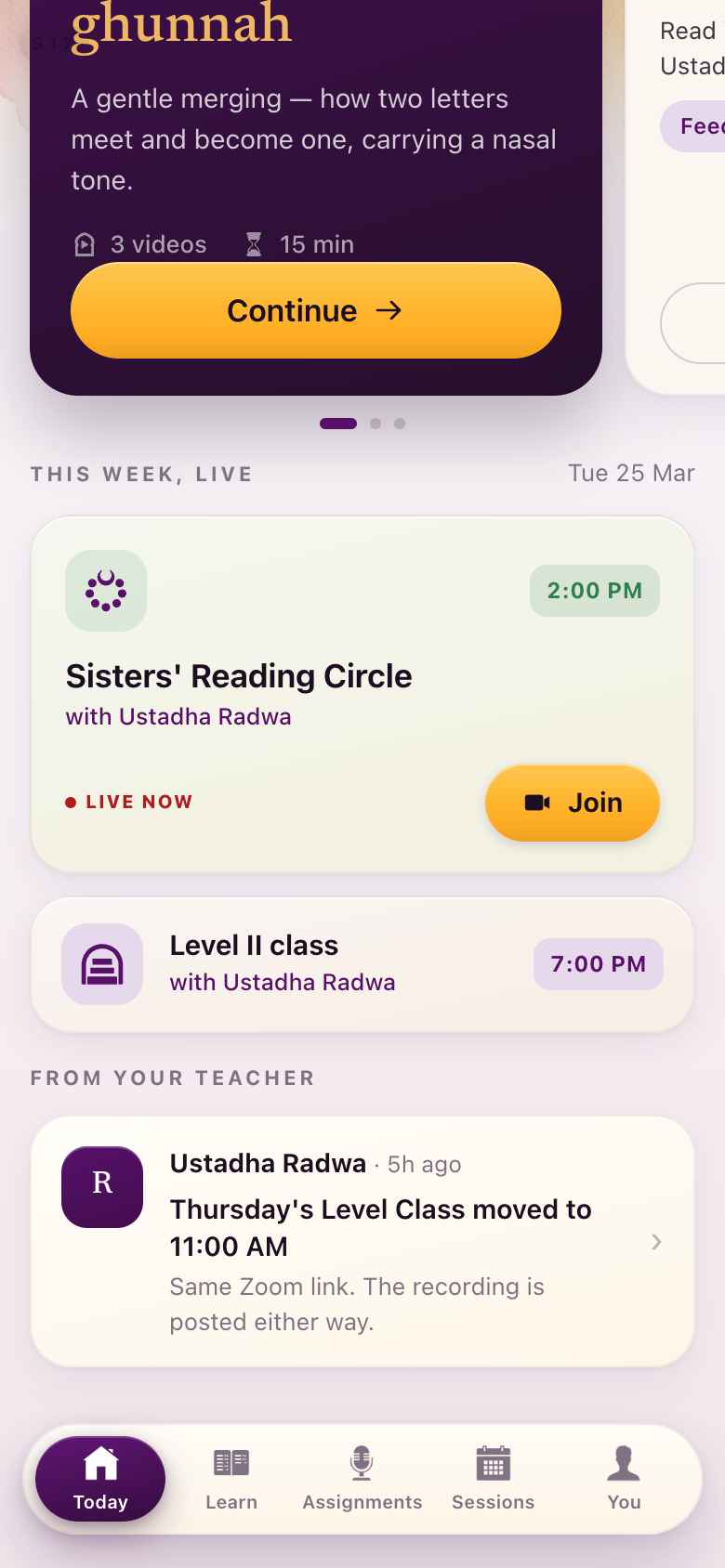
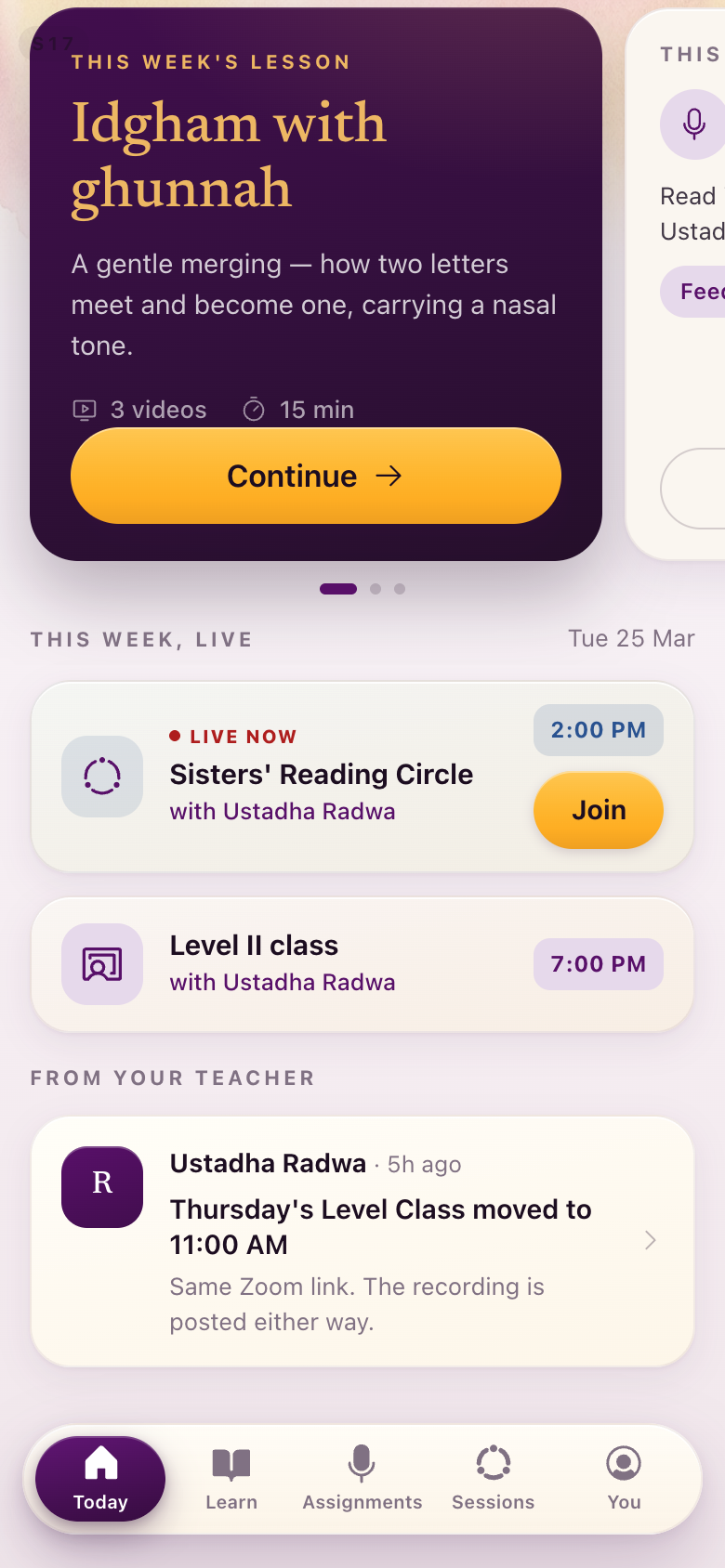
S17Tighten the session card
"These two classes fit on one card and this entire card is just one class... it could be done a little bit tighter so you can fit more things on the screen as soon as the person opens the screen."
The live session is now one row: mark, status tag, title, teacher, time and Join, at the height the old design gave a single line. More of the day reaches the first screen.
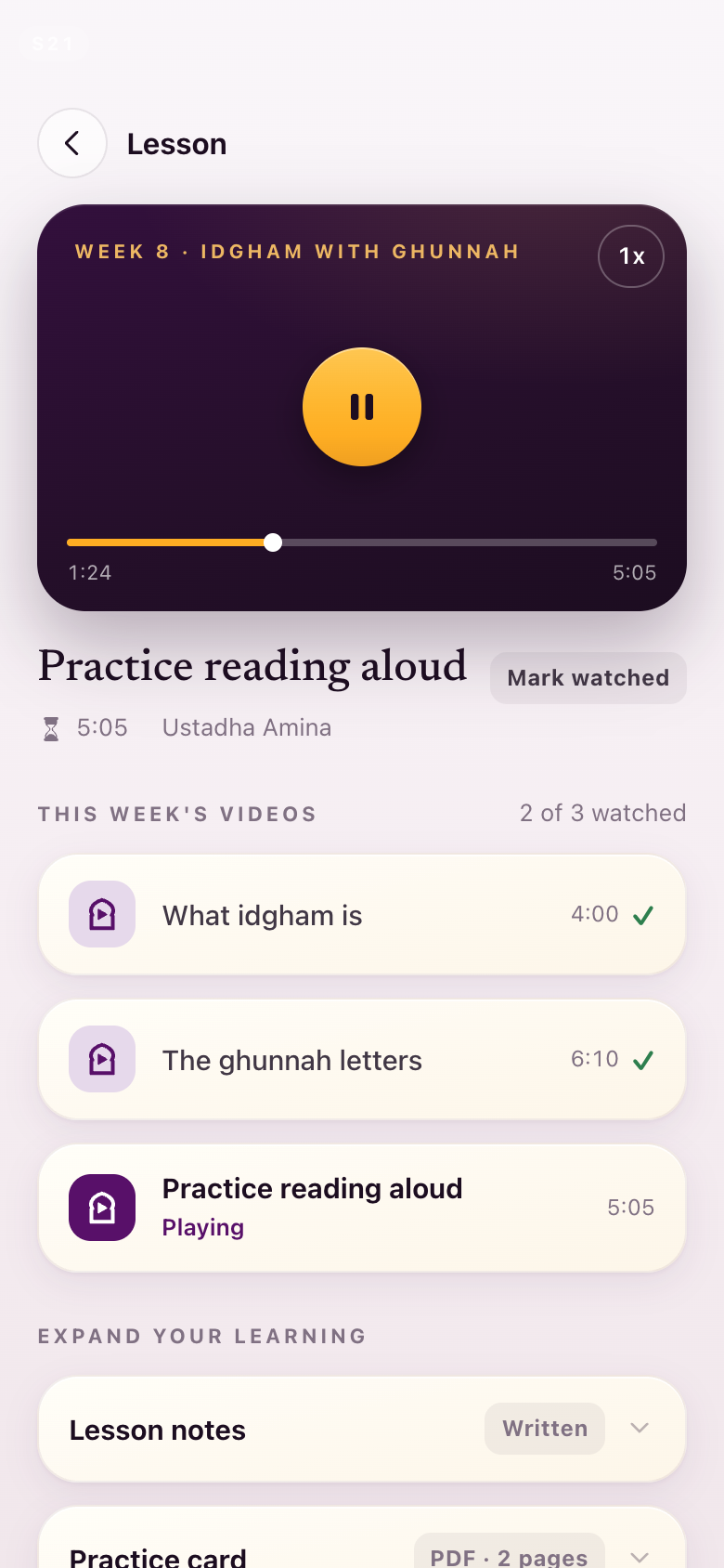
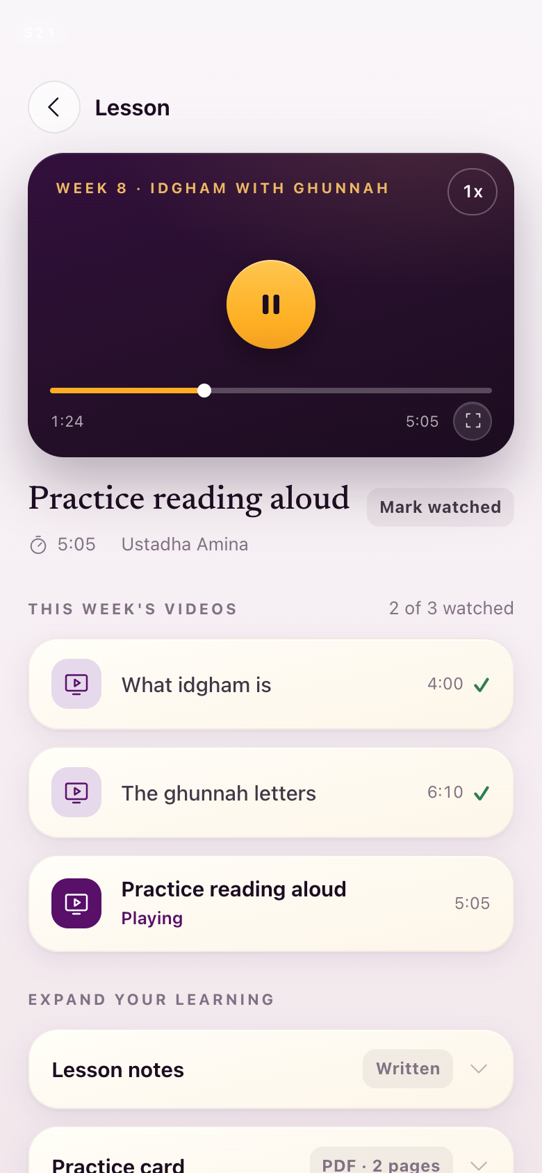
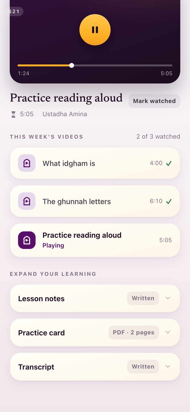
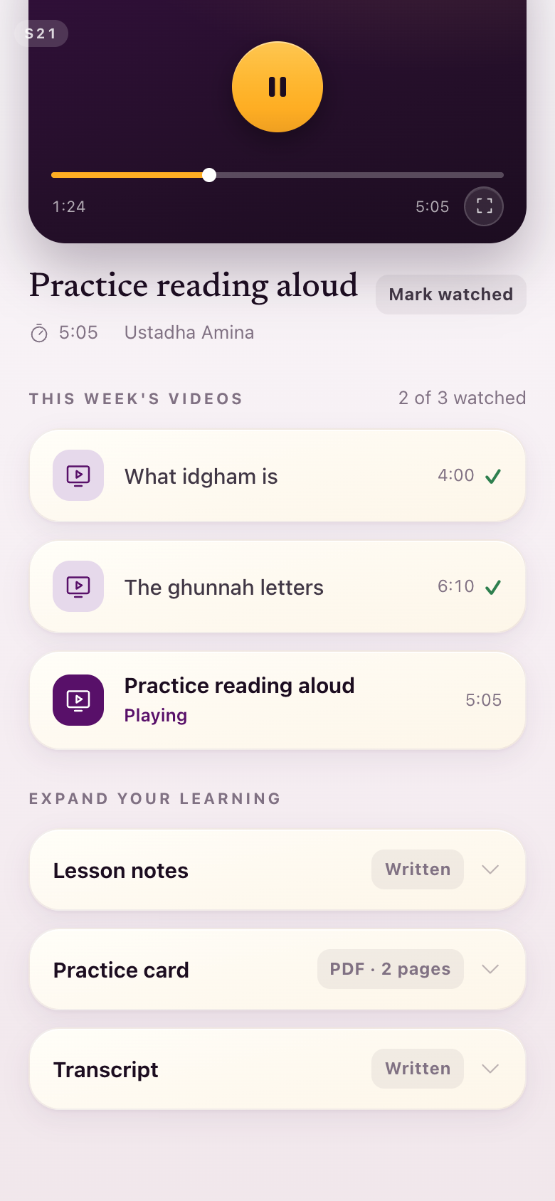
S21A full-screen option on the player
"I like the little player much better than it taking up half the screen. There should be a full-screen option anyway."
The small player stays exactly as it is. A full-screen control is added to its bar, at the right-hand end beside the running time.
S24The three clarifying symbols return
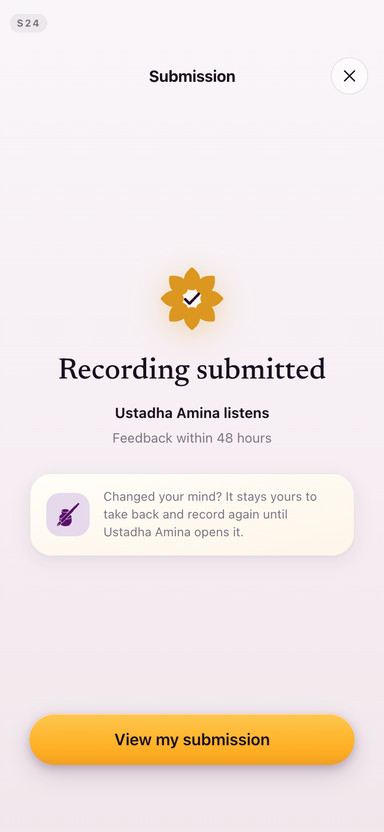
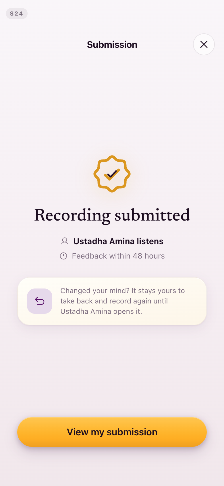
"Those communicate much more clearly than what's happening in the new screen."
The person (your teacher responds), the clock (the feedback window) and the reverse arrow (you can take it back) are back on the sent screen. The ceremony mark behind them is now straight-line geometry rather than a flower.
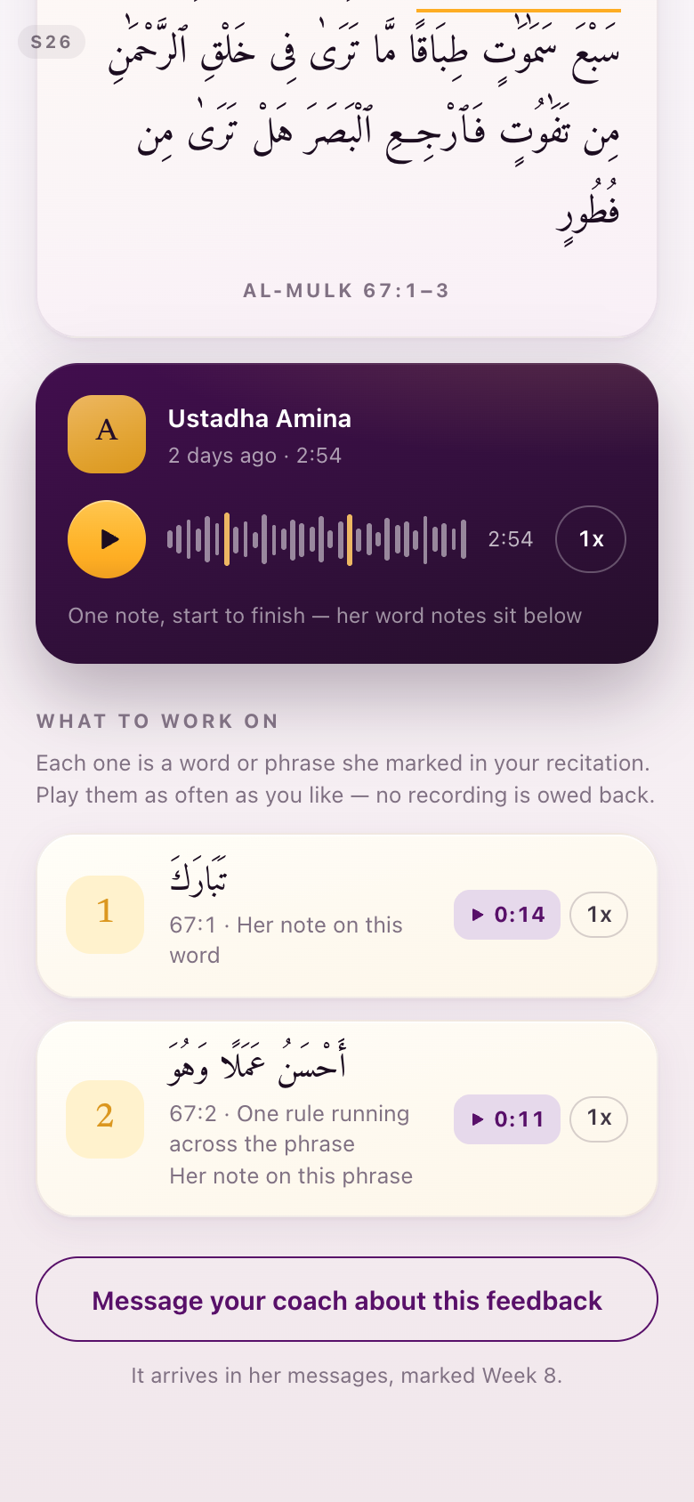
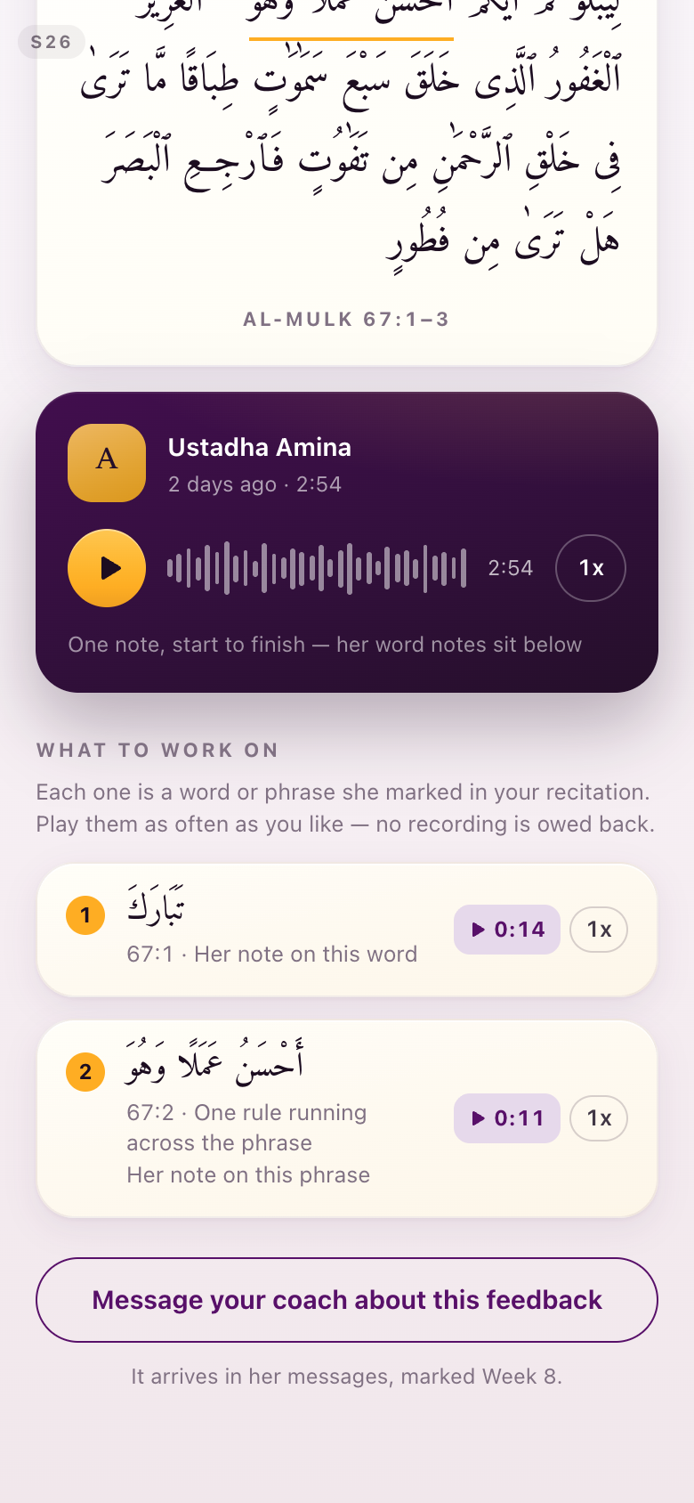
S26Gold annotation circles, and gold off the wave
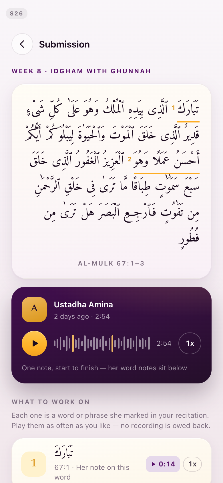
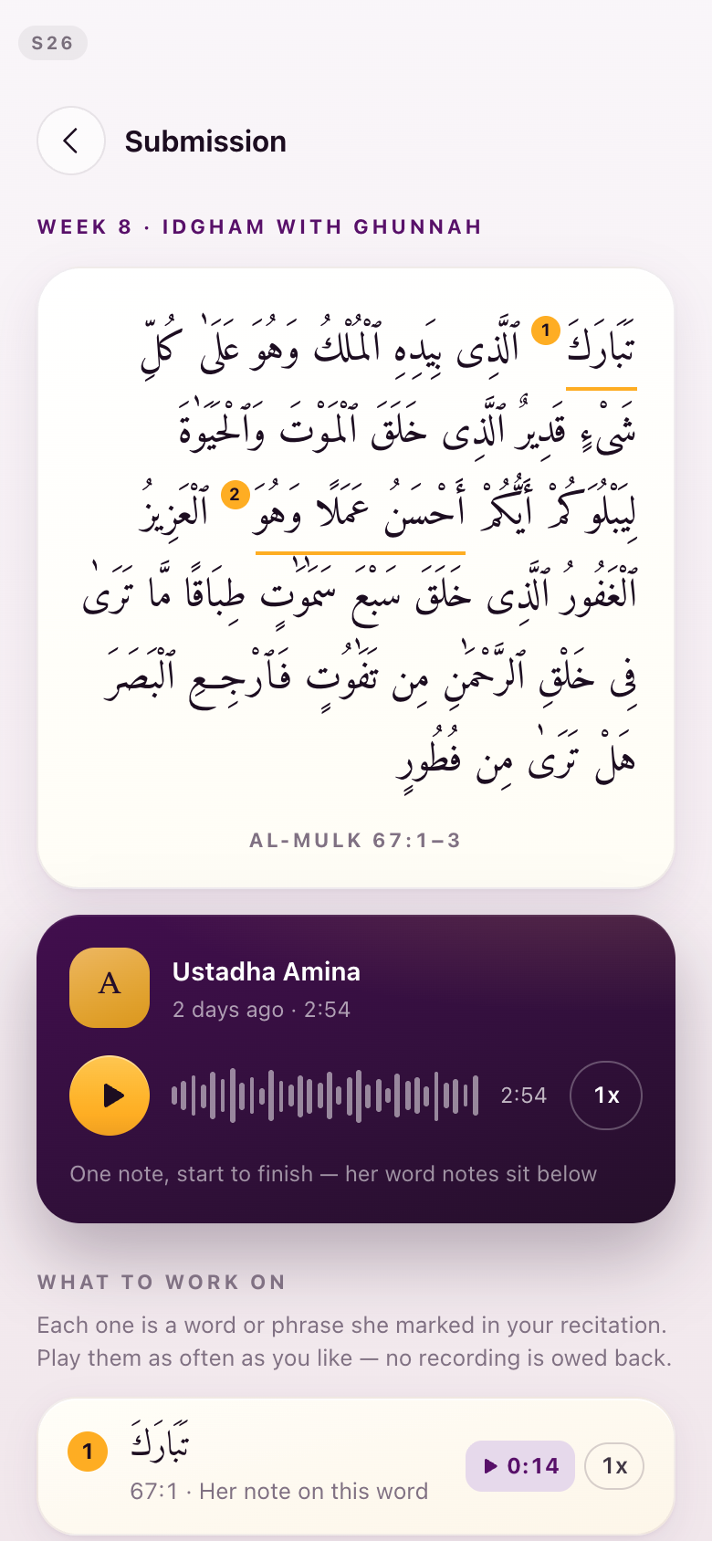
"I really like this design much better for it to be like a golden circle with a number in it." · "For the audio wave to not have golden highlights, because that indicates it's somehow pointing to the annotations that are done on the text, and we've determined that's not the case."
Two changes on one screen. The numbered markers anchored into the passage go back to gold circles; the purple you preferred stays for everything else. The gold highlights come off the waveform, so on this screen gold now means an annotation and only an annotation. The per-word voice notes you called better are untouched.
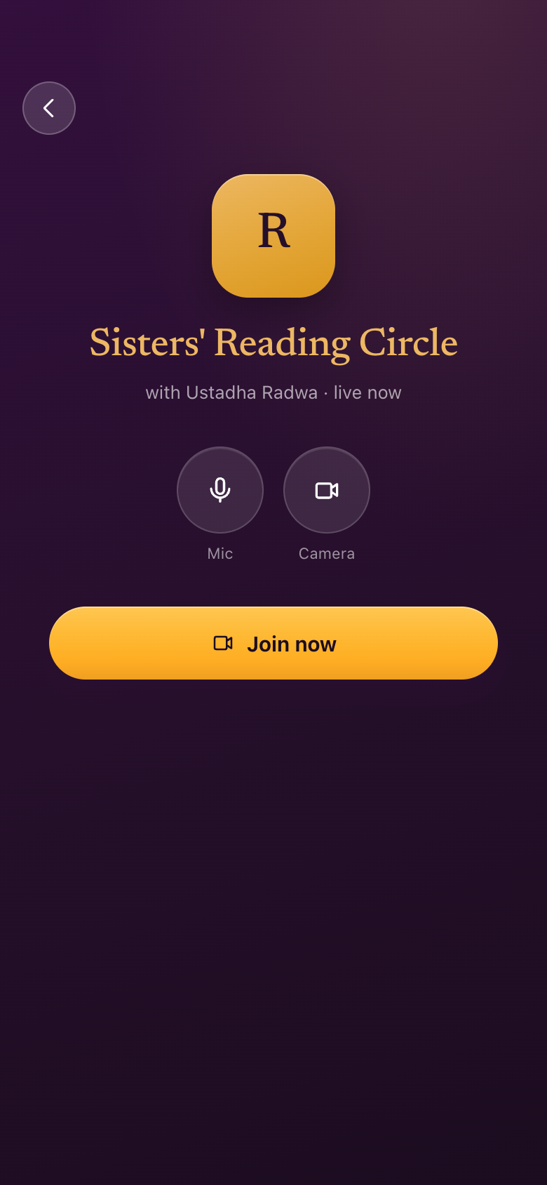
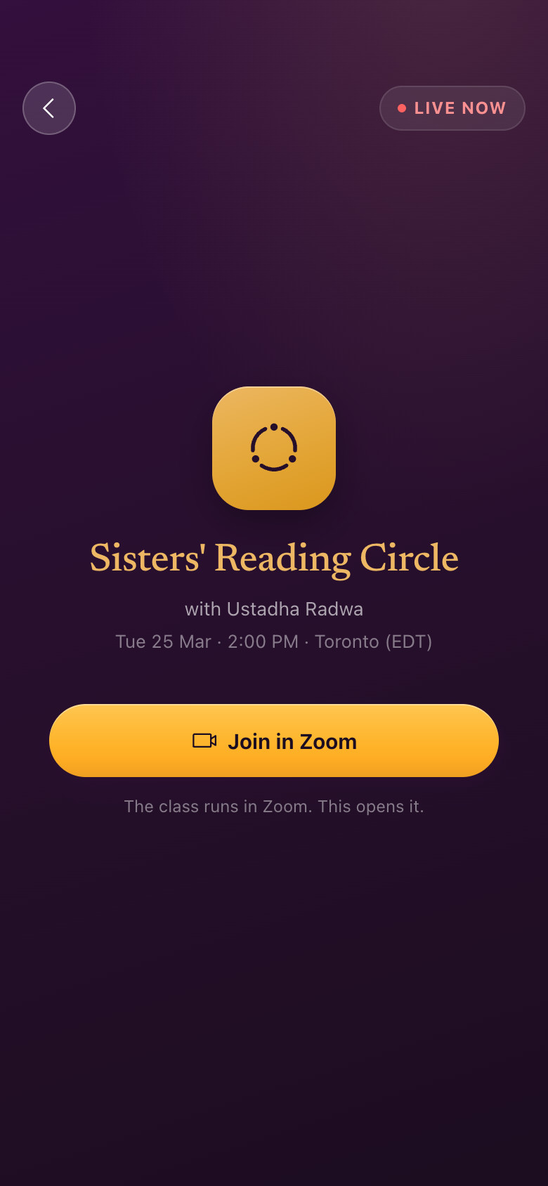
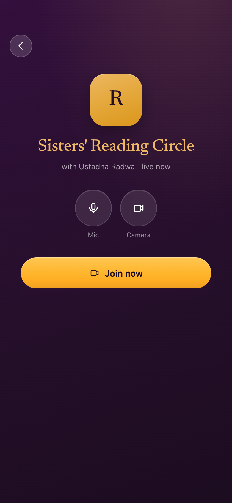
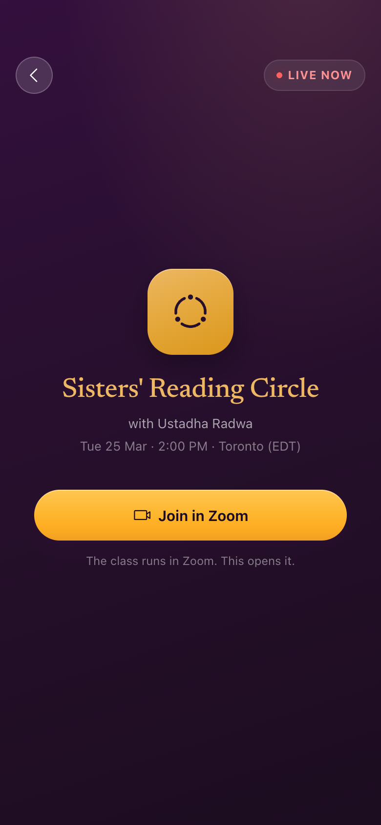
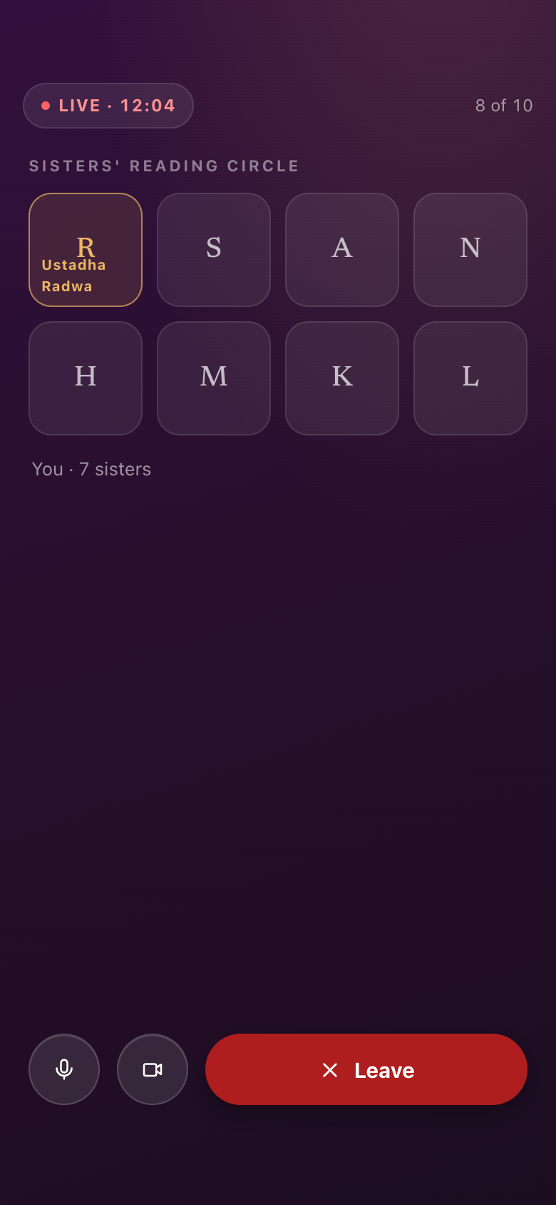
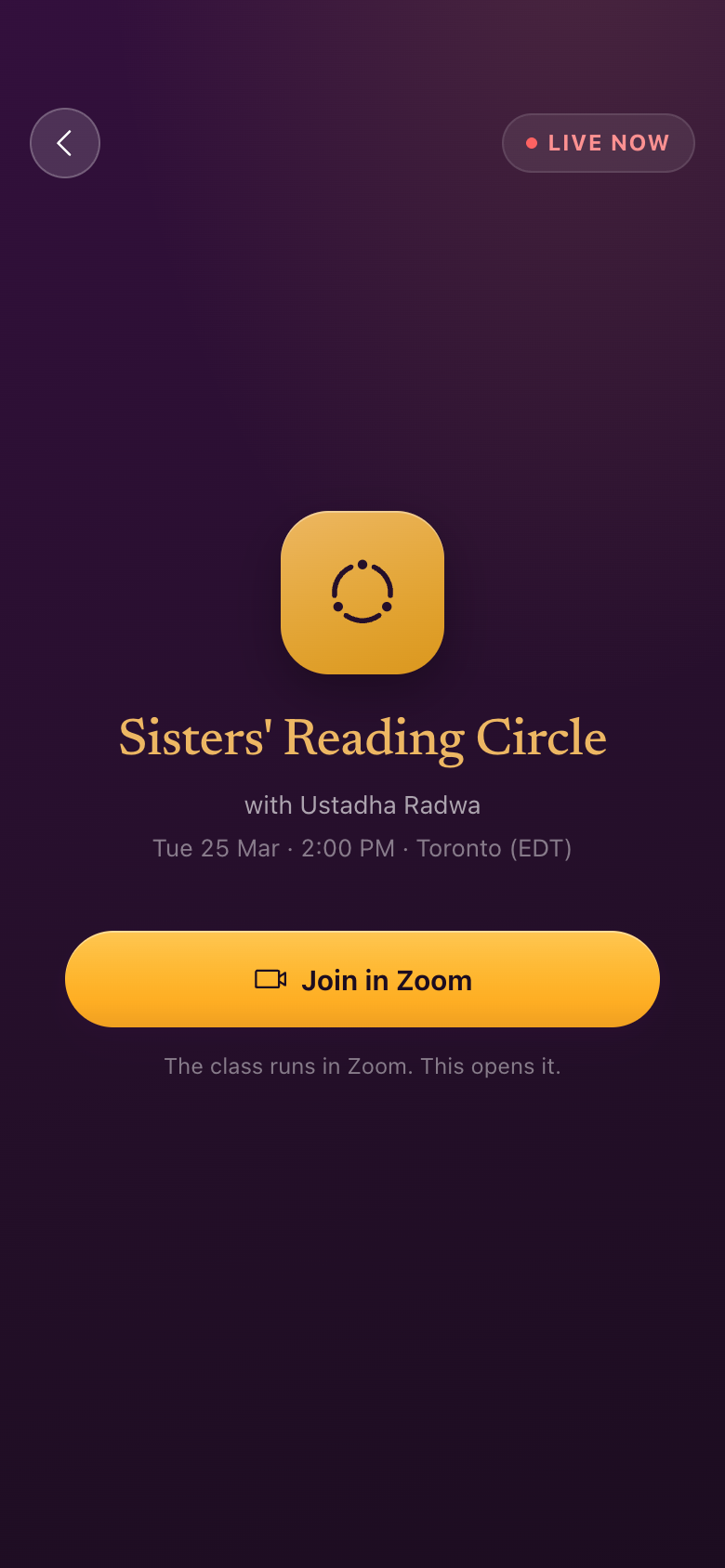
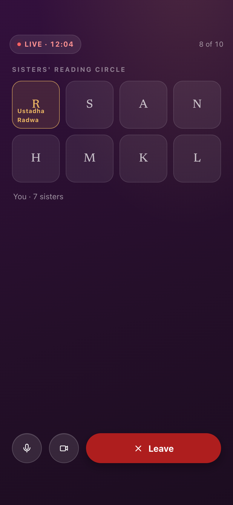
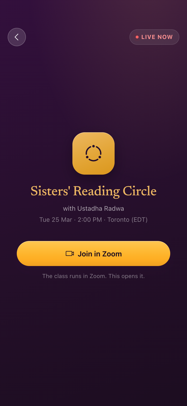
—No in-app live room
"The live room — we're going to be using Zoom... So we don't need waiting rooms and such."
The lobby is gone: no in-app waiting room, no microphone and camera toggles. What survives is the session, the time, and one button that opens Zoom, which says so. The second pair is the starkest: the in-call room, with its participant grid and its Leave button, is gone entirely.
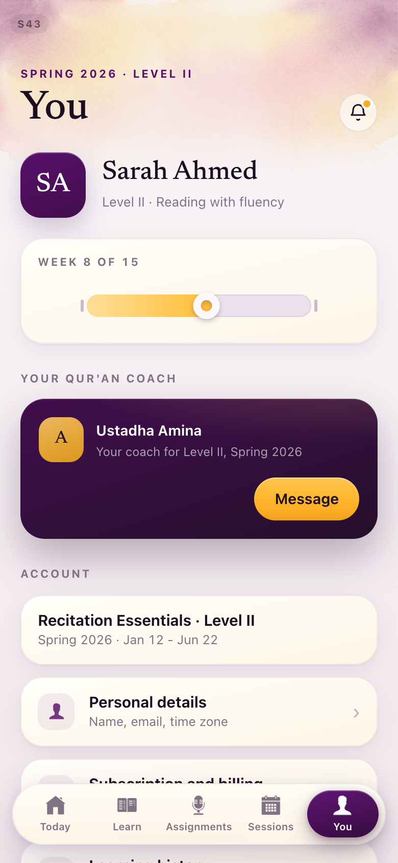
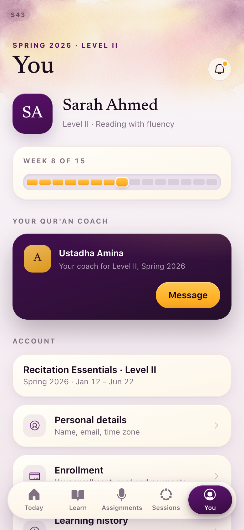
S43The 15-tick week strip returns
"I do prefer the old one... it shows you which week you're on."
The smooth gold capsule is replaced by the segmented fifteen-tick strip, redrawn in the current language rather than reverted. You can count the weeks again.
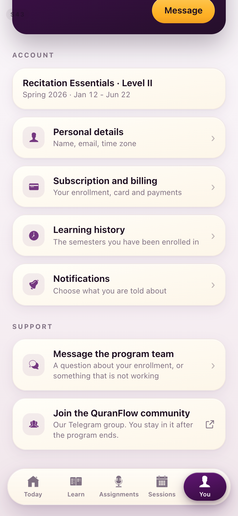
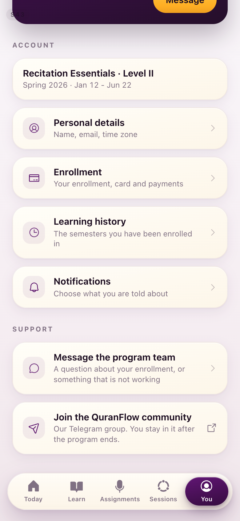
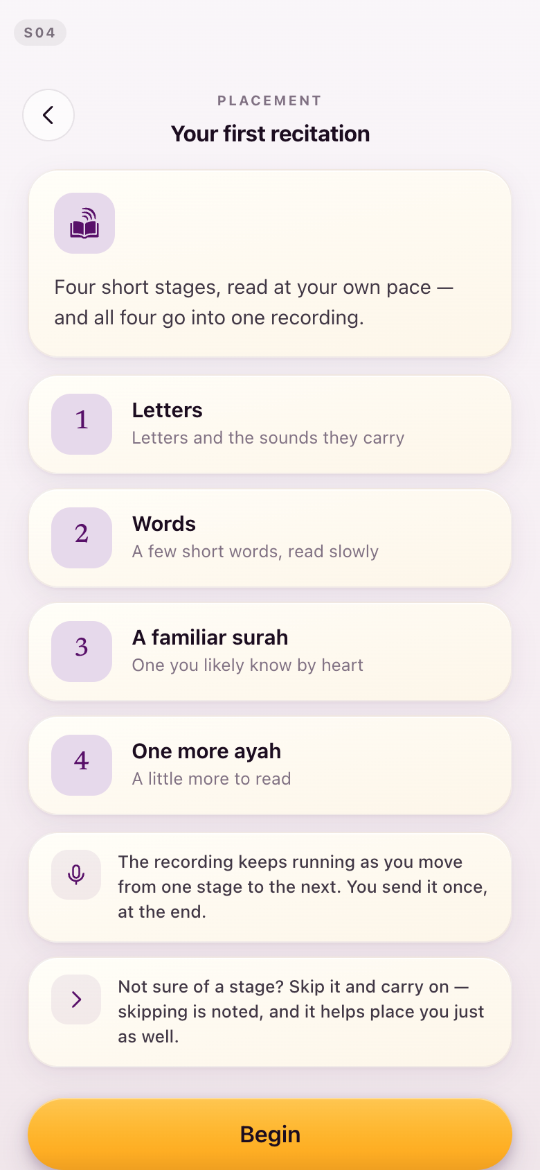
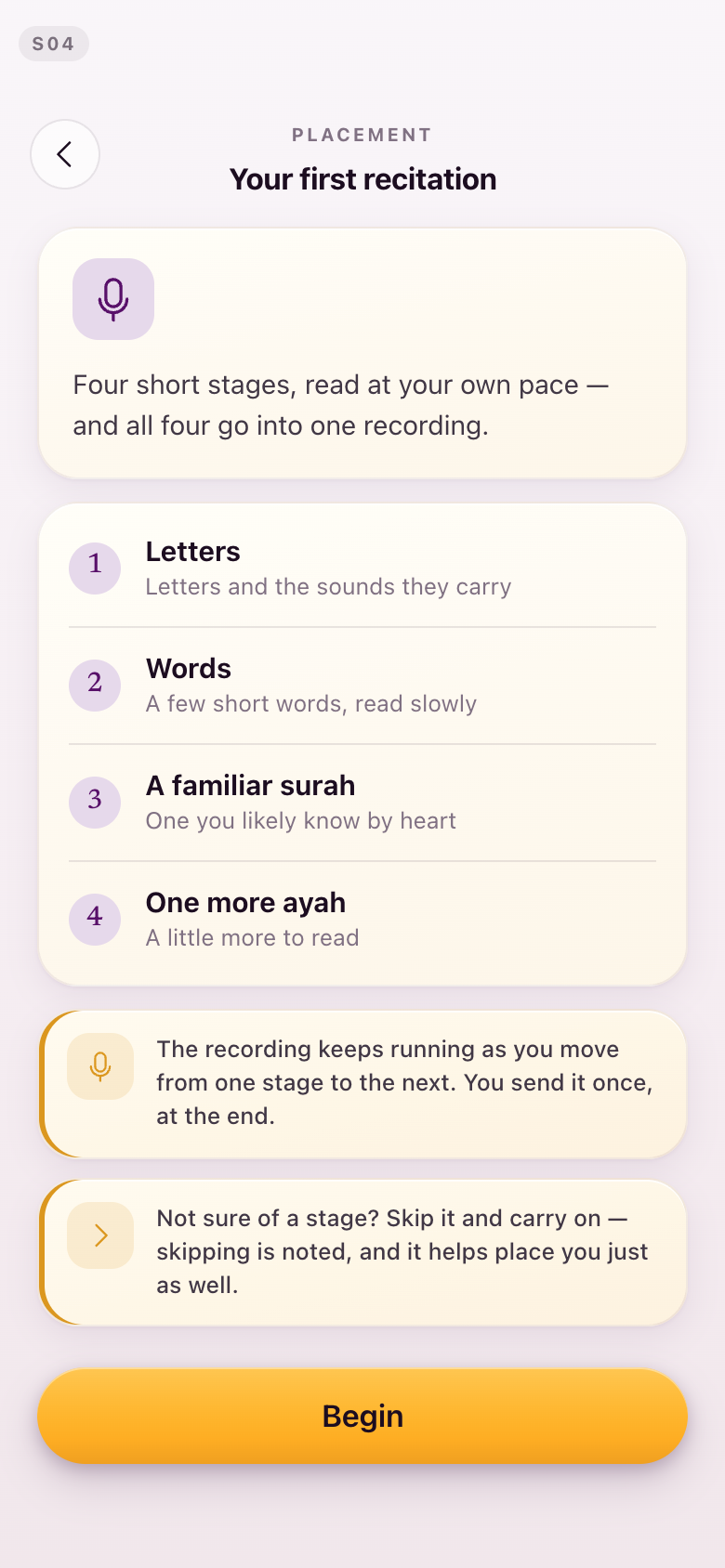
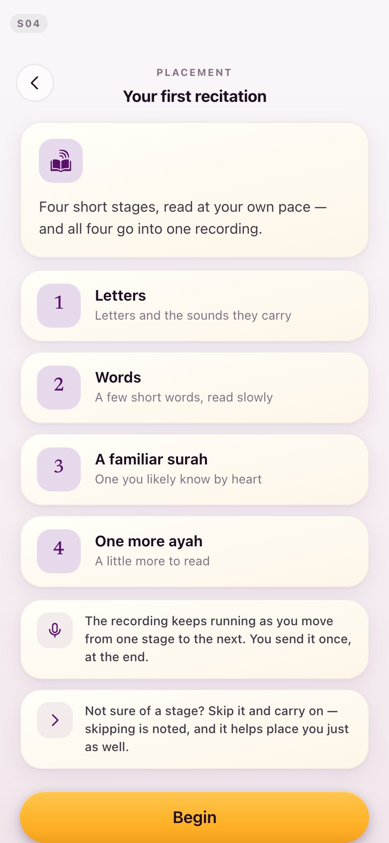
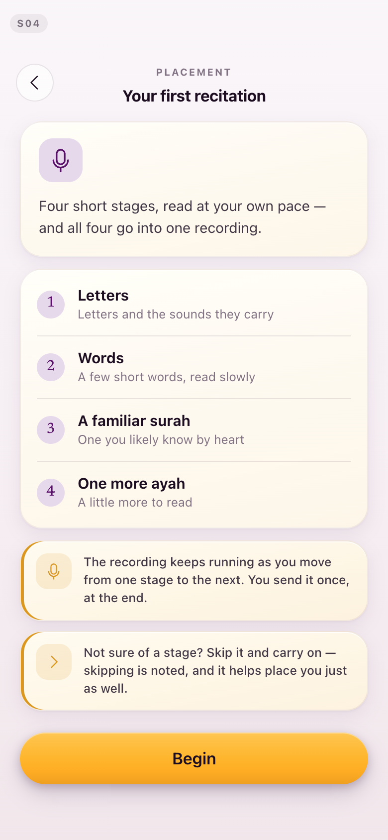
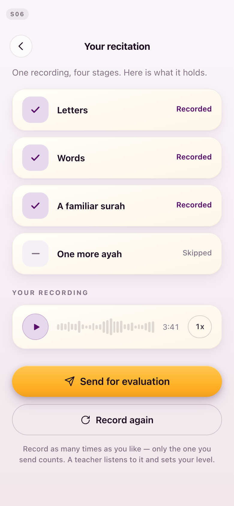
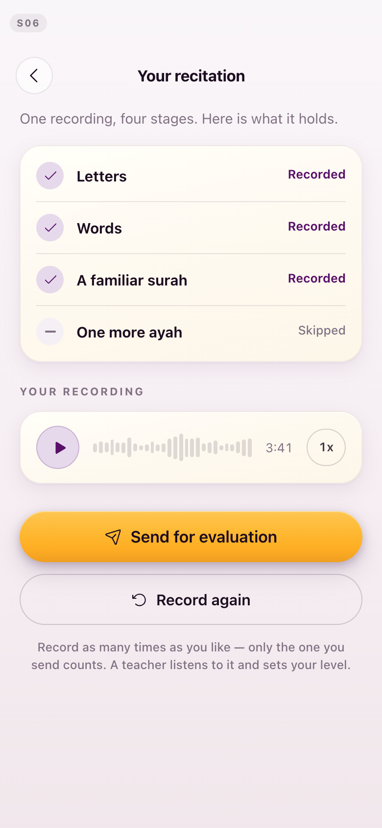
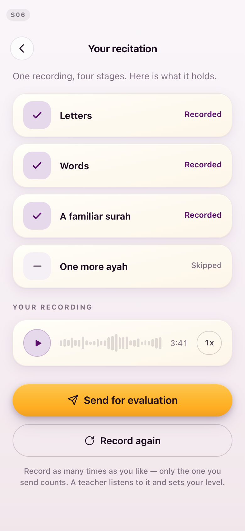
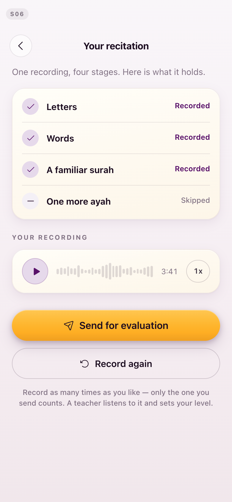
S04 · S06The four stages back in one card, and gold on the note
"I would prefer to have the breakdown of what the first recitation is to just leave it in one card." · Kamran: "I was a bit surprised that the recording kept on running." Lejla: "Maybe even golden icons for the recording, skip, and whatever it is."
The four reading stages are one enumerated card again, on both screens. The two notes below it — the recording keeps running, and any stage can be skipped — keep their prominence but are now visibly other: outlined rather than filled, with gold marks.
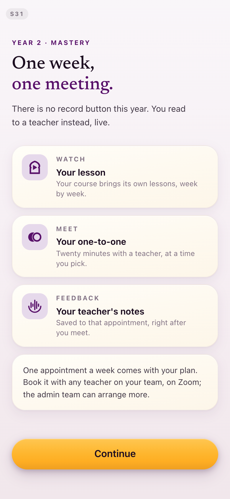
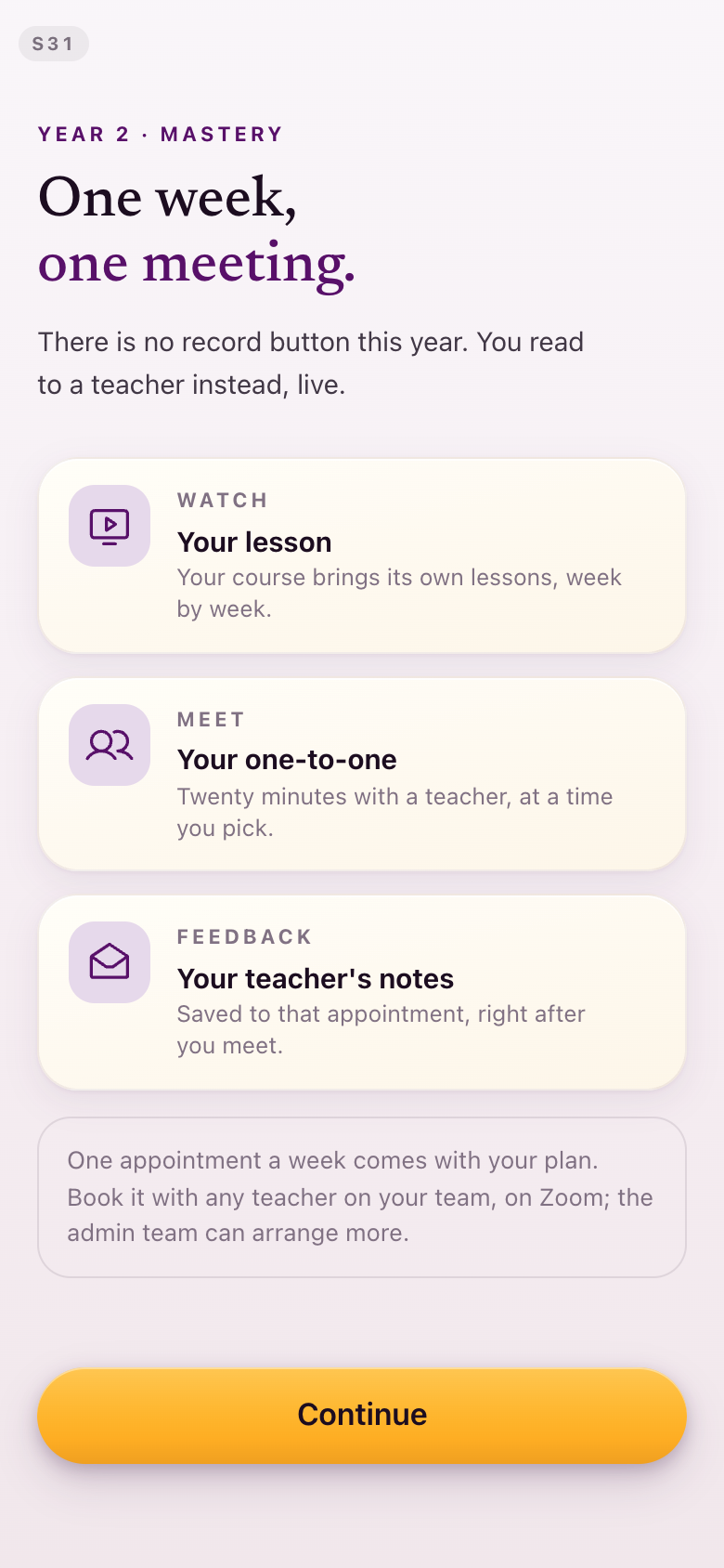
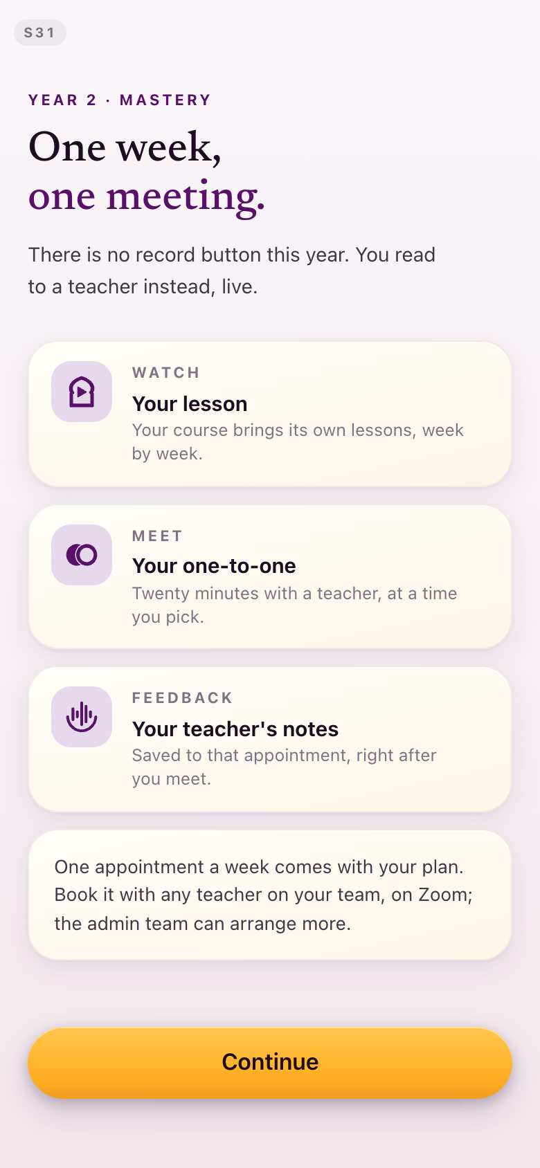
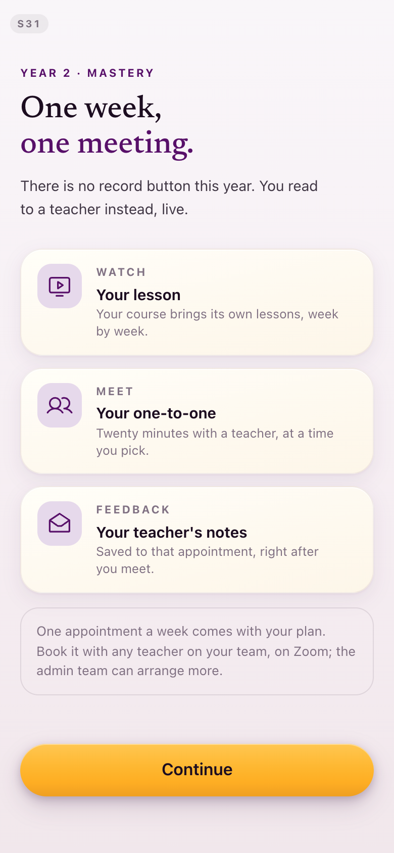
S31Asides in a quieter register
"It also highlighted the note as a separate card, it's giving it the same importance as the three main elements... the intros and outros, the clarifying parts, should not be as pronounced."
The "comes with your plan" note is an outlined card, which is the form you proposed. The three things the week actually asks of you keep the filled cards. This is now a rule: a page's cards are not all main characters.
S34Marks beside the date and the teacher
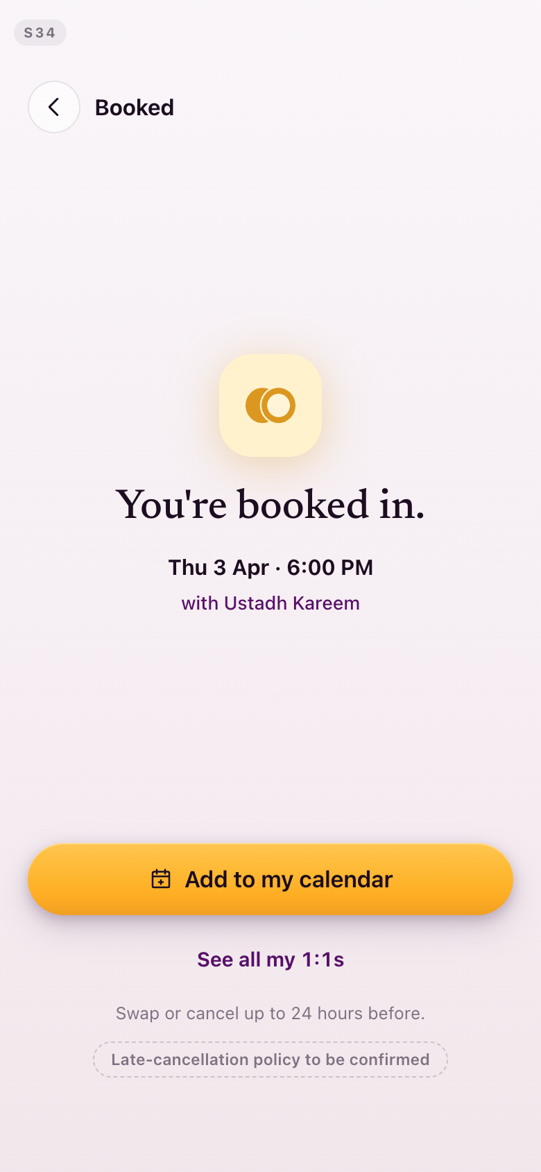
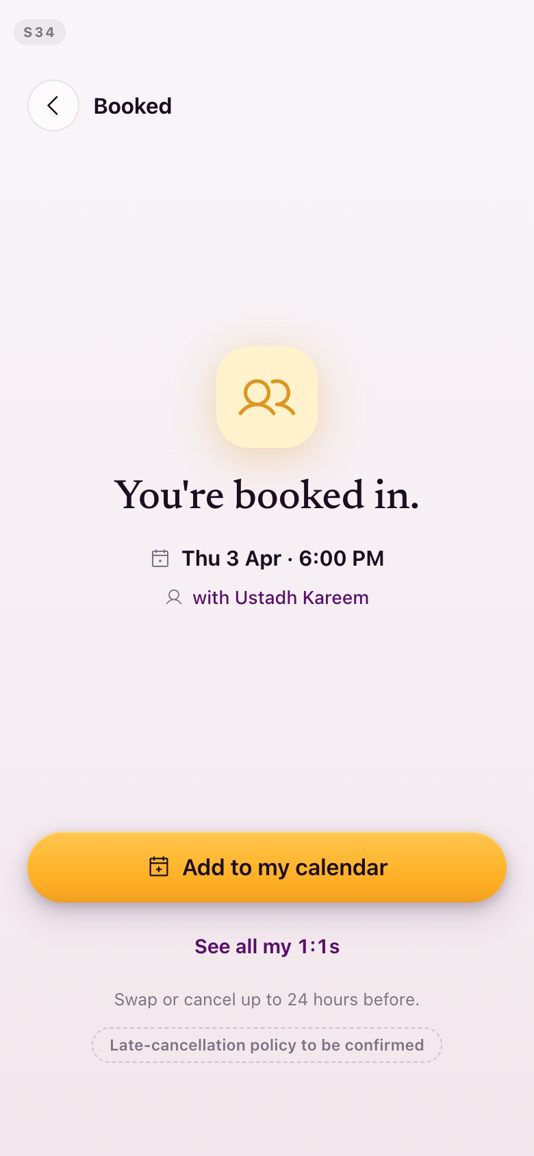
"I like when there is a calendar icon next to whatever the date is, and when there is your teacher's profile symbol next to the name — those kind of things add a little bit more pizzazz."
Both added, drawn from the one library.
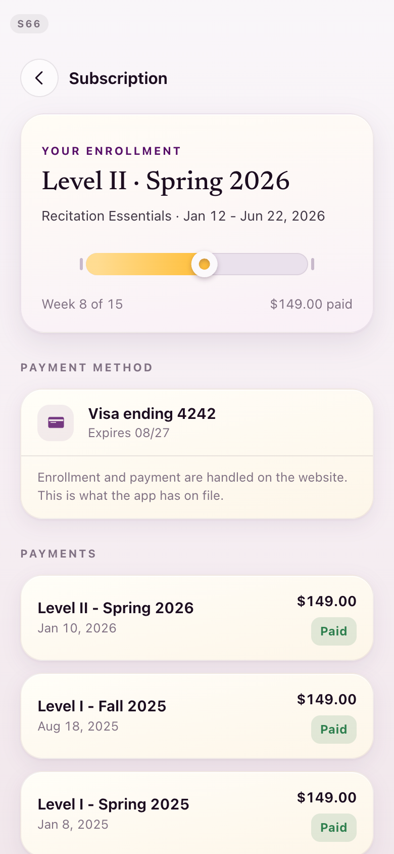
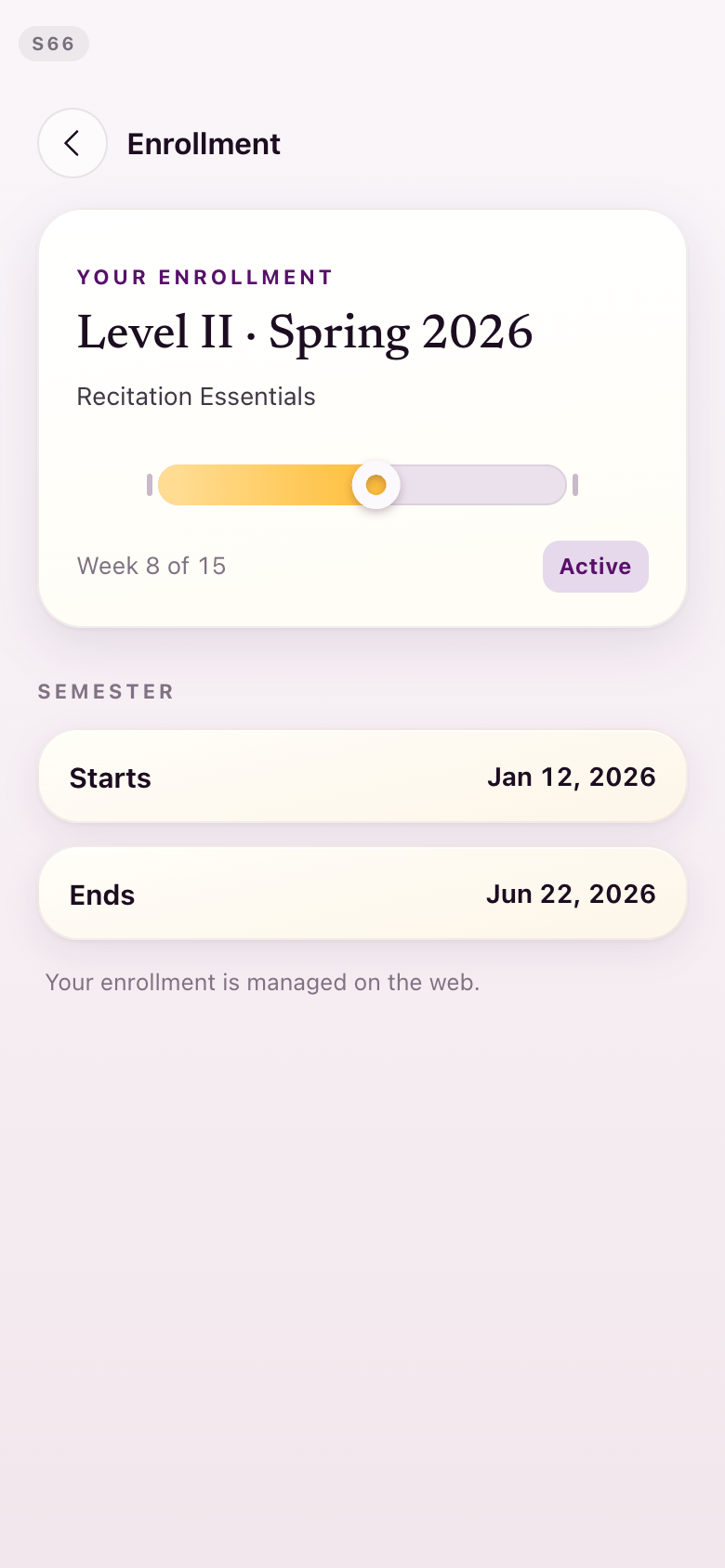
S66The payment surface is gone
"We need to figure the payment thing out... because there is no in-app payment."
Subscription is now Enrollment: a read-only record of what you are in and when it runs. No prices, no card on file, no payment history, and the one line that explains it — your enrollment is managed on the web. Kamran commissioned a compliance check behind this; selling nothing in the app keeps both stores satisfied, and showing prices is what would put the iOS submission at risk.
Section 7The coach side
We completely forgot about that — we need to be able to grade students for our own benefit, in the back end also supported.Lejla, August 28
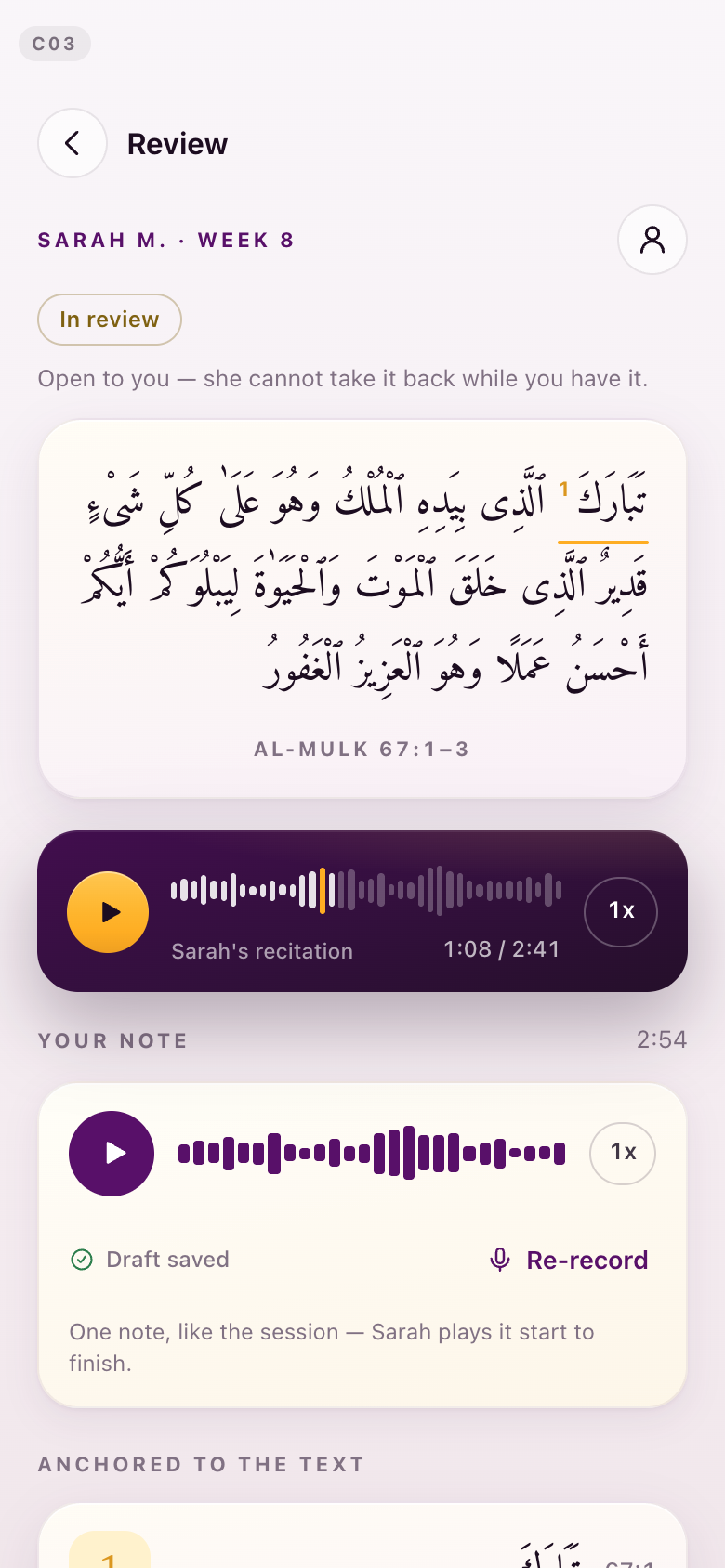
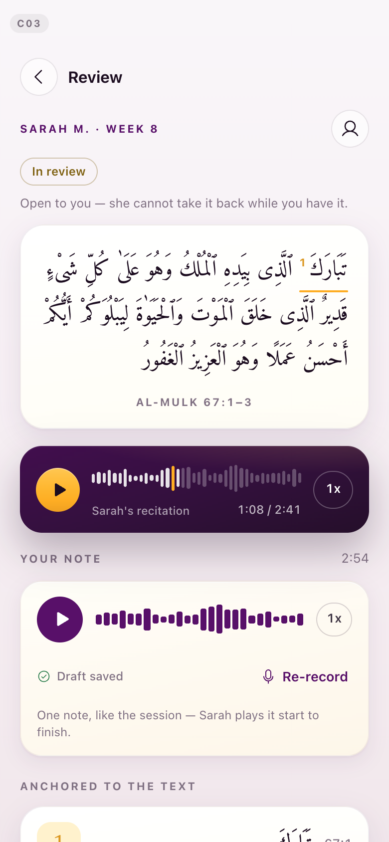
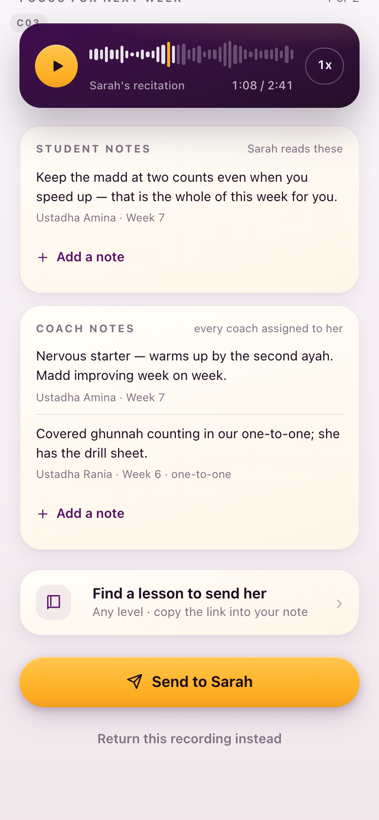
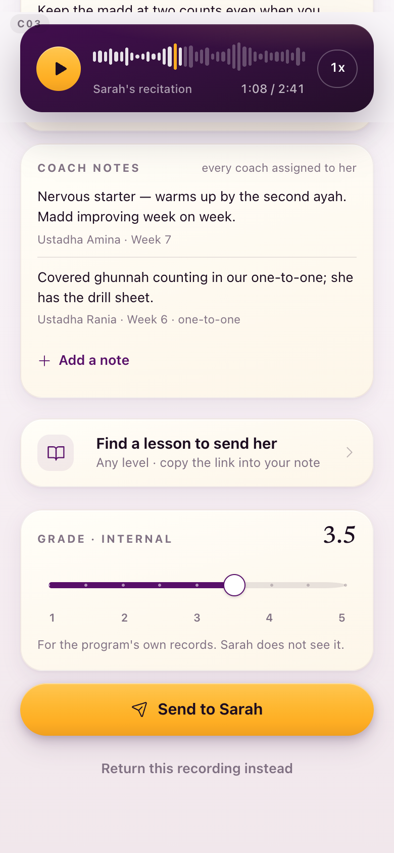
The grade. A 1 to 5 grade in half steps now sits at the send seam of the review, directly above Send. Half steps rather than tenths, because as Kamran put it, if there is no difference in meaning between 3.1 and 3.2 there is no point in offering it. It is labelled internal on the screen and the student does not see it. This is deliberately separate from the Academic Lead's rubric proposal, which stays in its own exploration.
Her hours needed nothing built. The screen already models what you described: submission length plus feedback length plus a thinking margin, the scheduled classes added on, and the adjust-hours control with a reason. The calculation engine, the reassignment that credits a substitute, and the monthly report that becomes the invoice are backend work and go to the admin track, not this round. The only thing that moved on that screen is colour.
Curriculum access is likewise validated and unchanged. Every coach sees the whole library, both years and every level, with the same lesson view the student has. Nothing was asked for and nothing was changed, so there is no pair here.
The entrance you could not find is the coach entrance, and the hub landing page carries a coach card of its own this time, both as the app and as a guided tour. Last round it was missing because the preview was not a full deploy.
Her side also takes the same icon and colour work as everything else: the seated ring, two people, the lapis reading circle, plum for live.
C03The review, with the grade
The grade sits with the send. The lower shot is the seam: the slider, the value, and the line saying the student does not see it.
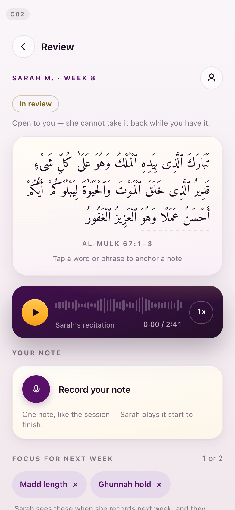
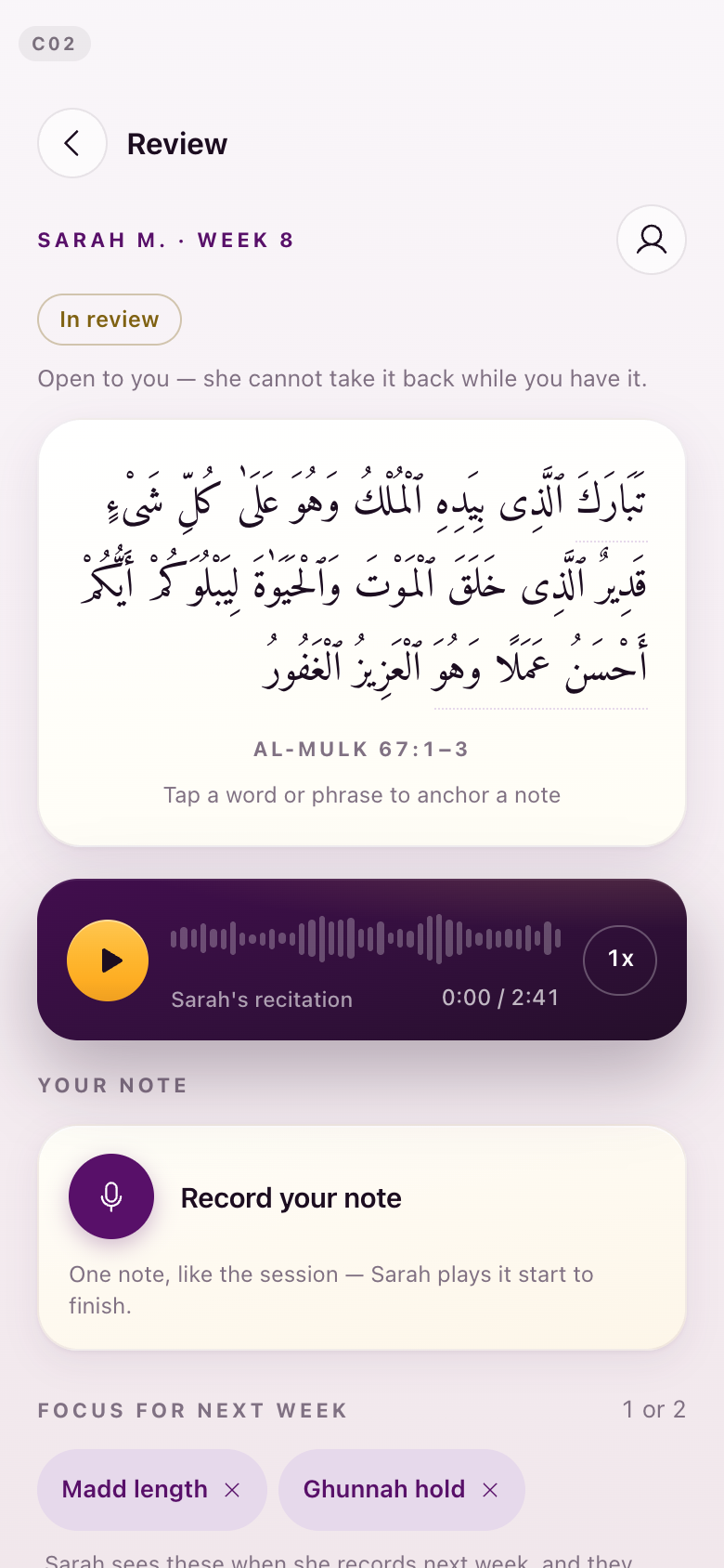
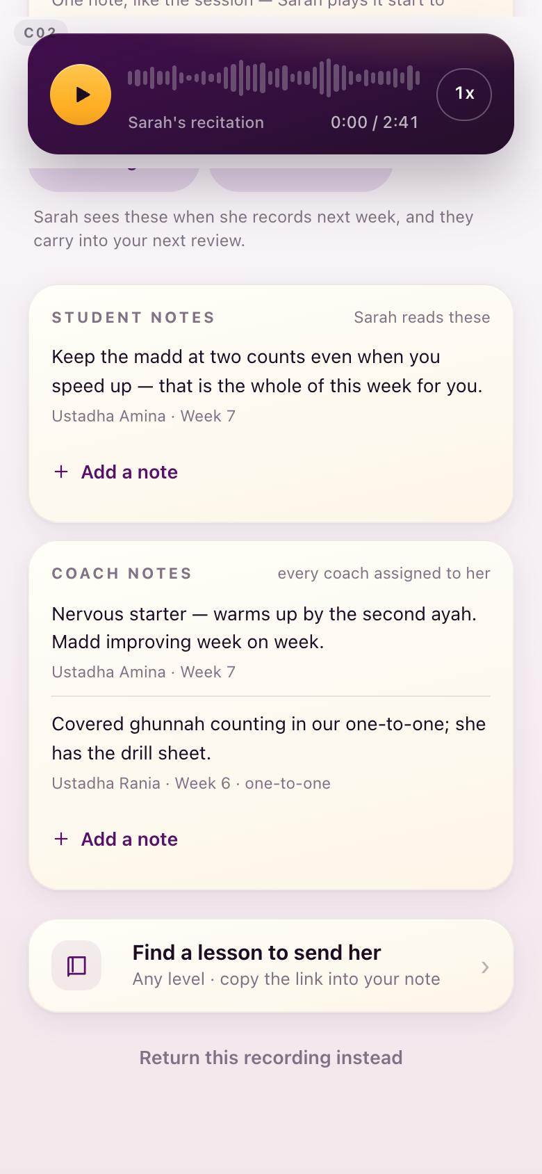
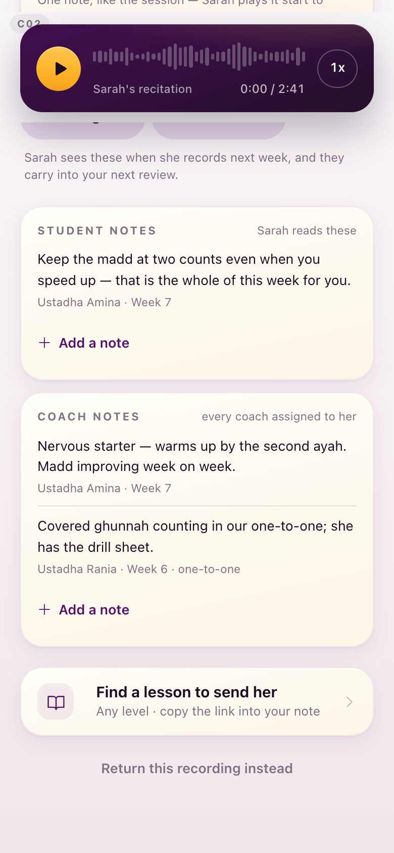
C02A review that has just opened
Empty, before she writes anything.
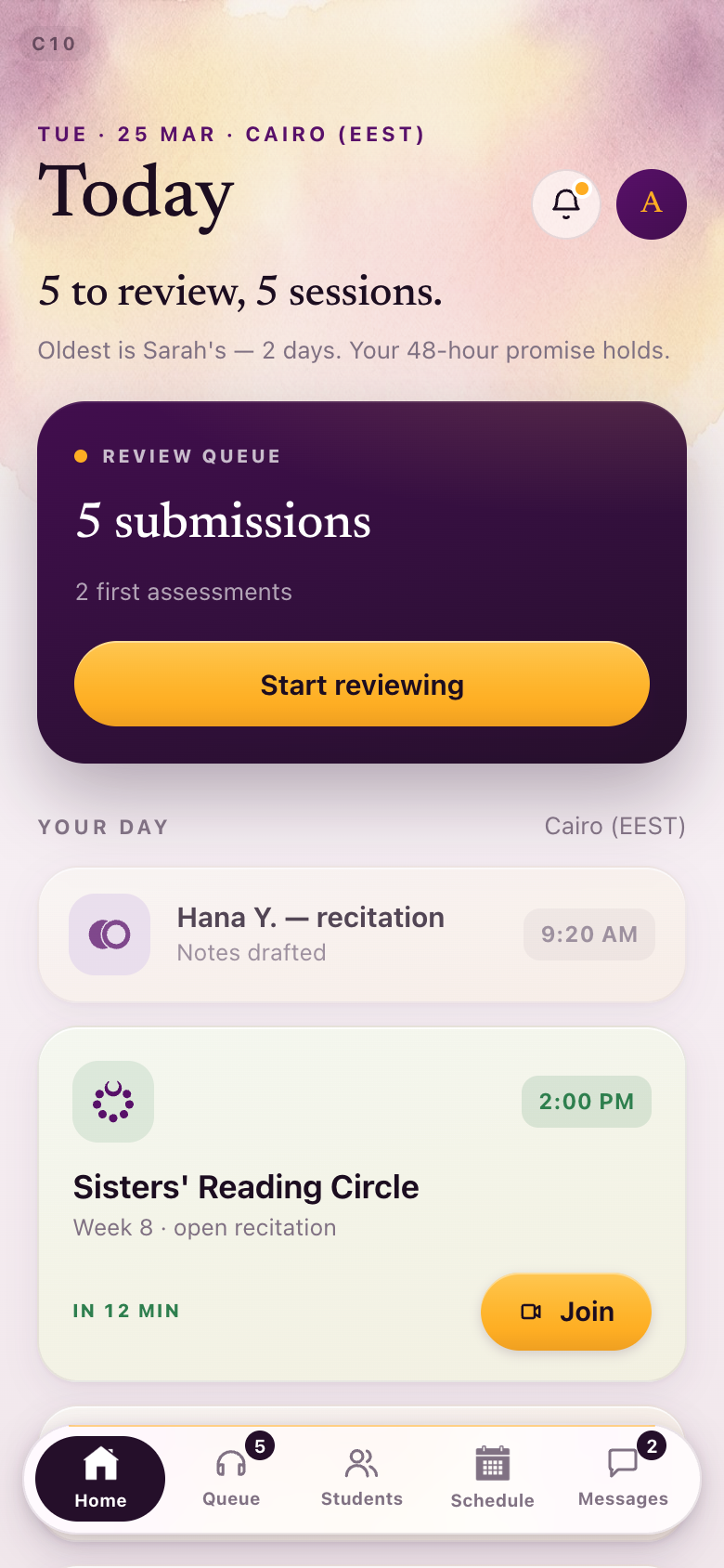
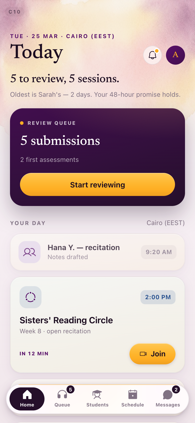
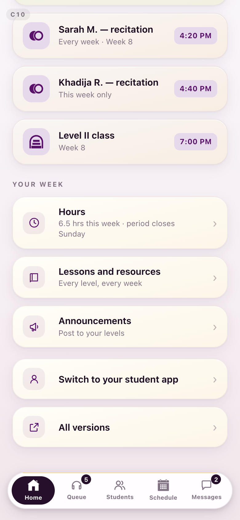
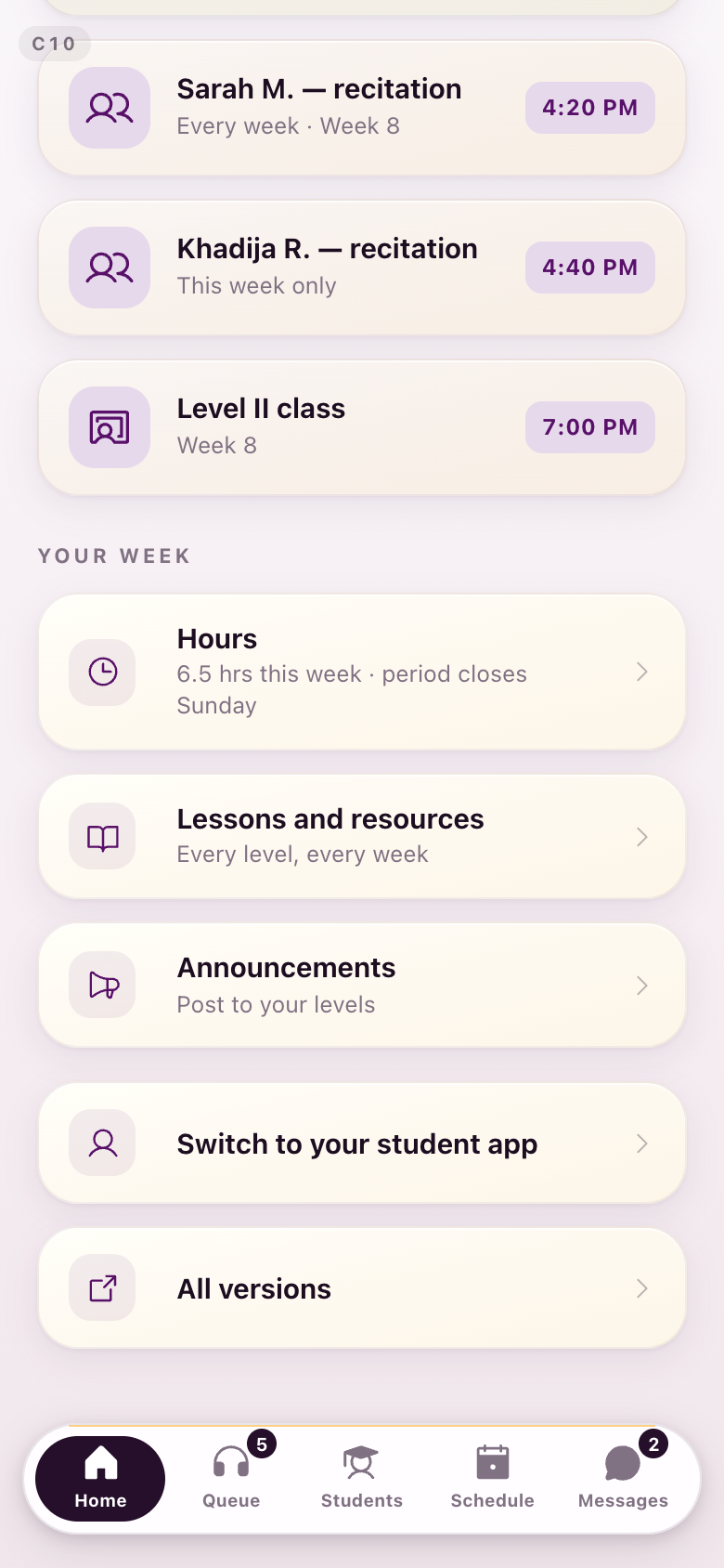
C10Her day
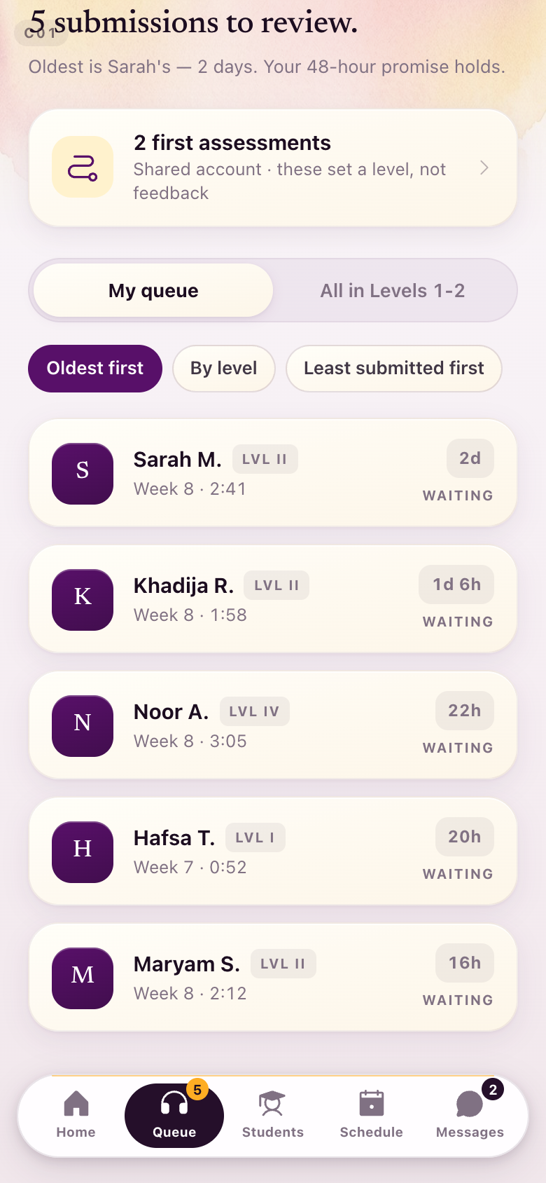
The queue, then the day. The one-to-one takes two people and the circle takes the seated ring, the same as on the student side.
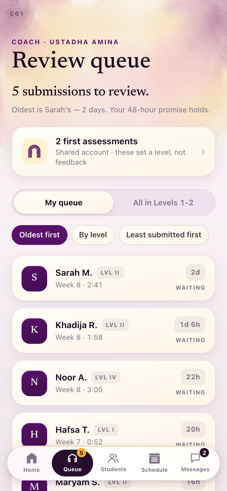
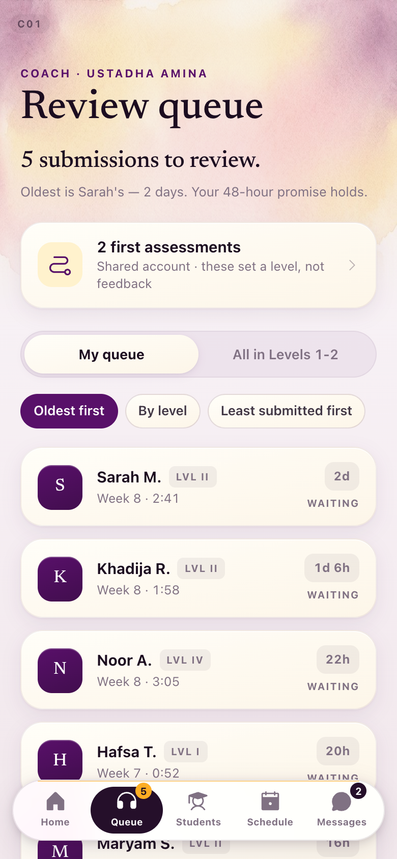
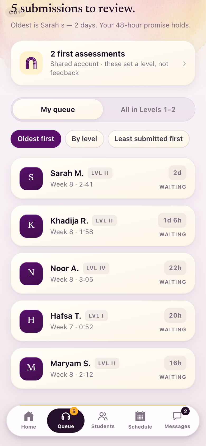
C01The review queue
Oldest first, with the promise to students at the top.
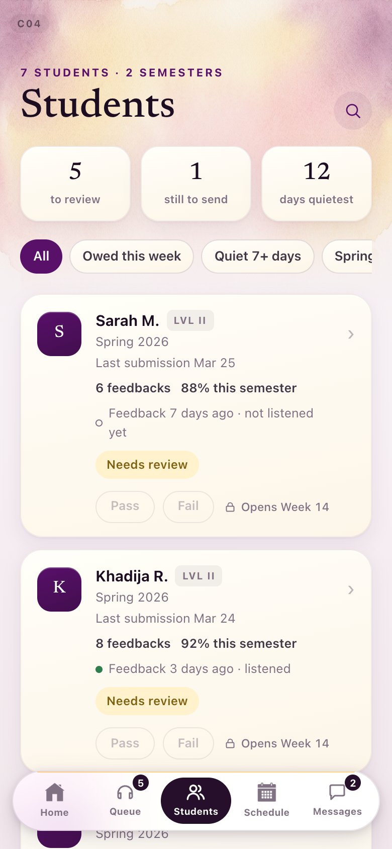
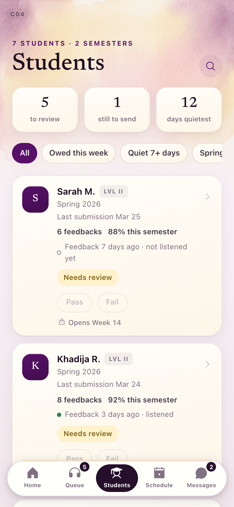
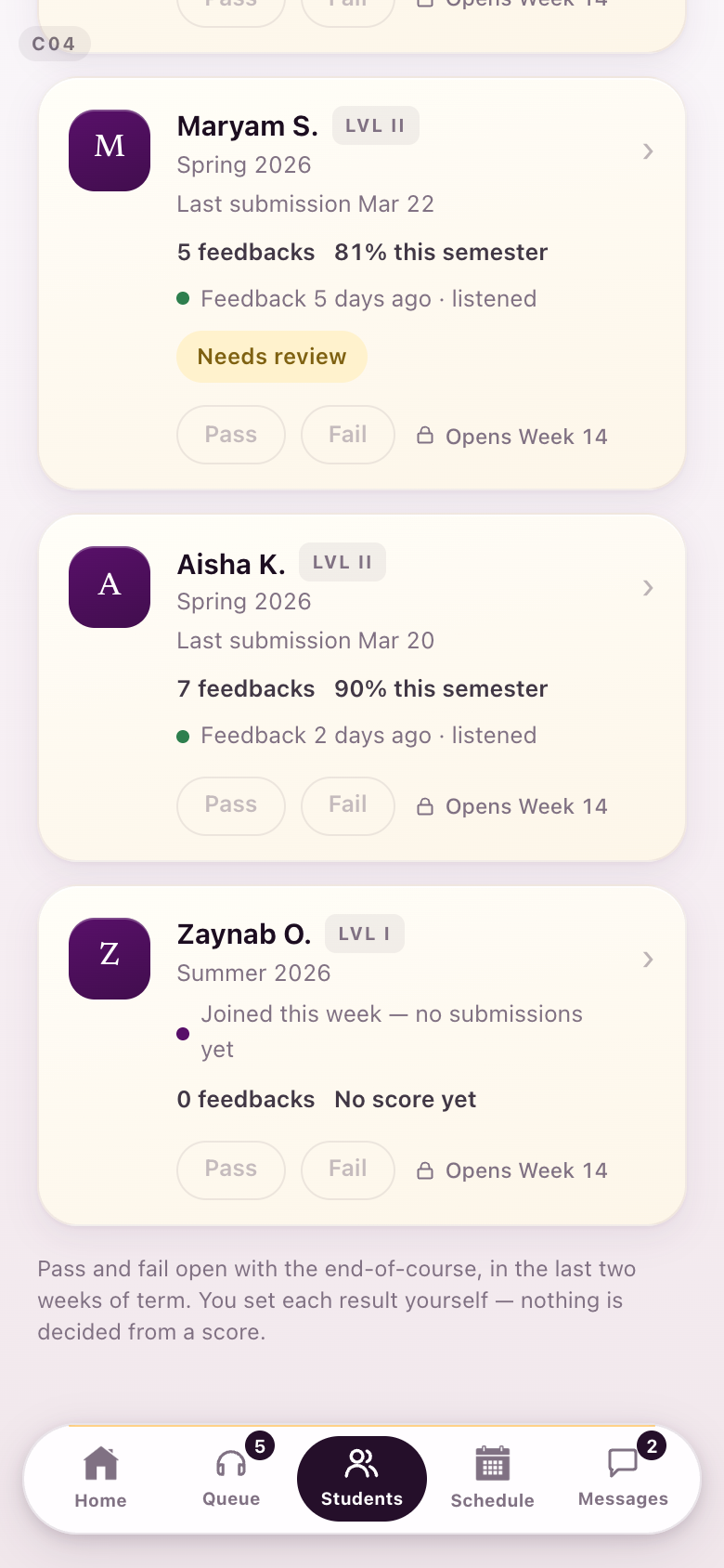
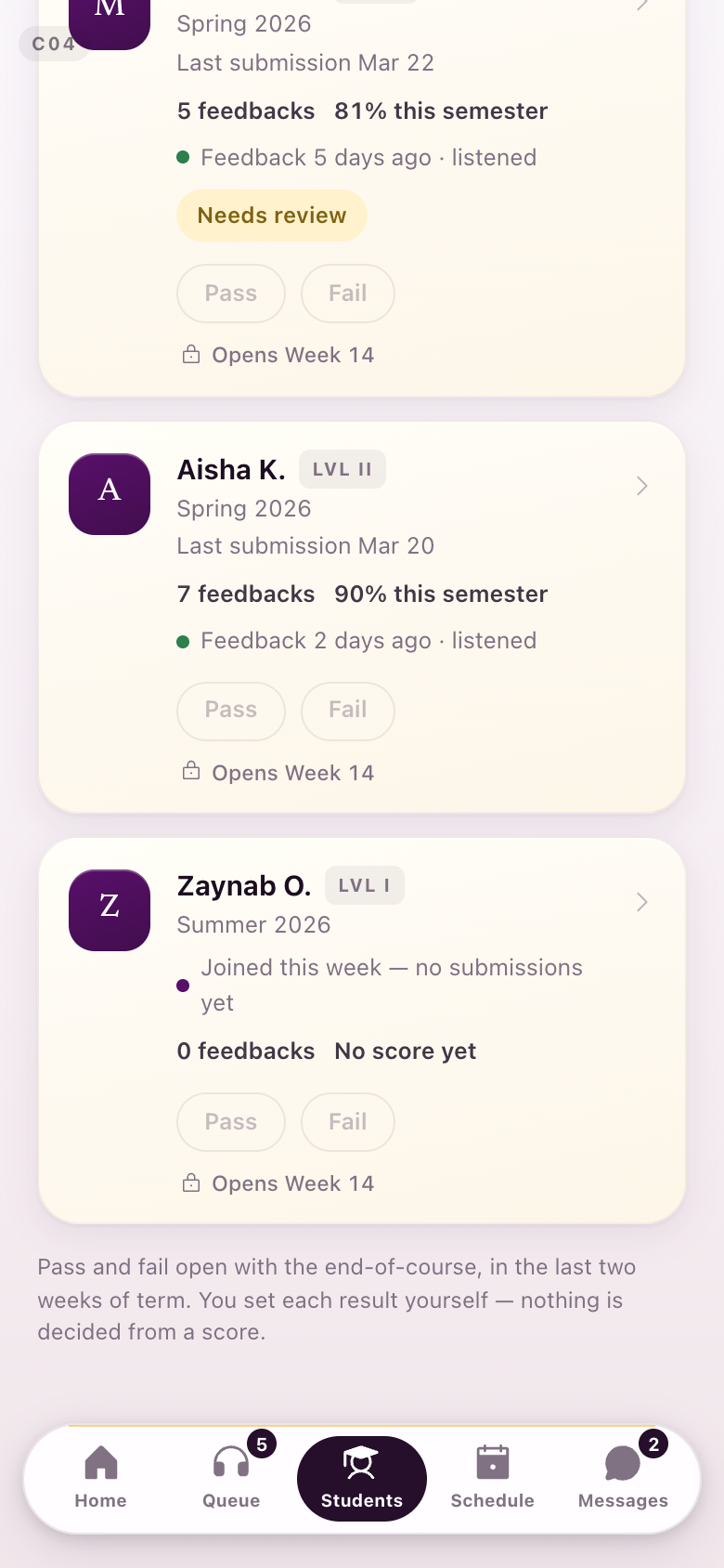
C04Her students
What she owes this week. The needs-review chip and the listened dot come off green for the same reason.
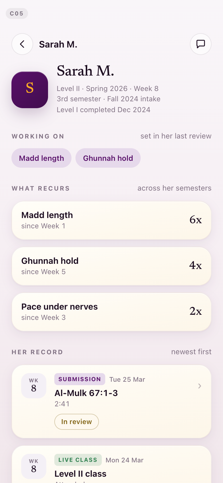
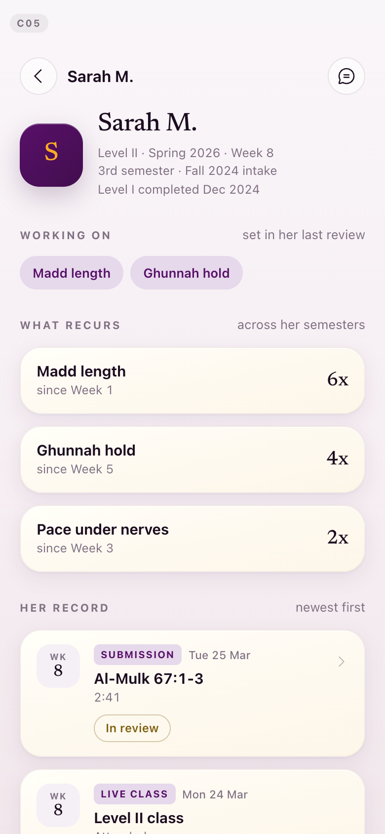
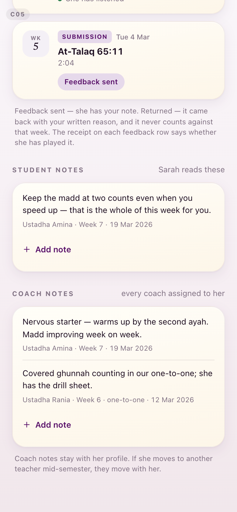
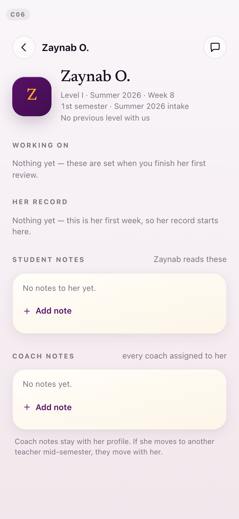
C05 · C06One student
An established record, and a student in her first week.
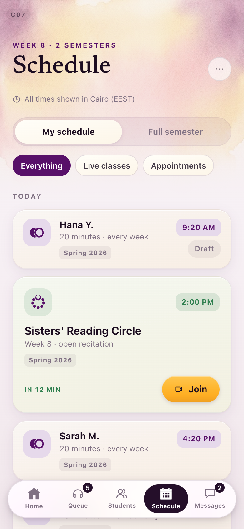
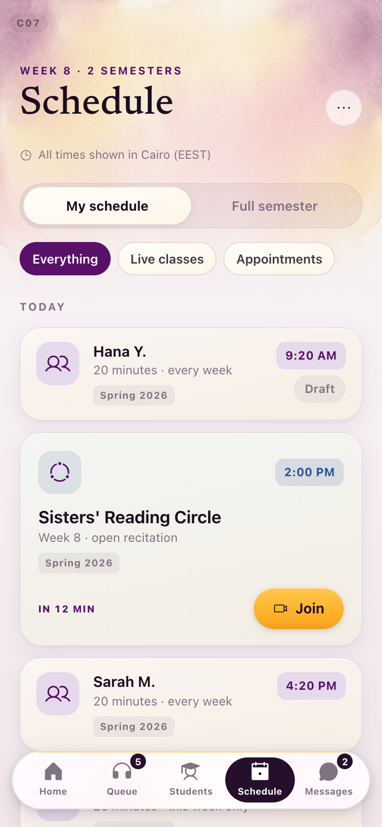
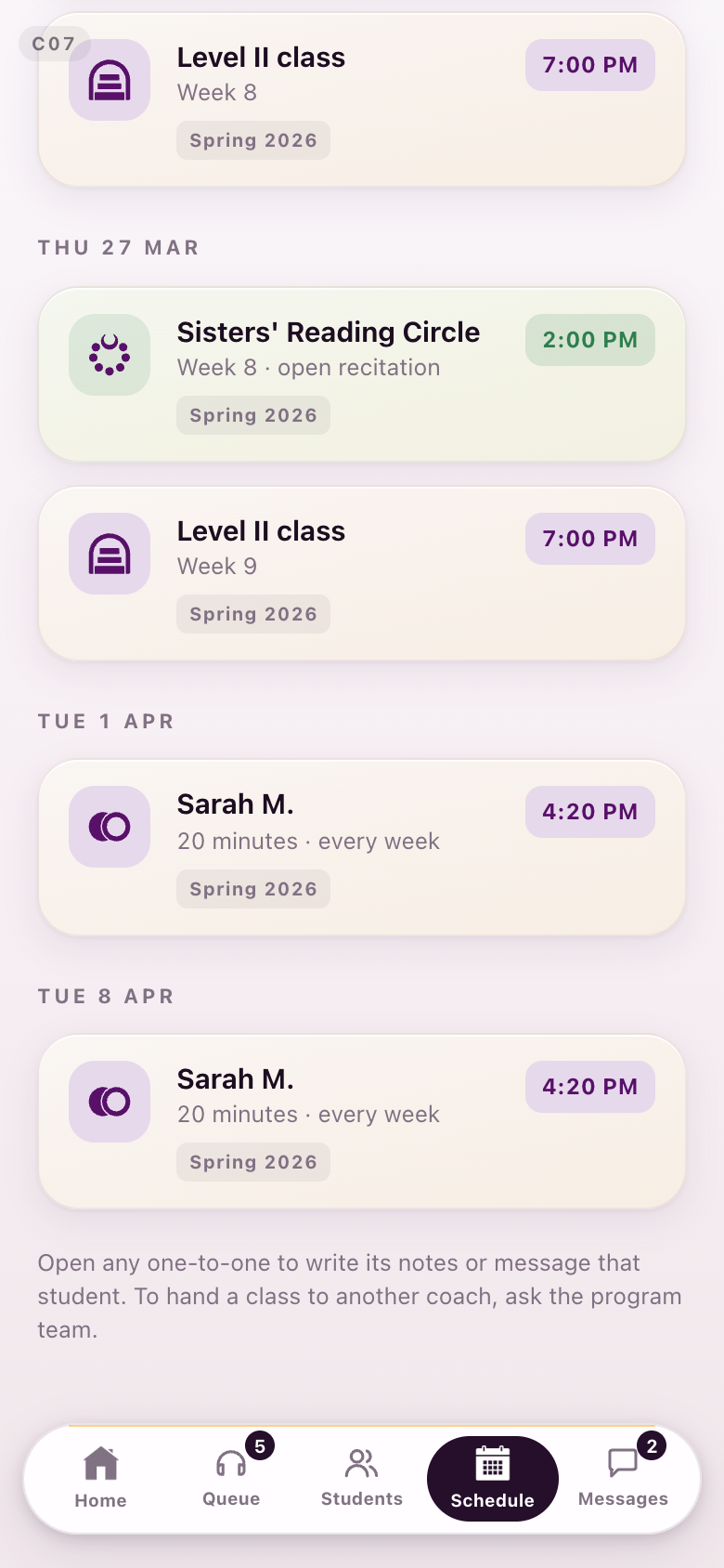
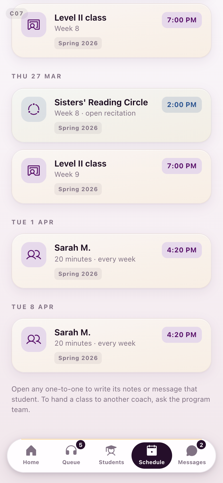
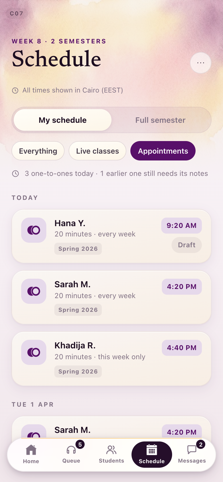
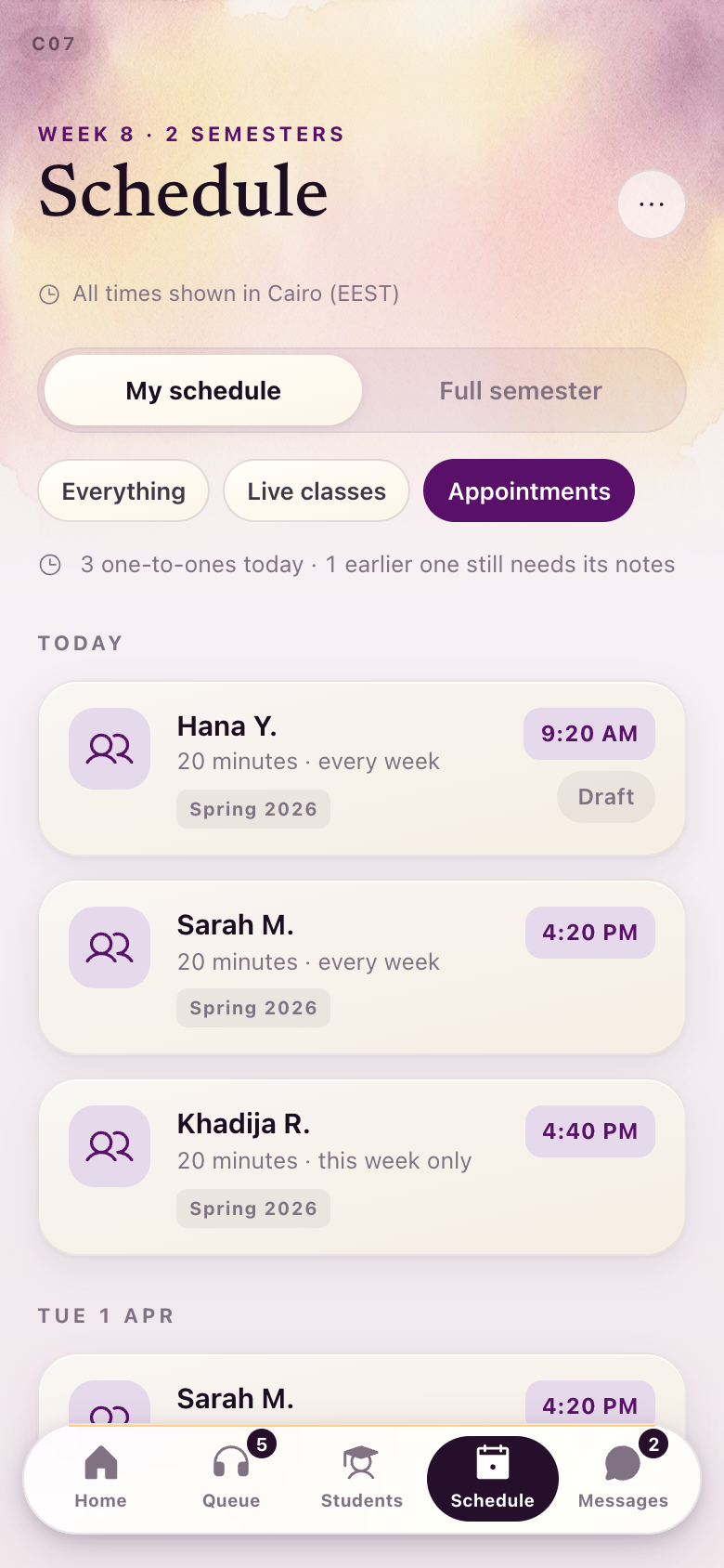
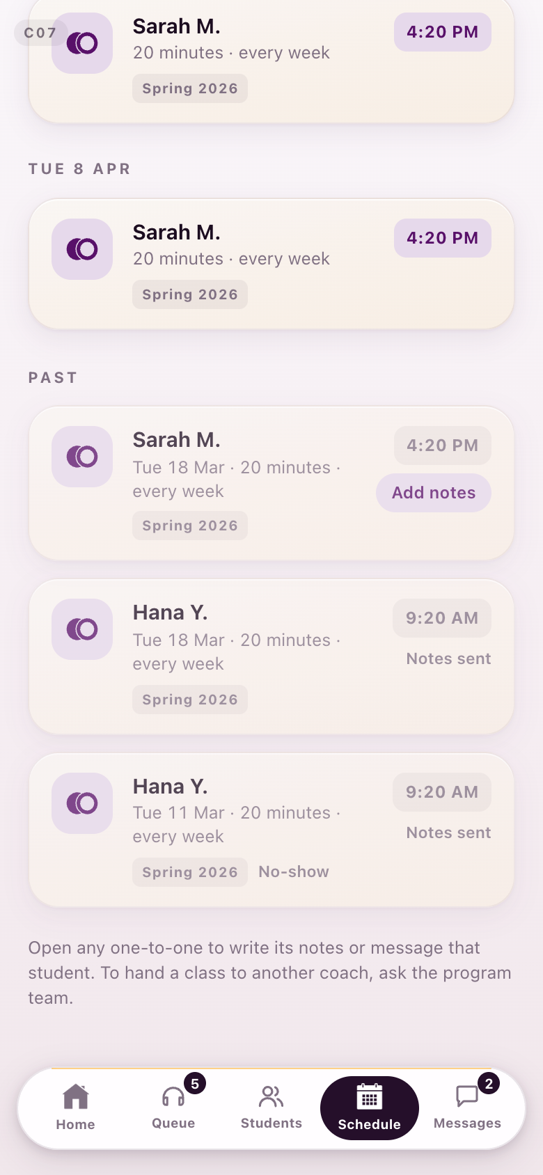
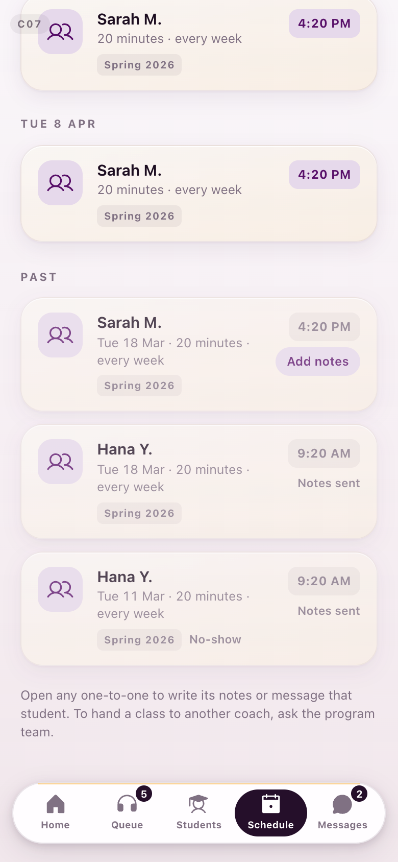
C07Her schedule
The whole week, and the same schedule filtered to one-to-ones.
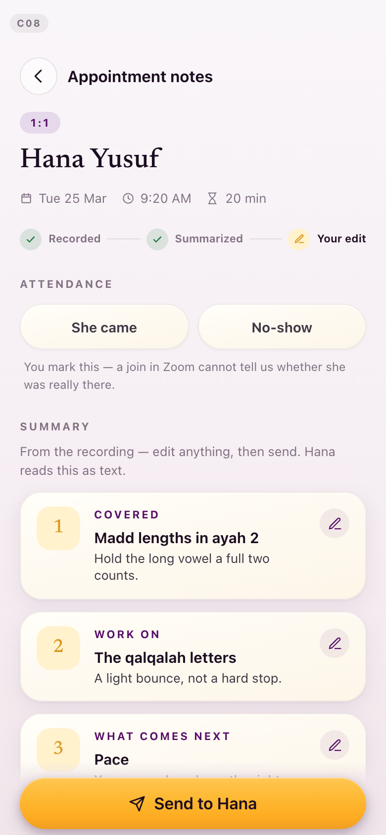
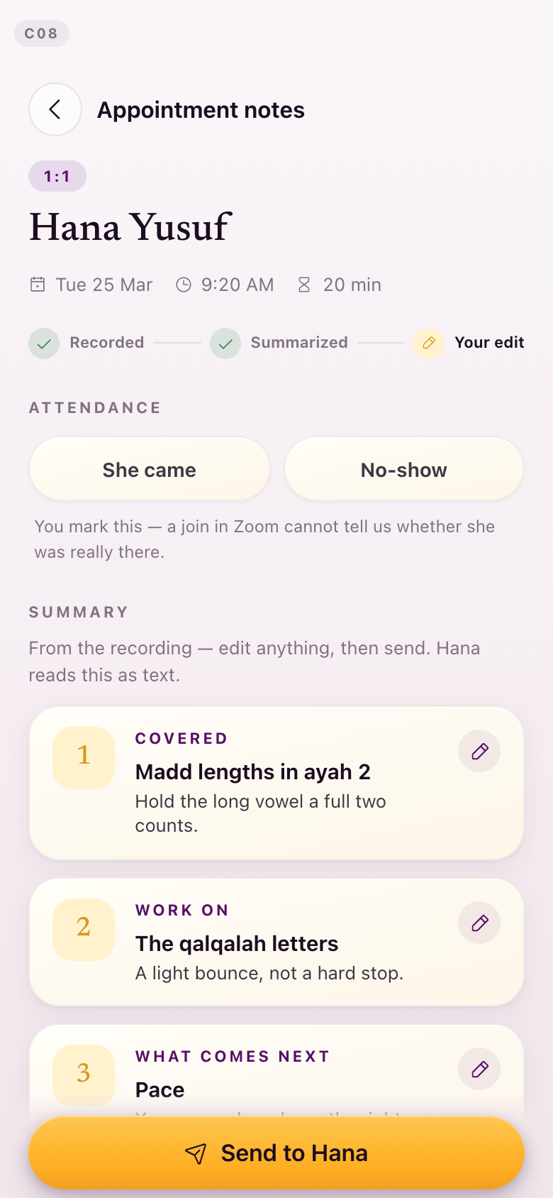
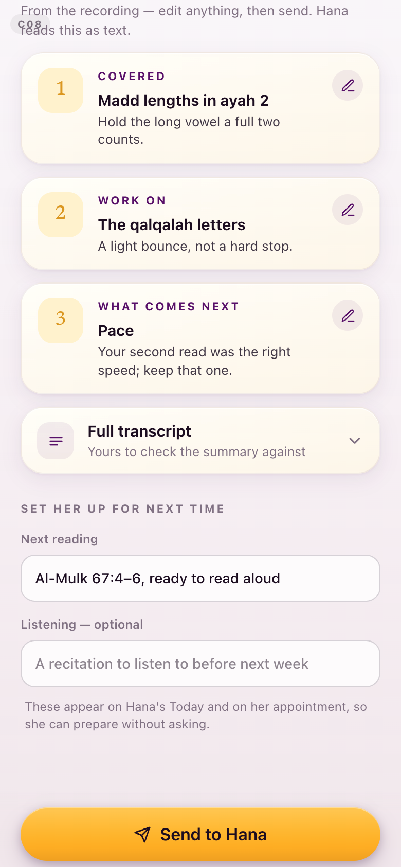
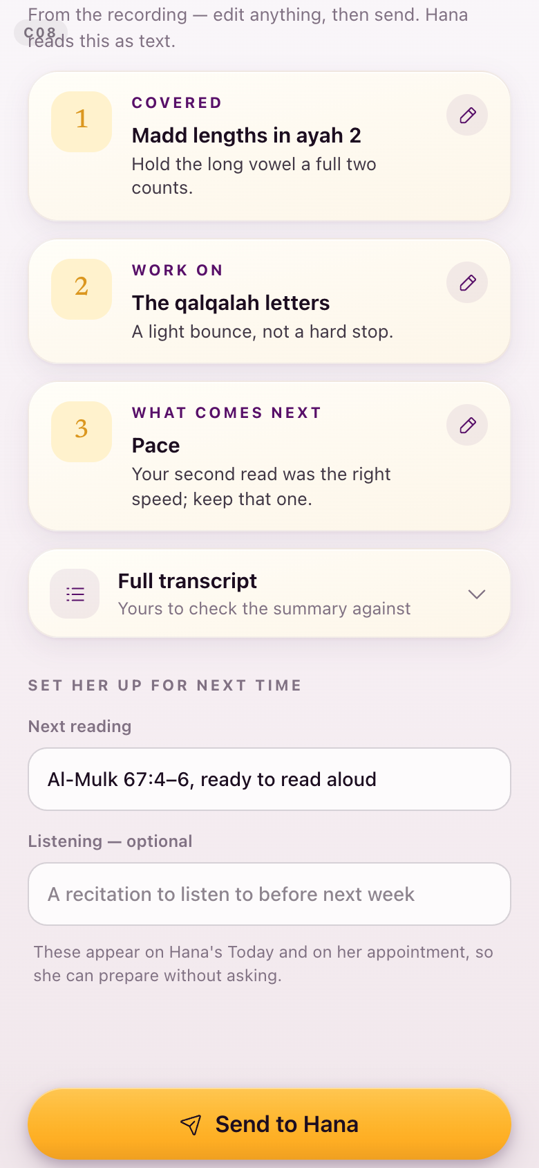
C08After a one-to-one
Attendance, her notes, and what comes next.
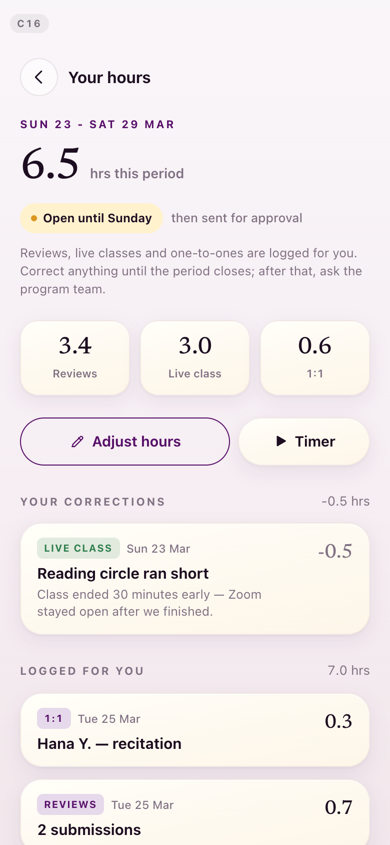
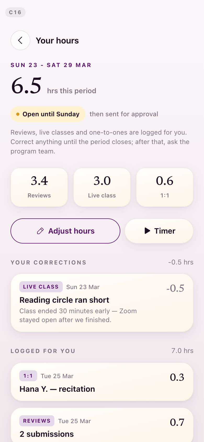
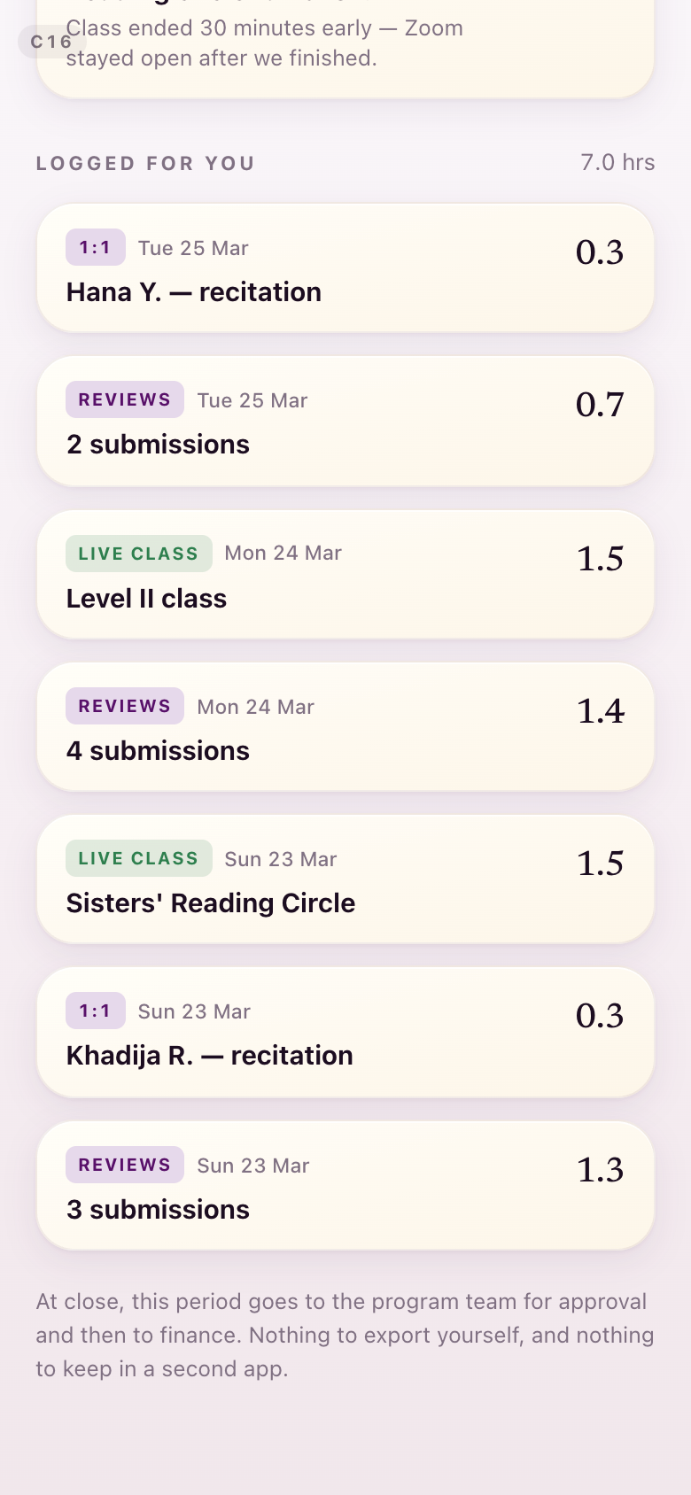
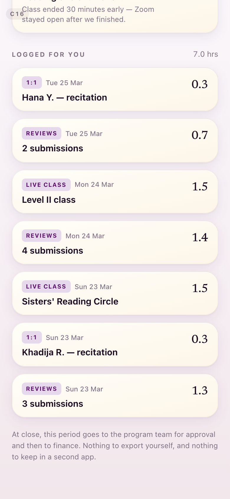
C16Her hours
The model you validated is untouched: the automatic total, the correction row, the adjust control. What moved is colour — the live-class correction chip is no longer green, because green now only means completed.
Section 8Getting to the recording
Lejla: “Ideally we want to pair the assignment with the start recording button.” Kamran: “You can't have a clear, highlighted, airy design and have everything on the screen above the fold.”Lejla + Kamran, August 28
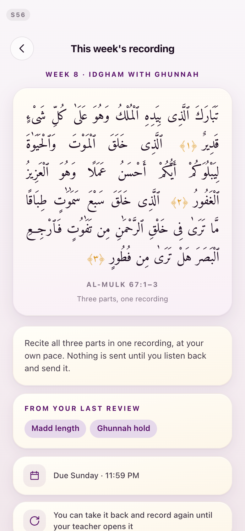
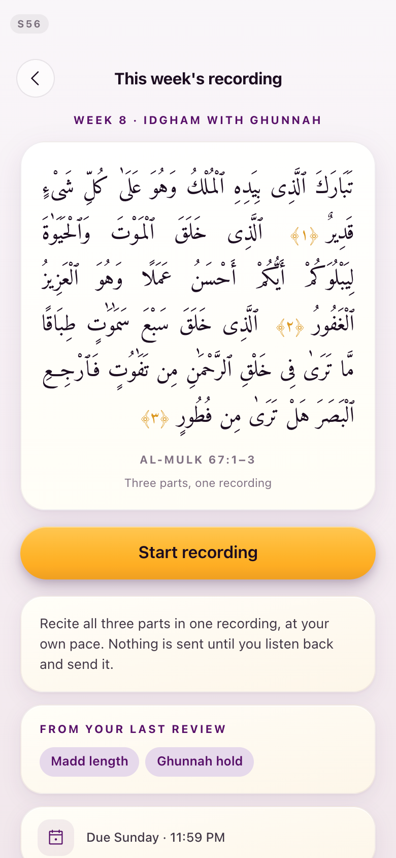
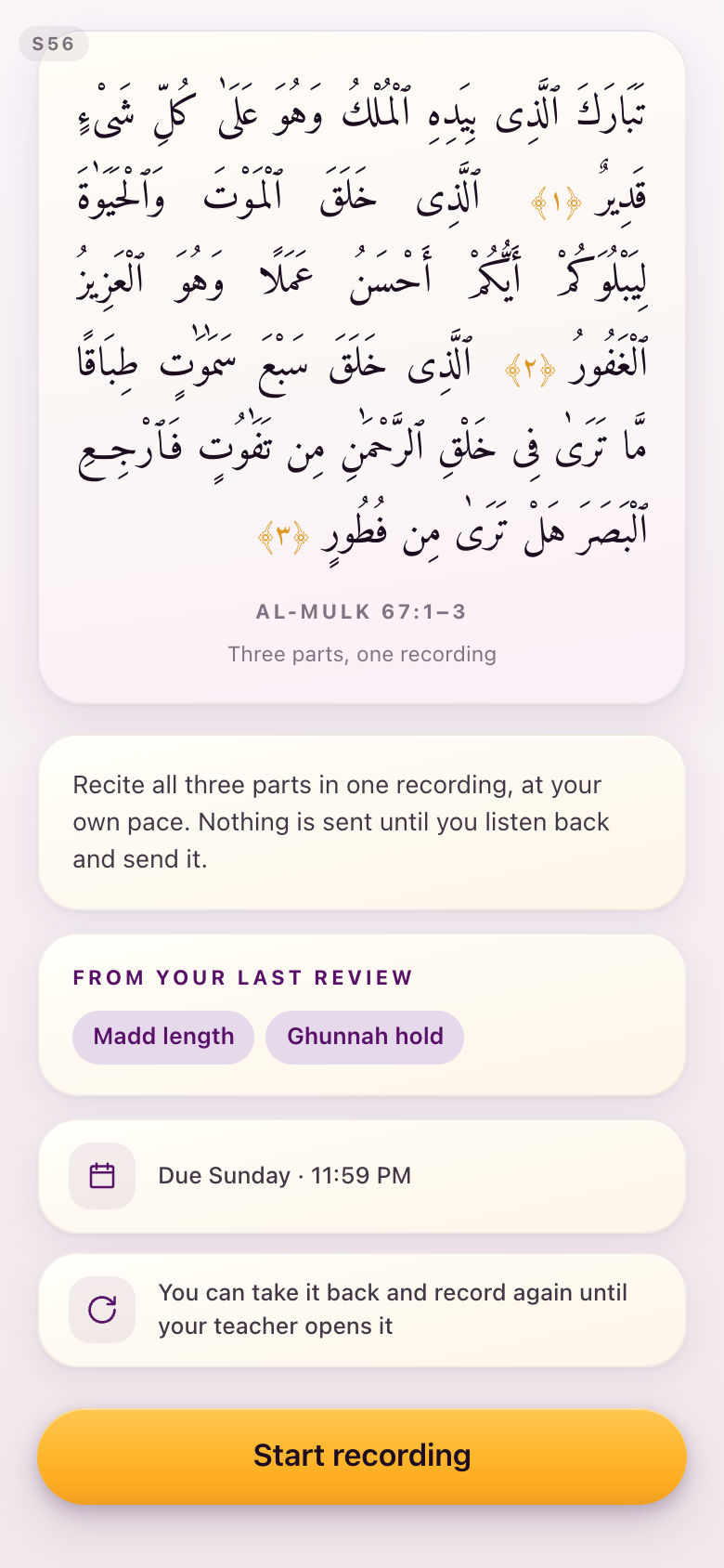
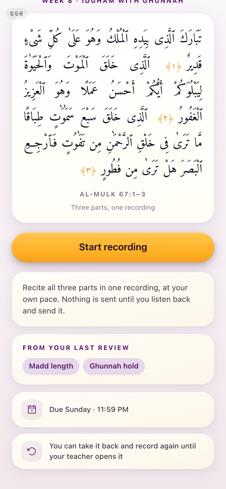
You granted Kamran's frame and held your preference, so the fix took the part that costs nothing. The Start recording card moved to sit directly under the passage, and the clarifications — the due date, the take-back window, what your last review flagged — moved below it. The assignment and its action are now paired, without giving up the card grammar or pretending the fold can be controlled across devices. Measured on an 844-pixel-tall screen, the button moved from 881 pixels down the page to 518.
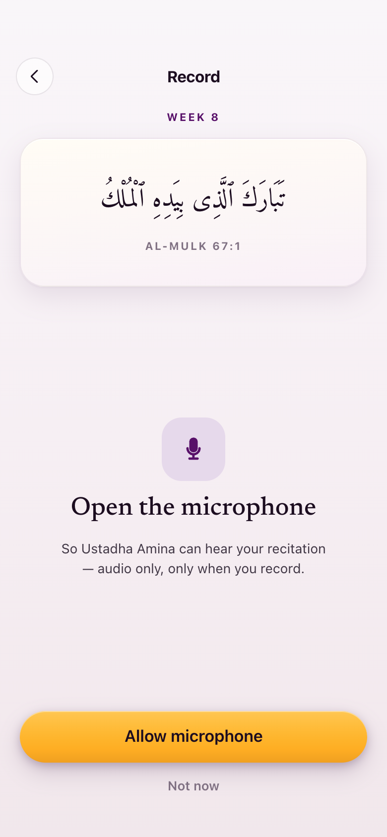
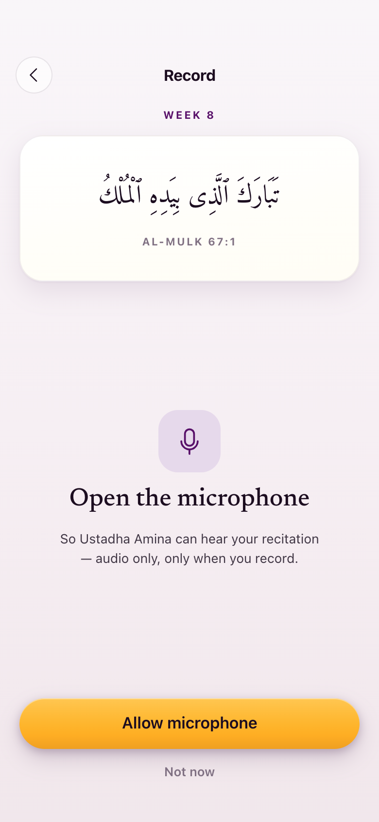
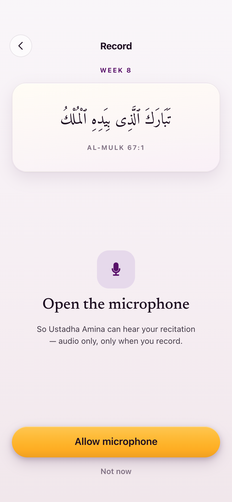
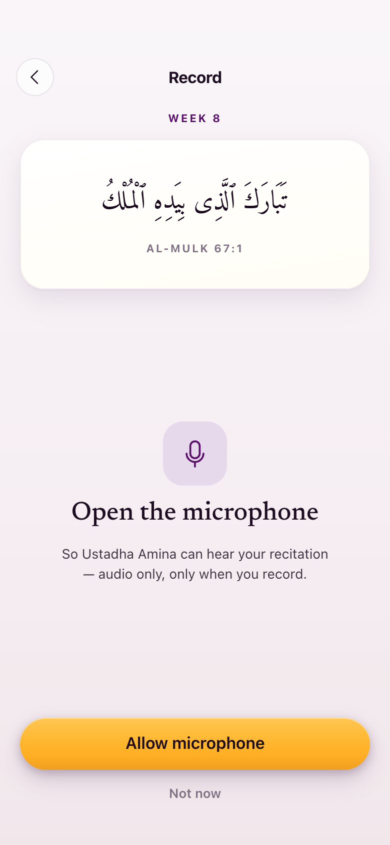
A separate finding from a walk of the whole flow: the microphone permission screen — the one you said you really liked, where the white card stands against the shaded background — was finished but orphaned. Nothing in the app opened it. It is now the first run of the record flow: the first time you record, it asks, and granting replaces it with the recorder rather than leaving it behind you. It draws the recorder's own microphone, which is the consistency you asked for.
S56This week's recording
The action moved up to the passage; the clarifications moved down below it.
—Asking for the microphone
The orphaned screen, now the first beat of the flow, with the one microphone on it.
Section 9What we did not change, and why
Either one of them work, I don't see like there's a huge issue with each one of them.Lejla, August 28
The profile checklist. You said the old one was cleaner because you can enumerate what remains, and the new one reads like an ID card, but that either works. We left it. Your preference is on file, so if that screen is reworked for another reason it starts from the version you preferred.
The default avatar. You said the app is female-coded and then the profile icon is a man. The man you saw was the old icon set, which is retired. The person icon now used on the You tab and in every person seat is the library's generic user mark, which is not gendered — no beard, no head covering, no shoulders that read either way. Drawn faceless avatars were explored and withdrawn: a designed hijabi or bearded figure makes a choice about a student on her behalf, on a screen where the app knows nothing about her. Kamran ruled: no custom avatars.
Gold. Restated once, because it was the other thing you asked for and it is easy to read a non-change as an oversight: gold buttons stay everywhere, and hierarchy is fill against outline rather than a second colour.
Section 10What we need from you
We don't have assignments that are specific to just one ayah... it just says week one assignment... On the back end I'm the one dictating what it says here — I have full control of what it says.Lejla, August 28
Two items are decided but not built, and both wait on the same thing.
Assignment naming. A week mixes ayat across surahs to drill one rule, so the surah-and-verse titles in the current sample content are wrong. The student-facing pattern is "Week 8 assignment", with the admin dictating every display title from the backend as free text. Kamran's note for the developers is recorded: these are backend content fields on a consistent schema — title, author, running time — uploaded structurally, not app copy and not typed in one at a time.
The shape of a lesson. A week's lesson is one titled unit holding up to about three titled videos: the concept video, the walkthrough for that week's submission, and a practice-with-me or extra-explanation video. The current sample content does not have that shape.
The one thing blocking it: the level-lessons and curriculum document, which is the document that actually gets entered into the backend. Both changes are a pass over the sample content on every screen that names an assignment or a lesson, and neither can start until that document exists. Nothing else in this round is waiting on anything.